Pure Pens Celtic and English Inks

I can’t say they were the first fountain pen inks I bought, but the Pure Pens Celtic collection were the first ones I actually made a considered choice to buy.
Over the decades, I’d bought a bottle or two of Parker Quink Black or some cartridges, but as I only had the one grotty fountain pen that I rarely used, I never gave the ink much thought. The pen was almost always dried up and not worth using.
When I started actually getting fountain pens as an actual hobby, I bought a cheap no-name pen from Amazon and a Lamy Safari: a matte black with some free black cartridges and what now turn out to be relatively rare orange Lamy cartridges. Soon after, I found Pure Pens, a small retailer that happens to be about 12 miles away, albeit about 30 miles’ journey thanks to the Severn Estuary. I bought a Noodler’s Ahab Demonstrator and a bottle of their own-brand cheap “Celtic Sea” ink.
It turned out to be an excellent ink, and remains probably my second favourite ink overall ever since.
Launched in early 2018 and supplemented since, the Pure Pens Ink range aims to be affordable, good-quality ink that tend to “sit between other ink producers’ main colours”. I think they’ve done a good job in hitting that target. They’re not too showy, but not boring either. They don’t sheen wildly like Organics Studio Nitrogen or Walden, but many do sheen enough to make things a bit more interesting. They’re restrained without being dull.
The bottles aren’t particularly showy or special, but they’re functional; more to the point, they’re fairly generic, which means money hasn’t been wasted on the bottles. And, they’re 60ml bottles, so somewhere between Diamine’s 30ml small plastic bottles, their 80ml big glass bottles, and the typical 50ml from Parker Quink and Waterman. It’s a useful size and good value.
Now, taking any one of their inks in isolation, and I’m sure you can find a very similar ink in Diamine’s massive catalogue, or one of the other manufacturers. That might be the case – and not entirely surprising, if you get my meaning – but the thing I really like is the collection as a whole.
Fundamentally, it’s a very well curated collection… probably the best I’ve come across.
The colours complement each other well, and they don’t overlap much. From what I’ve heard, Pure Pens considered a number of different samples, and only chose the ones they felt were interesting enough, rather than releasing everything. I respect that choice.
Later in 2018, they released a new “English” range. Now, I’m still not sure what distinguishes this from their “Celtic” inks. As a Welsh company, I thought it was a jab at their neighbours – a range of more conventional, boring inks. Indeed, “St. George’s Cross” is a fairly conventional (but still good) red ink, and “Buckingham Blue” a fairly conventional blue, but then “Windermere” is an excellent and interesting blue-black with some sheen, and “Cotswolds” is a complex, heavily-shading ochre / yellow / orange / brown / baby poo.
Anyway, back to the Celtics, I mentioned that my first bottle, “Celtic Sea” was probably my second-favourite ink. It might be joint-first, come to think of it… it’s pipped by “Cwm Idwal”.
This is by no means the first review of Pure Pens’ inks; the United Inkdom team have done some great reviews, including beautiful swatches by Nick Stewart and the absolutely stunning photos by Mateusz, who Pure Pens should be contracting to do all their photography! While I have absolutely nothing against free samples for review, I bought all these inks myself, and they remain at the forefront of my collection.
Note: The photos I’ve taken here aren’t 100% consistent and accurate with each other. I’ve intentionally tweaked various hue, saturation and exposure settings for each to make them appear as close as I can make them to the way I perceive them normally. Some of these inks are difficult to photograph, so the images straight out of the camera just didn’t look correct. And my camera sucks – it’s a ~15-year-old original Canon EOS 300D (Digital Rebel).
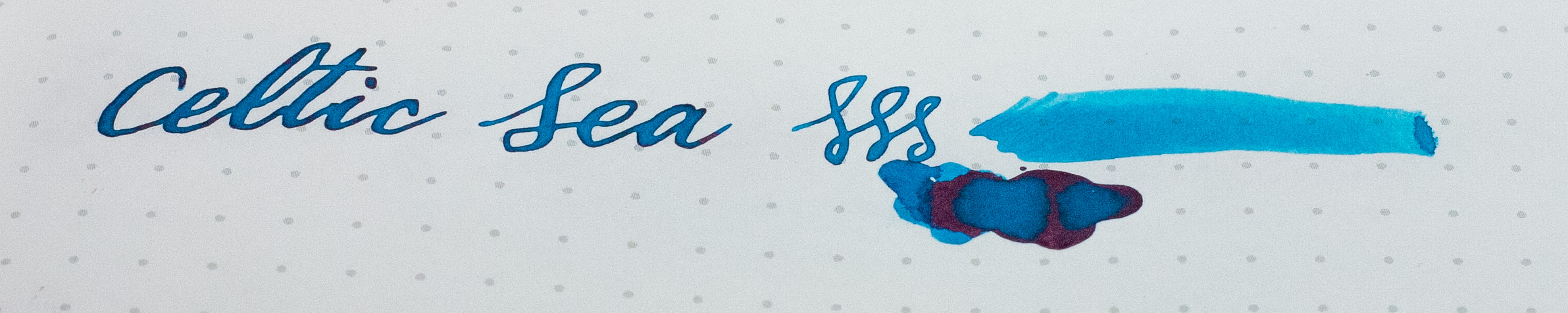
Pure Pens’ Celtic Sea on Tomoe River paper, Noodlers Ahab
Celtic Sea
is a cerulean blue with good shading and a bit of red sheen. I’m not really a fan of typical “school” blue ink, but this stuff is gorgeous. Being a flex fan, my pens tend to write pretty wet, so it’s a dark blue turquoise blue for me, like a dark azure.

Pure Pens’ Cwm Idwal on Tomoe River paper, Noodlers Ahab
Cwm Idwal
is a dark murky green, with a dark red sheen. It’s clearly similar in formulation to Organics Studio Henry David Thoreau Walden Pond, but nowhere near as sheeny, so you get to see the underlying colour rather than having your retinas blasted out with maroon reflections. It has real depth, especially on good paper. It’s dark enough that it doesn’t scream “Hey! I’m trying to be different!” so I’d be happy using it for everyday notes.
And, it has a interesting property when cleaning your pen: it appears blue in the bottle, and drops into water blue, and but with stirring it (eventually) turns pine green.

Cwm Idwal in water. (Click for better video)
(I really messed up the exposure and colour-balance on the video, but I’ve tried to correct it in post. Heck, it should be clear what’s going on though. It does actually go full-on green after a few minutes, but my battery was dying!)
I have at least one pen inked up with Cwm Idwal all the time, if not more.
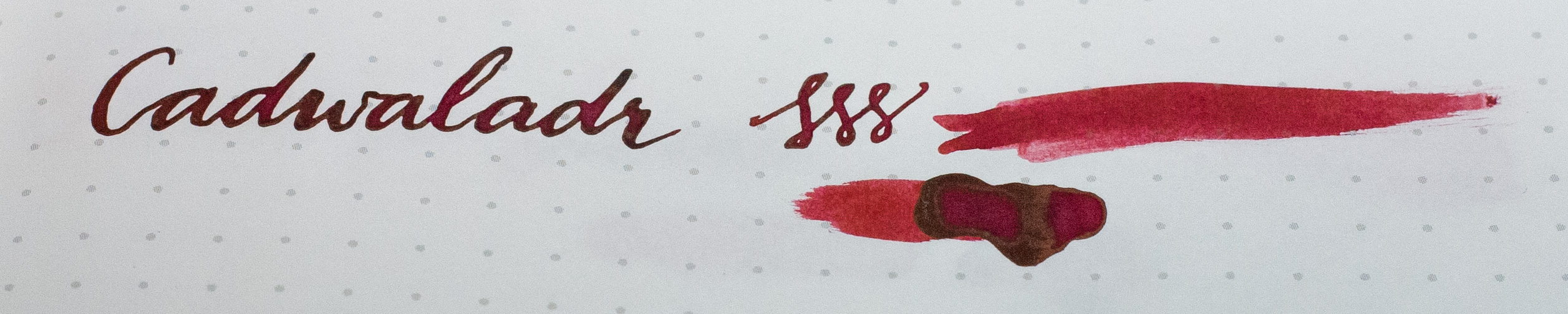
Pure Pens’ Cadwaladr on Tomoe River paper, Noodlers Ahab
Cadwaladr
is a deep red that shades quite well. It’s a blood red – but not Diamine Oxblood – and it has a hint of gold sheen… just a hint, though. It’s really rich, and presents as a proper red ink, without being a boring red ink. It won’t underwhelm. It’s definitely a favourite of mine, and Cadwaladr is permanently inked up in my Platinum 3776 Bourgogne.
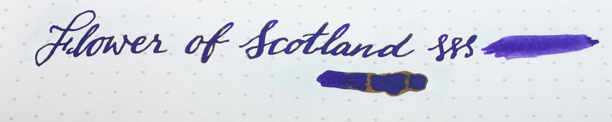
Pure Pens’ Flower of Scotland on Tomoe River paper, Noodlers Ahab
Flower of Scotland
is a reliable middle-of-the-road purple; relatively dark, and with a little gold sheen. Oddly, with purple being one of my favourite colours, I wasn’t that impressed with Flower of Scotland. There’s certainly nothing wrong with it, but as with Diamine Imperial Purple, it just doesn’t wow me. Saying that, I’ve heard others rave about Flower of Scotland so by no means would I call it a dud. It did show an odd foaming in the bottle that worried me a little, but I was assured by Pure Pens that it’s normal and just something about the purple dye used.
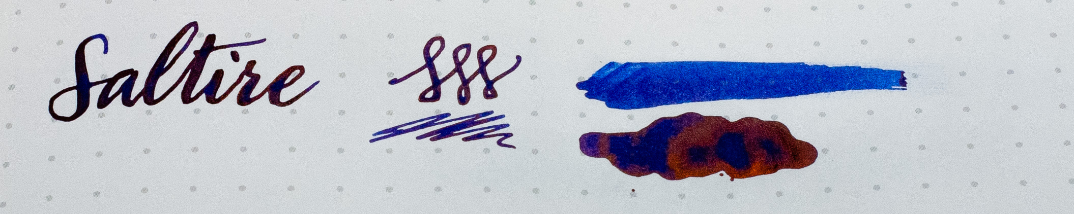
Pure Pens’ Saltire on Tomoe River paper, Noodlers Ahab
Saltire
is a “nice” dark blue ink. I say “nice” because I’m not really a fan of plain blue ink. I’m not sure if this is a holdover from school or not, but I do remember that at school my handwriting was worse in blue ink, so I tended to use black instead. Well, for that matter I was usually using a Biro anyway.
Still, one of my resolutions for 2019 is to try to learn to love plain blue ink. In fact, I’m planning to explore a range of washable/erasable blue inks shortly, much as I hate to admit it. After all, blue is a favourite colour of mine, although as with purple, I don’t seem to take well to blue ink.
Anyway, many people clearly like blue ink. For a blue ink it is good. It is one of the notorious RSBs: the red-sheening blues that infected 2018 like a plague that seems to have reached epidemic levels in Mt. Gambier, Australia. ;-)
It’s darker and more saturated than Waterman Mysterious Blue (probably by virtue of being wetter), Lamy Blue, and certainly all the washable Royal Blues like Pelikan 4001, Sheaffer Skrip Blue, Diamine Royal Blue, and so forth. It’s definitely Blue rather than Blue-Black, though.
Out of the Pure Pens collection, I’d say it’s the sheeniest.
And, gritting my teeth, if I had to get a blue ink, I do think Saltire would be a favourite.
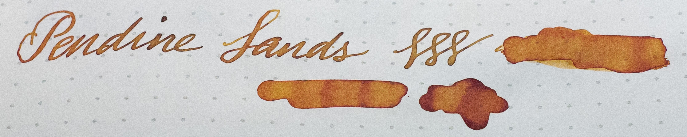
Pure Pens’ Pendine Sands on Tomoe River paper, Noodlers Ahab
Pendine Sands
is an orange, tending towards a darker, slightly dirtier tone rather than comedy orange. It’s not a million miles from the venerable Noodler’s Apache Sunset; so I suppose the sky is a little less showy in Cornwall than Arizona. It shades richly and can provide a very deep reddy-orange if laid on thick. Once settled (at normal volumes) it is more subtle than it might seem when wet, which is not necessarily a bad thing… as with the others, these are relatively “sensible” inks. Being generally lighter than the others, I contaminated my tests once or twice, much as yellows and oranges are prone to do.
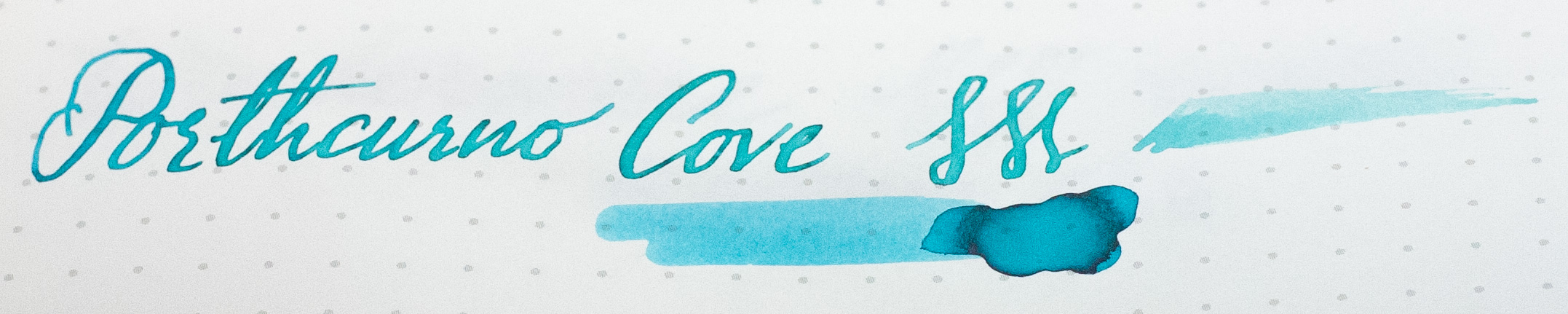
Pure Pens’ Porthcurno Cove on Tomoe River paper, Noodlers Ahab
Porthcurno Cove
is a vibrant turquoise. I haven’t been to the eponymic beach in Cornwall, but this really does remind me of the waters of the Tobago Cays in the Caribbean, which I have been happy to snorkel around. It’s somewhat close to being a lighter Celtic Sea, but definitely a greener tinge. It shades well, giving it texture. As other reviewers have noticed, it’s hard to portray it in photographs – the colour doesn’t fit well into the sRGB gamut – so just consider it a little bit greener than it might appear here.
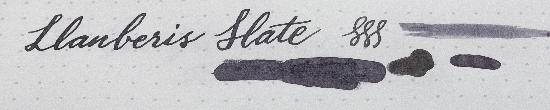
Pure Pens’ Llanberis Slate on Tomoe River paper, Noodlers Ahab
Llanberis Slate.
I bloody love Llanberis Slate. I didn’t think I’d like a grey ink that much, but it’s just compelling. It’s a cold grey (much like its namesake, and much like the rest of Wales, to be honest) but it really does conjure up the slate of Snowdonia. It goes on pretty dark (at least with the wet-nibbed Noodlers Ahab I’m using), but slowly fades to a more subtle mid-grey. This is very dependent on paper, mind you. On Tomoe River it stays quite dark, but on some papers, it goes as light as HB pencil. It works particularly well on light cream paper, giving a nice contrast.
Pure Pens’ Llanberis Slate on Lemome cream paper, Mabie-Todd Swan
It shades well, and if you squint hard and tap your heels together, you’ll see a tinge of purple in there too. It’s just beautiful.
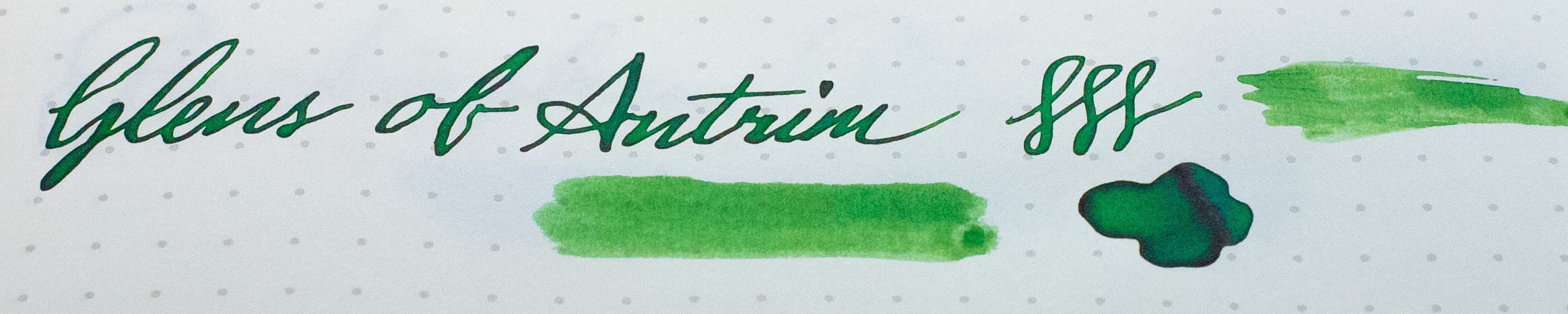
Pure Pens’ Glens of Antrim on Tomoe River paper, Noodlers Ahab
Glens of Antrim
is a proper green. It’s leafy, it’s rich, it’s lush. Unlike the dark Cwm Idwal, it won’t be mistaken for anything but a green ink, and it doesn’t veer at all towards turquoise. Slap bang in the middle of the purest green, it’s a little yellower than what I’ve seen with some other inks just called “Green”. It shades well, but it doesn’t sheen.
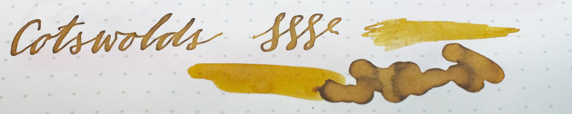
Pure Pens’ Cotswolds on Tomoe River paper, Noodlers Ahab
Cotswolds
is a dirty mustard yellow, with the capability to tend towards brown, depending on the paper and the pen. With a dry pen or absorbent paper, it’s a relatively unsaturated, subtle yellow, but when piled on wet or on something like Tomoe River, it shades strongly to brown, grey and black. It’s been described as honey, but if so, it’s more like that yellower opaque honey than the archetypal golden clear honey. There is a risk of it looking like baby-poo, to be honest, but it doesn’t smell like it. It shades, but doesn’t sheen.
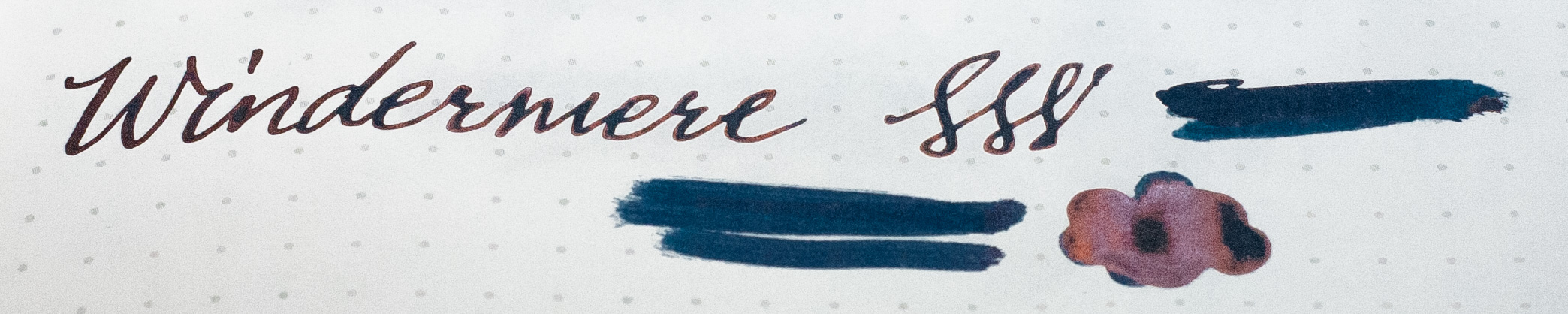
Pure Pens’ Windermere on Tomoe River paper, Noodlers Ahab
Windermere
is a blue-black with a slight red sheen, and a surprise for me. Did I mention I can’t bear blue ink? Well, Windermere made me like blue-black. Actually, Randall by Nick Stewart really did it, but the not-dissimilar (and cheaper, but less special) Windermere solidified it. It’s on the bluer side of blue-black (black-blue?) and has some healthy red/maroon sheen, showing its kinship with Saltire. In terms of chromatic saturation (ie. how colourful it is… not the same as chemical saturation), it’s more colourful than other blue-blacks I’ve seen that tend towards a blue-tinted dark grey; this is more a black-tinted blue! It’s also a tiny bit greener/tealer than a typical blue-black which tend to be a colder blue. It’s definitely a good everyday carry ink. It does shade, but with a dark ink like this it’s not that apparent.
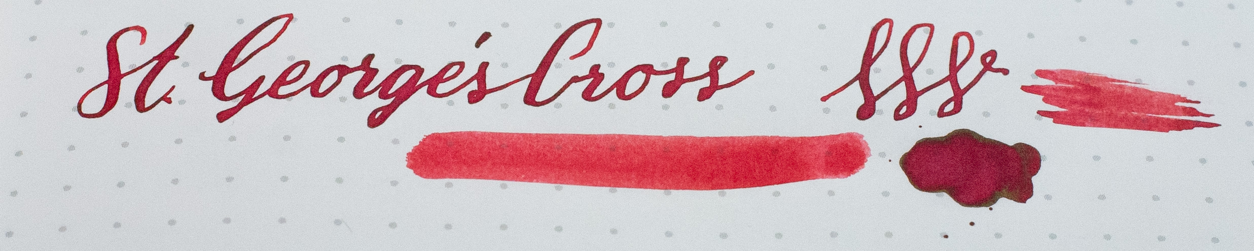
Pure Pens’ St. George’s Cross on Tomoe River paper, Noodlers Ahab
St. George’s Cross
is a red ink. To be absolutely honest, I’m not sure I would’ve bought this if it wasn’t for completism. It and Buckingham Blue are what made me think the “English” range was Pure Pens’ dig at the English for being boring. However, it’s actually not that dull. It’s definitely a plainer red than Cadwaladr, but it’s got some grit to it; when laid on with a dry pen, it’s a plain red and not even very saturated (chromatically). It even looks a bit washed out. However, with a wetter pen, it’s goes grunge, and shades with a dark edge. It’s a meaner version of plain red ink. It’s red ink in a grouchy mood. St. George is cross, after all. (badum-tish.)
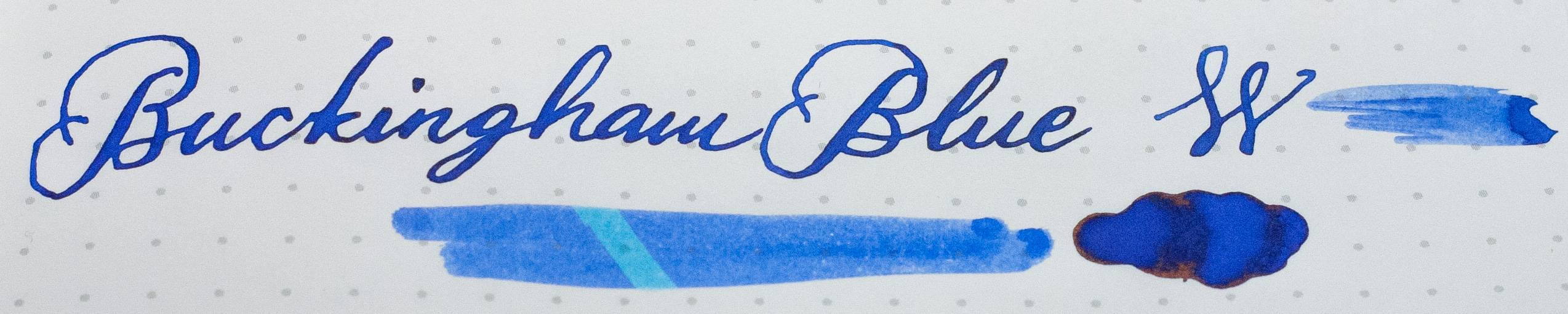
Pure Pens’ Buckingham Blue on Tomoe River paper, Noodlers Ahab
Buckingham Blue
is a blue ink. Much like St. George’s Cross, my initial reaction – especially from Pure Pens’ own photographs – was that this was just an insipid plain blue ink like the ones that come free with every pen. Turns out… well, maybe half right. It’s certainly a plain blue, but it has a little richness to it that makes it more palatable. I did test it with an ink eradicator pen, and it does show some lightening to an almost Porthcurno light cyan/turquoise, so it certainly shares some of the same dyes as “Washable Bleh”. It’s close to Diamine Royal Blue, which also eradicates to a light cyan. With a wetter pen, it does have a bit of dark shading, and some richness to it.
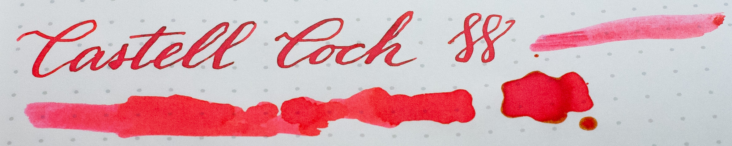
Pure Pens’ Castell Coch on Tomoe River paper, Noodlers Ahab
Castell Coch
was expected to be a baby pink ink. When written with a dry pen, it’s certainly a nice subtle pink. However, when thrown at the page with a wet flex pen or a dunked Q-tip, it’s an orangey Candy Apple Red! As with a lot of the others, it can shade with a dark edge, although not as much as the others. As I’ve mentioned above, most of my pens write wet and I use a good paper like Tomoe River or Rhodia, so for me, Castell Coch is more red-orange than pink. If you write with a drier pen, expect a proper middle-of-the-road warm pink.
And, at the time of writing, 10% of proceeds go to charity – Breast Cancer Care, specifically.
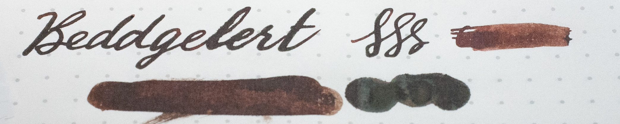
Pure Pens’ Beddgelert on Tomoe River paper, Noodlers Ahab
Beddgelert
… ah, one day I’ll write about my search for the brown of my dreams. Well, to some extent I already have. I was looking for a brown that wasn’t too red (eg. Diamine Ancient Copper, Waterman Absolute Brown), or too orange/yellow (Diamine Sepia, Edelstein Smoky Quartz), or too chocolatey (Diamine Chocolate Brown). I wanted the colour of the stain a wet tea-bag leaves (Yorkshire Tea, and no, Herbin’s Lie de Thé wasn’t right either) I wanted something like my 1934 Parker Vacumatic, which I think was originally burgundy but drifted more towards the golden yellow end over the years. I felt that Pure Pens’ range was missing a brown… and a black, for that matter.
I’d wished for a bottle of SBREBROWN, but being limited edition, I missed it. I was forlorn. It did appear to be slightly too red, but various other reviews showed it might be right. I messaged Dr. Brown himself and asked for more, and even bugged P.W.Akkerman a little on their Facebook page. In the meantime, I picked up Diamine Ochre, which turned out to be almost exactly right. It’s darker than I wanted, and the name is utterly misleading – I consider “ochre” to be a far yellower, lighter colour. When SBREBROWN was re-released by Akkerman, I think I must’ve been first in the queue for it, hammering “Buy Now” for a couple of bottles. It hasn’t disappointed.
But this isn’t about SBREBROWN or Diamine Ochre. Pure Pens’ Beddgelert is a less showy brown; it’s more towards chocolate than either of those two, and much like Pure Pens’ other inks, it shades dark, and sits in the middle of the road. It’s a good chocolate with a tiny bit of sheen on Tomoe River. It’s less chromatically-saturated than either of the two aforementioned browns with practically no “toffee” or “orange” to it. In that regard, it actually fits my original criteria pretty well: it doesn’t tend towards red, orange or yellow, and is fairly squarely in the “plain brown” camp. It’s a chocolate, frankly. It doesn’t match my Vacumatic, but that’s okay because I have ample supplies of Diamine Ochre and SBREBROWN for the time being.
Hmm… That didn’t sound like a glowing review of Beddgelert, but on the contrary, it is a good ink. It’s just not exactly what I was looking for in my earlier search, and that was my yardstick. It’s a solid brown and does fit with the rest of the range.
What next?
I think Pure Pens needs a black, and not a plain black. I’d love to see a black with a hint of green or a hint of… well, anything really, except for blue.
I’d also like to see them offer a limey yellow/green with some dirty shading, much like Cotswolds but green rather than mustard.
There are a number of colours I’d love to see as inks, but the question of whether they’d fit into the well-curated range that Pure Pens has managed to assemble is another question. I think there are already one or two outliers that I’m not sure I would’ve included in that definition, but I still trust them not to overwhelm us with confusing similar shades or just silly, badly-behaved inks.
I’d also like to see more washable inks out there. We hear a lot about the desire for permanent, bulletproof, waterproof inks, but with the amount of clothes and carpet I’ve ruined, and the almost perpetual stains on my hands nowadays, I’d actually like some washable/erasable inks that aren’t that insipid “Washable Bleh” that we’re saddled with.
I can understand that the predominance of blue for washable/erasable ink comes from the existence of a safe, simple washable dye that happens to be blue, coupled with the fact that schools and businesses – the main users of fountain pens back in the day – wanted blue ink; and that there’s not been much demand since. Parker Quink seems to have stopped selling their Washable Black in bottled form, only now selling cartridges. So, wouldn’t it be nice if someone filled that Niche with some new kid-friendly and school-uniform-friendly inks that weren’t that awful dull bleh?
UPDATE, March 2020: Blacks from Pure Pens, Beast of Bodmin and its glitterati sister Welsh Gold are available. I’d still like a black with something a little special… but not as special as the shimmer-laden Welsh Gold!
