<?xml version="1.0" encoding="utf-8"?><feed xmlns="http://www.w3.org/2005/Atom" ><generator uri="https://jekyllrb.com/" version="4.3.4">Jekyll</generator><link href="https://gidden.net/feed.xml" rel="self" type="application/atom+xml" /><link href="https://gidden.net/" rel="alternate" type="text/html" /><updated>2025-06-01T21:03:56+01:00</updated><id>https://gidden.net/feed.xml</id><title type="html">Tom Gidden</title><author><name>Tom Gidden</name></author><entry><title type="html">Gid’s Games for PalmOS, 2001</title><link href="https://gidden.net/2025/06/01/gids-games-for-palmos-2001/" rel="alternate" type="text/html" title="Gid’s Games for PalmOS, 2001" /><published>2025-06-01T00:00:00+01:00</published><updated>2025-06-01T00:00:00+01:00</updated><id>https://gidden.net/2025/06/01/gids-games-for-palmos-2001</id><content type="html" xml:base="https://gidden.net/2025/06/01/gids-games-for-palmos-2001/"><![CDATA[<p>In 2001 I wrote some PalmOS games, continuing the <i>“Gid’s Games”</i> project I started in 1995. After months of learning, coding, testing, I put the games on sale on Handango (the main “app store” for Palm-based devices back then) and made a grand total of $50. :(</p>

<p>Anyway, thanks to <a href="https://cloudpilot-emu.github.io/">CloudpilotEmu</a> you can now play them here.</p>

<p>There are two “bonus features” here: firstly, the <b>“*repton”</b> app is a test for a scrolling arcade game using the physical buttons; it’s shamelessly copied from <i>Repton 3</i>, although I would never have released it as-is of course.</p>

<p>Secondly, if you scroll down in the <b>“Gid’s Games”</b> app, you should see the incomplete “Wheel” game, which I never released.</p>

<script src="/projects/ggpalm/cloudpilot-emu.js"></script>

<style>

.article-post {
    display: flex;
    align-items: flex-start;
    gap: 30px;
}

.emulator-container {
    flex: 0 0 auto;
    text-align: center;
}

canvas {
    display: block;
    border: 2px solid #ddd;
    border-radius: 8px;
    background: #000;
    <!-- width: 240px;
    height: calc(100vh);
    max-height: 480px;
    min-height: 320px; -->
    box-shadow: 0 4px 8px rgba(0,0,0,0.1);
}

canvas:focus {
    outline: 2px solid #007bff;
    outline-offset: 2px;
}

.text-content {
    flex: 1;
    min-width: 0;
}

.text-content p {
    margin-bottom: 1rem;
    text-align: justify;
}

/* Mobile responsive */
@media (max-width: 768px) {
    body {
        padding-top: 60px;
    }
    
    .article-post {
        flex-direction: column-reverse;
        gap: 20px;
    }
    
    .emulator-container {
        align-self: center;
    }
    
    canvas {
        <!-- width: 200px;
        height: calc(100vh - 150px);
        max-height: 400px;
        min-height: 267px; -->
    }
    
    .text-content p {
        text-align: left;
    }
}
</style>

<script>
    (async function () {
        const file = (location.href ?? '').includes('Vx') ? 'ggpalm_Vx.img' : 'ggpalm_IIIc.img';

        const imageResponse = await fetch('/projects/ggpalm/'+file);
        if (!imageResponse.ok) {
            throw new Error('could not download session image');
        }

        const image = await imageResponse.arrayBuffer();
        const emulator = await cloudpilot.createEmulator();
        const canvas = document.getElementsByTagName('canvas')[0];

        emulator.
            loadSession(new Uint8Array(image))
            .setCanvas(canvas)
            .bindInput(canvas)
            .resume();
    })().catch(e => console.error(e));
</script>]]></content><author><name>Tom Gidden</name></author><summary type="html"><![CDATA[In 2001 I wrote some PalmOS games, continuing the “Gid’s Games” project I started in 1995. After months of learning, coding, testing, I put the games on sale on Handango (the main “app store” for Palm-based devices back then) and made a grand total of $50. :(]]></summary><media:thumbnail xmlns:media="http://search.yahoo.com/mrss/" url="https://gidden.net/images/ggpalm.png" /><media:content medium="image" url="https://gidden.net/images/ggpalm.png" xmlns:media="http://search.yahoo.com/mrss/" /></entry><entry><title type="html">Flex Thoughts</title><link href="https://gidden.net/2021/09/21/flex-thoughts/" rel="alternate" type="text/html" title="Flex Thoughts" /><published>2021-09-21T00:00:00+01:00</published><updated>2021-09-21T00:00:00+01:00</updated><id>https://gidden.net/2021/09/21/flex-thoughts</id><content type="html" xml:base="https://gidden.net/2021/09/21/flex-thoughts/"><![CDATA[<p>Yes, I have an FNF 2-channel ebonite feed in my 743 FA, which improves ink supply considerably. I ordered the feed the same day I ordered the pen.</p>

<p>I haven’t bothered getting one for my 912 FA; when I ordered the 743 the 912 ebonite wasn’t then available… apparently it was unusually tricky to perfect.  While it’s now available, I don’t use my 912 FA enough to warrant the upgrade.</p>

<p>It’s an interesting area.  Some thoughts, for the incredibly few who might possibly care:</p>

<ul>
  <li>
    <p>Little known, but the stock Pilot feed is made of two parts; there’s an inner section that can be easily modified to increase flow, by just scoring out some more plastic to make for a wider tube.  That’s how I’ve improved my 912 for better flex performance.</p>
  </li>
  <li>
    <p>However, increasing flow isn’t the whole story.</p>
  </li>
  <li>
    <p>The Pilot stock feed is designed as a one-size-fits-all for all nib styles, and the FA nib is a niche item.  So, it’s (presumably) optimised for the standard nibs “constant-flow” nibs, and for manufacturing.</p>
  </li>
  <li>
    <p>It’s also probably optimised for the short non-continuous strokes of Japanese script, where the tines can hold enough ink to complete each stroke, so continuous <em>variable</em> ink flow needed for continuous flex isn’t really what the stock feed is best at.</p>
  </li>
  <li>
    <p>As I understand it, those nibs are also ground for a more upright holding angle, used in Japanese script, traditionally with an almost-vertical brush angle.  I find my 912 FA writes much better when held more vertically than I’m comfortable with.</p>
  </li>
  <li>
    <p>Put all of this together and it’s understandable why some western writers – especially those with a lot of continuous stroke cursive and a relatively low pen angle preference – have flow problems with the FA, at least with the standard feed.  I suspect this is why they don’t really market the FA much outside Japan… I bet it’d be a customer support nightmare compared to the solid nib variants.</p>
  </li>
  <li>
    <p>The ability of a static feed (eg. a solid single component rather than a sprung or hinged thing) to keep the right shape for an arbitrary nib deflection is questionable, no matter whether ebonite or ABS.  More likely, the wetting factor is what matters;</p>
  </li>
  <li>
    <p>I do tend to prefer ebonite for flex; while non-CNC ebonite feeds (eg. Noodlers, FPR) are so rudimentary compared to injection-molded and etched ABS, a <em>good</em> ebonite feed does seem to support flex better.  However, being cut mainly by hand, it’s a crapshoot; I’ve had as many bad Noodlers feeds as good, and a few that on inspection are defective and will never work properly.</p>
  </li>
  <li>
    <p>Saying that, I’m also not entirely sure it being ebonite is the big deal… there’s a lot of smoke-and-mirrors around ebonite, wettability, etc.; I think an ABS feed machined with the same precision CNC process, rather than injection-molded and etched, might perform as well as the ebonite. I’d like to try one of FNF’s clear acrylic feeds sometime.</p>
  </li>
  <li>
    <p>My conclusion is that it’s probably possible to mass-produce a good flex feed in plastic for western script, but being CNC, not at the budget end of the market.  A CNC ebonite feed is probably the best option right now, but while the Pilot FA nib (either #10 or #15) is probably the best mass-produced (albeit low-volume) modern flex nib out there, it’s not ideally suited for western flex writing.</p>
  </li>
  <li>
    <p>Vintage still wins, but not just because it’s “vintage”… more that it was optimised for western script at the time, and used ebonite feed material; any limitations of the feed-cutting process compared to modern CNC or injection-molding is compensated for by a) use of ebonite; b) better skill at nib optimisation; c) economies of scale; d) higher pricing, comparatively; e) possibly (but unlikely) binning strategies.</p>
  </li>
  <li>
    <p>It’d be interesting to see what a giant like Pilot could do if they properly concentrated on making a premium flex pen for western-style cursive hands, rather than on Japanese writing.</p>
  </li>
</ul>]]></content><author><name>Tom Gidden</name></author><category term="pens" /><summary type="html"><![CDATA[Yes, I have an FNF 2-channel ebonite feed in my 743 FA, which improves ink supply considerably. I ordered the feed the same day I ordered the pen.]]></summary></entry><entry><title type="html">Pure Pens’ blacks</title><link href="https://gidden.net/2020/03/02/pure-pens-blacks/" rel="alternate" type="text/html" title="Pure Pens’ blacks" /><published>2020-03-02T00:00:00+00:00</published><updated>2020-03-02T00:00:00+00:00</updated><id>https://gidden.net/2020/03/02/pure-pens-blacks</id><content type="html" xml:base="https://gidden.net/2020/03/02/pure-pens-blacks/"><![CDATA[<p>Well, I couldn’t really ignore <a href="https://www.purepens.co.uk/">Pure Pens</a>’ release of two new inks, after avidly buying all of their collection since they started producing their own inks.  Especially after <a href="/2019/01/13/pure-pens-inks">commenting that they were missing a black ink…</a></p>

<p>The two are clearly distinguishable by <a href="https://www.purepens.co.uk/collections/pure-pens/products/pure-pens-ink-welsh-gold"><em>Welsh Gold</em></a> being a shimmer ink, while <a href="https://www.purepens.co.uk/collections/pure-pens/products/pure-pens-ink-beast-of-bodmin"><em>Beast of Bodmin</em></a> is a non-shimmer.</p>

<p>The base inks are very similar, and might be the same – so, a shimmer and a non-shimmer pair, much like their excellent 15th Anniversary <a href="/2019/08/12/diamine-exclusives"><em>Alexandrite</em></a> released under the Diamine brand, of which I only tried the non-shimmer.</p>

<p><strong>If they’re not the same base ink, they’re very close.</strong></p>

<p>They still seem to be strictly maintaining the English/Welsh border in the branding, with <em>Welsh Gold</em> coming with a black-label as with the other Celtics, while <em>Beast of Bodmin</em> comes with the same white-label as with the English collection.  This fits <a href="/2019/01/13/pure-pens-inks">my earlier theory</a> that the English collection contains the plain red, blue and now black, while the Celtic collection is reserved for the more interesting colours!</p>

<figure class="image-wrapper ">


        <img data-srcset="https://images.weserv.nl/?url=gidden.net/images/gidink/purepens/purepens_blacks_comparison1.jpg&amp;w=1000&amp;il, https://images.weserv.nl/?url=gidden.net/images/gidink/purepens/purepens_blacks_comparison1.jpg&amp;w=1000&amp;il&amp;dpr=1.5 1.5x, https://images.weserv.nl/?url=gidden.net/images/gidink/purepens/purepens_blacks_comparison1.jpg&amp;w=1000&amp;il&amp;dpr=2 2x" class="lazyload" loading="lazy" onerror="this.onerror=null;this.srcset='';this.src='/images/gidink/purepens/purepens_blacks_comparison1.jpg'" alt="Comparison of blacks with Pure Pens Beast of Bodmin, and Pure Pens Welsh Gold" data-src="https://images.weserv.nl/?url=gidden.net/images/gidink/purepens/purepens_blacks_comparison1.jpg&amp;w=1000&amp;il" />
    
    
</figure>

<p>Anyway, it’s a straightforward black, with no significant sheen, slightly tending to the warmer, redder side in comparison to the few blacks and near-blacks I’ve swatched.  In comparison, <em>Diamine Jet Black</em> is bluer, <em>Pelikan Onyx</em> is slightly greenish, and <em>Parker Quink Black</em> is tealish. <em>Lamy Black</em> is a purer black, but still has red/pink leanings, and <em>Jinhao Black</em> is similar.  I’d say that <em>Beast of Bodmin</em> does sit more with <em>Lamy</em> and <em>Jinhao</em> blacks, but seems a bit stronger and darker… In my opinion, stronger and darker doesn’t necessarily mean it’s a better ink – just that it’s closer to a “true black” <em>if that is what you want</em>.</p>

<figure class="image-wrapper ">


        <img data-srcset="https://images.weserv.nl/?url=gidden.net/images/gidink/purepens/purepens_blacks_comparison2.jpg&amp;w=1000&amp;il, https://images.weserv.nl/?url=gidden.net/images/gidink/purepens/purepens_blacks_comparison2.jpg&amp;w=1000&amp;il&amp;dpr=1.5 1.5x, https://images.weserv.nl/?url=gidden.net/images/gidink/purepens/purepens_blacks_comparison2.jpg&amp;w=1000&amp;il&amp;dpr=2 2x" class="lazyload" loading="lazy" onerror="this.onerror=null;this.srcset='';this.src='/images/gidink/purepens/purepens_blacks_comparison2.jpg'" alt="Comparison of blacks with Pure Pens Beast of Bodmin, and Pure Pens Welsh Gold" data-src="https://images.weserv.nl/?url=gidden.net/images/gidink/purepens/purepens_blacks_comparison2.jpg&amp;w=1000&amp;il" />
    
    
</figure>

<p>So, these new inks are respectable, relatively no-nonsense blacks, at a good price (as ever).  <em>Beast of Bodmin</em> is a well-behaved everyday black with no distraction, while <em>Welsh Gold</em> is interesting by virtue of it being a fairly pedestrian base colour but with added shimmer; most shimmers seem to have showy base colours (and often sheen), while <em>Welsh Gold</em> wears a conservative business suit with saucy accessories and socks.</p>

<p>They’re not deep, intense blacks, but not weak either.  To be honest, <em>Bodmin</em> is a very middle-of-the-road ink, which is not a bad thing.  To me, it means the Pure Pens collection now has all the main colours covered in their collection, and for a retailer, I think that’s a great thing… I’ve said it before, but it bears repeating:  the value of the Pure Pens collection is their <em>curation</em>… while Diamine and others will supply a huge range of other colours with no rhyme or reason, the Celtics and the Englishes represent a choice selection that are easy to comprehend and choose, and they do it at a very fair price.</p>

<p>As usual, they arrived from Pure Pens quickly and well-packaged.</p>]]></content><author><name>Tom Gidden</name></author><category term="pens" /><category term="pens" /><category term="ink" /><summary type="html"><![CDATA[Well, I couldn’t really ignore Pure Pens’ release of two new inks, after avidly buying all of their collection since they started producing their own inks. Especially after commenting that they were missing a black ink…]]></summary><media:thumbnail xmlns:media="http://search.yahoo.com/mrss/" url="https://gidden.net/images/gidink/purepens/purepens_blacks.jpg" /><media:content medium="image" url="https://gidden.net/images/gidink/purepens/purepens_blacks.jpg" xmlns:media="http://search.yahoo.com/mrss/" /></entry><entry><title type="html">Diamine Exclusives</title><link href="https://gidden.net/2019/08/12/diamine-exclusives/" rel="alternate" type="text/html" title="Diamine Exclusives" /><published>2019-08-12T00:00:00+01:00</published><updated>2019-08-12T00:00:00+01:00</updated><id>https://gidden.net/2019/08/12/diamine-exclusives</id><content type="html" xml:base="https://gidden.net/2019/08/12/diamine-exclusives/"><![CDATA[<p>Okay, first, a confession.  I’ve gone off fountain pens.</p>

<p>After a ridiculously pen-centric 2018, it all became a bit too much, and Real Life got in the way.  I don’t want to dwell on the various ways everything got more complicated, but suffice to say, I decided to wind down my pen activities.</p>

<p>This was also right after I putatively joined <a href="http://unitedinkdom.uk/">United Inkdom</a> and promptly failed to take part in any of the group reviews or, indeed, writing anything at all.  Sorry about that.</p>

<p>I still own a bunch of fountain pens, but I only have a few inked up, and most of my inks are in storage boxes.  I haven’t bought any new pens or inks for a while, and I unsubscribed from all the blogs, newsletters, Facebook groups et al.</p>

<p>(My camera, my dip pen, my Q-tips and other paraphernalia are also in storage right now, so best you’re getting are some iPhone shots, I’m afraid…  Oh, and I think I left my good handwriting in the car, too.)</p>

<p>One of the last activities I did before this mental spring-clean was to vote in the Fountain Pen UK Facebook group’s ink surveys for an exclusive FPUK ink, and write screeds about the various options sampled.</p>

<p>So, when I found out on the grapevine that Diamine had released not one but <em>two</em> FPUK inks, I did feel a little obligated to quickly nip out of retirement and order them.  About an hour after placing the order with <a href="https://www.purepens.co.uk/">Pure Pens</a>, I received their email newsletter about <em>their</em><sup id="fnref:1"><a href="#fn:1" class="footnote" rel="footnote" role="doc-noteref">1</a></sup> exclusive(?) 15th Anniversary ink by Diamine – “Alexandrite”.  And, of course, just as with FPUK, they released two versions: <a href="https://www.purepens.co.uk/products/diamine-x-niche-pens-alexandrite-fountain-pen-ink-80ml">a non-shimmer</a> and <a href="https://www.purepens.co.uk/products/diamine-x-niche-pens-alexandrite-fountain-pen-ink-30ml-shimmering">a shimmer</a>.</p>

<p>Fortunately, I caught the order on time and asked Pure Pens to amend my order, adding in <a href="https://www.purepens.co.uk/products/diamine-x-niche-pens-alexandrite-fountain-pen-ink-30ml">30ml of the non-shimmer</a>… I won’t bother with the shimmer ink as I don’t share my seven-year-old daughter’s glitter obsession.</p>

<p>True to form, the package arrived Next Business Day.</p>

<h2 id="diamine-x-niche-pens-alexandrite"><a href="https://www.purepens.co.uk/products/diamine-x-niche-pens-alexandrite-fountain-pen-ink-30ml">Diamine x Niche Pens <em>Alexandrite</em></a></h2>

<figure class="image-wrapper ">


        <img data-srcset="https://images.weserv.nl/?url=gidden.net/images/gidink/diamine_exclusives_2019aug/alexandrite.jpg&amp;w=1000&amp;il, https://images.weserv.nl/?url=gidden.net/images/gidink/diamine_exclusives_2019aug/alexandrite.jpg&amp;w=1000&amp;il&amp;dpr=1.5 1.5x, https://images.weserv.nl/?url=gidden.net/images/gidink/diamine_exclusives_2019aug/alexandrite.jpg&amp;w=1000&amp;il&amp;dpr=2 2x" class="lazyload" loading="lazy" onerror="this.onerror=null;this.srcset='';this.src='/images/gidink/diamine_exclusives_2019aug/alexandrite.jpg'" alt="Diamine x Niche Pens Alexandrite" data-src="https://images.weserv.nl/?url=gidden.net/images/gidink/diamine_exclusives_2019aug/alexandrite.jpg&amp;w=1000&amp;il" />
    
        <figcaption class="image-caption">
            <p>Diamine x Niche Pens <em>Alexandrite</em></p>

        </figcaption>
    
    
</figure>

<p>I’m not sure if this is an exclusive or a UK exclusive to Niche / Pure Pens, but I imagine so. That’d be par for the course with Diamine’s myriad exclusives to various retailers.  It’s definitely <em>not</em> branded as a <em>Pure Pens Celtic</em> or <em>English</em> collection ink, although I do think it could probably fit in there.</p>

<p>Being a <em>Red-Sheening Blue</em> it’s a rare treat.<sup id="fnref:2"><a href="#fn:2" class="footnote" rel="footnote" role="doc-noteref">2</a></sup></p>

<p>More accurately, it’s a red-sheening-teal.  It’s a <em>nice</em> blue-teal too.  It has the crimson red sheen of <em>Pure Pens Saltire</em>, <em>Krishna Moonview</em>, <em>Diamine Skull &amp; Roses</em>, and <em>Organics Studio Nitrogen</em> (among hundreds of others that share this dye chemistry), and sheens <em>fairly</em> strongly on Rhodia.  It’s not as “metallic” as Nitrogen, Moonview, Walden and all those, but certainly more than the light hint of crimson sheen in <em>Pure Pens</em>’ own inks.</p>

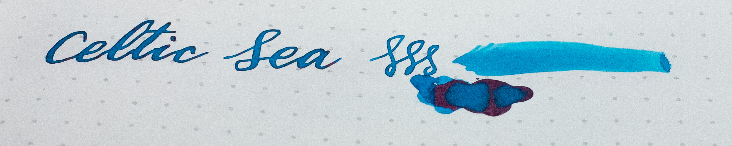
<p>The base colour, however, is gorgeous.  It’s not a million miles from <em>Pure Pens</em> <em>Celtic Sea</em> (although maybe a little <em>tealier</em>?), and appears close to <em>Sailor Jentle Yama-dori</em>, although I must admit I only ever had about 0.25ml of that ink so I’m no expert.  As Red-Sheening-Blues have never really been my thing, I don’t have a lot to compare it to.</p>

<p>As it’s evidently outside the sRGB gamut, the photos don’t really represent it well – and to be fair, the photographer did absolutely nothing to try to capture it accurately.  It’s got that real parrotty vibe to it; like you made a smoothie out of a mermaid, a butterfly and a tonne of copper salts.  It’s like a slightly-bluer <em>Herbin Emeraude de Chivor</em> with the glitter filtered out.</p>

<p>If I was still down the rabbit hole, I’d be ordering <a href="https://www.purepens.co.uk/products/diamine-x-niche-pens-alexandrite-fountain-pen-ink-80ml">the 80ml bottle of this stuff</a> and using it a lot, I reckon.</p>

<h2 id="diamine-monboddos-hat"><a href="https://www.purepens.co.uk/products/diamine-mondobbos-hat-fountain-pen-ink-80ml">Diamine <em>Monboddo’s Hat</em></a></h2>

<figure class="image-wrapper ">


        <img data-srcset="https://images.weserv.nl/?url=gidden.net/images/gidink/diamine_exclusives_2019aug/moboddos-hat.jpg&amp;w=1000&amp;il, https://images.weserv.nl/?url=gidden.net/images/gidink/diamine_exclusives_2019aug/moboddos-hat.jpg&amp;w=1000&amp;il&amp;dpr=1.5 1.5x, https://images.weserv.nl/?url=gidden.net/images/gidink/diamine_exclusives_2019aug/moboddos-hat.jpg&amp;w=1000&amp;il&amp;dpr=2 2x" class="lazyload" loading="lazy" onerror="this.onerror=null;this.srcset='';this.src='/images/gidink/diamine_exclusives_2019aug/moboddos-hat.jpg'" alt="Diamine Monboddo's Hat" data-src="https://images.weserv.nl/?url=gidden.net/images/gidink/diamine_exclusives_2019aug/moboddos-hat.jpg&amp;w=1000&amp;il" />
    
        <figcaption class="image-caption">
            <p>Diamine <em>Monboddo’s Hat</em></p>

        </figcaption>
    
    
</figure>

<p>With an included card with art from <a href="https://nickstewart.ink/">Nick Stewart</a> and words by FPUK’s Bernando Gomes, this one’s clearly named after United Inkdom ringleader and curator of purples, <a href="http://toomanypurples.blogspot.com/">Scribble Monboddo</a>.</p>

<p>Now for another confession… while purple is one of my favourite colours, I’ve never really liked purple ink.  It’s just hasn’t hit the spot for me.  Don’t tell Scribs.</p>

<p><em>Monboddo’s Hat</em> seems close to <em>Diamine Imperial Purple</em> and <em>Waterman Tender Purple</em>, but a bit plummier, maybe.  It sheens gold/yellow fairly well.</p>

<h2 id="diamine-scribble-purple"><a href="https://www.purepens.co.uk/products/diamine-scibble-purple-fountain-pen-ink-80ml">Diamine <em>Scribble Purple</em></a></h2>

<figure class="image-wrapper ">


        <img data-srcset="https://images.weserv.nl/?url=gidden.net/images/gidink/diamine_exclusives_2019aug/scribble.jpg&amp;w=1000&amp;il, https://images.weserv.nl/?url=gidden.net/images/gidink/diamine_exclusives_2019aug/scribble.jpg&amp;w=1000&amp;il&amp;dpr=1.5 1.5x, https://images.weserv.nl/?url=gidden.net/images/gidink/diamine_exclusives_2019aug/scribble.jpg&amp;w=1000&amp;il&amp;dpr=2 2x" class="lazyload" loading="lazy" onerror="this.onerror=null;this.srcset='';this.src='/images/gidink/diamine_exclusives_2019aug/scribble.jpg'" alt="Diamine Scribble Purple" data-src="https://images.weserv.nl/?url=gidden.net/images/gidink/diamine_exclusives_2019aug/scribble.jpg&amp;w=1000&amp;il" />
    
        <figcaption class="image-caption">
            <p>Diamine <em>Scribble Purple</em></p>

        </figcaption>
    
    
</figure>

<p>I left the FPUK group before the final resolution of which of the ten samples would win so I don’t know what the thing about two inks was, or even <em>which</em> of the samples won.  (<em>UPDATE</em>: turns out I voted for 765 <em>Scribble Purple</em>, and secondly 768X <em>Monboddo’s Hat</em>, so my choices won.)  Regardless, they are a bit different.  <em>Scribble Purple</em> is a tad darker, bluer than <em>Monboddo’s Hat</em>, but is still in that “Imperial” range, rather than being a lilac or an indigo.  It’s closer to <em>Pure Pens Flower of Scotland</em> than <em>Diamine Imperial Purple</em>.  It seems to sheen more than <em>Monboddo’s Hat</em> too.</p>

<h2 id="a-dry-ink">A dry ink</h2>

<p>One thing to note is the dryness of <em>Monboddo’s Hat</em>.  The whole “wet vs. dry” ink thing is a bit of a tough one, and I’ve never really got a grip on it.  It’s really about the ink’s viscosity, surface tension and propensity to flow.  Counterintuitively, an ink tends to be made drier by adding water – as a very polar liquid<sup id="fnref:3"><a href="#fn:3" class="footnote" rel="footnote" role="doc-noteref">3</a></sup> water has a high surface tension, which makes it less likely to “wet” other things… that’s why water beads up on a windscreen, and why you add a <em>detergent</em> to make it actually wash dishes and windows.  So, a wetter ink is made by adding a <em>surfactant</em> – a tiny, tiny amount.  As ink usually contains a surfactant, adding water makes it less effective and effectively <em>drier</em>.</p>

<p>Anyway, that’s the <s>science</s> hand-waving.  Inks made by the traditional manufacturers like Waterman, Montblanc, Parker, Pelikan and so forth tend to be drier, and their pens optimised for that.  Third-party inks and other pens often tend to be wetter.  Diamine inks do tend to be moderately wet, but still well-behaved.</p>

<p>I’m certainly no expert on this, but I think a drier ink with an optimised pen will give fewer headaches, and that’s why one might tend to pair a premium pen with an ink made by the same company.  If, however, you want to play with different inks and pens, and the pens might not be made to as exacting tolerances and adjustments, wetter ink makes for easier flow, but consequently, more mess.</p>

<p>The bottle of <em>Montblanc Oyster Grey</em> I recently bought is a dry ink, and as a result it does not flow well in some of my pens, and especially ones with ebonite components.  I suspect this is because ebonite wets well (compared to plastic feeds, even with etched mechanical and chemical surface energy modification<sup id="fnref:4"><a href="#fn:4" class="footnote" rel="footnote" role="doc-noteref">4</a></sup>) and the ink won’t let go.  While a wetter ink will certainly soak onto the ebonite, it also pours off it easily.</p>

<p>What this comes down to:</p>
<ul>
  <li>A wet ink will flow more than a drier ink.</li>
  <li>A “wet pen” (a pen that’ll tend to run wet) allows more ink through than a “dry pen”</li>
  <li>A wet ink in a wet pen will lay down more ink, leaving a darker line, but as a result is more likely to make a mess.</li>
  <li>A dry ink in a dry pen won’t write well. It’ll railroad, starve, and so on.</li>
  <li>A wet ink in a dry pen, or a dry ink in a wet pen will lay down less ink but might be a happy medium.</li>
  <li>A flex nib, needing a variable and immediate ink flow, can perform better with wetter ink; however, a drier ink, having stronger surface tension, may maintain flow between separated tines during a strong flex.</li>
</ul>

<p>That last point is what always confuses me about wet vs. dry.  It seems to be a balancing act.  There’s some confusion around, with some people recommending adding water to make an ink wetter.  There are also other factors involved.  And, the actual difference between wet and dry ink is very slight; as a fountain pen is basically a “controlled leak”, a very small percentage of surfactant added can make an ink so wet it’s unusable and it’ll just pour out of the pen.</p>

<p>Most non-enthusiast users will not properly comprehend the difference between a wet or dry ink or pen, but they probably <em>will</em> get annoyed by a pen that leaks<sup id="fnref:5"><a href="#fn:5" class="footnote" rel="footnote" role="doc-noteref">5</a></sup> and a pen that won’t run a continuous line, and just not know <em>why</em>.</p>

<p>There’s also the matter of the paper. An absorbent paper will pull ink from the pen and into the paper by capillary action – which is why some ink will bloom on some paper.  A more glossy or surfaced paper (especially Tomoe River) on the other hand, will keep the ink on the surface.  As a result, a drier ink will perform better on cheaper, grottier paper.  So, a well-balanced dry pen and ink combination will perform better on a wider range of paper stock.</p>

<p>Ink sheen (which all three of these inks are quite rich in) will tend to show up stronger on less-absorbent paper.  Sheen is the phenomenon of excess ink crystallising on the surface of the paper rather than soaking in.  It’s dependent on:</p>
<ul>
  <li>The quality of the paper; especially the property of limiting the absorption (adsorption?) of ink</li>
  <li>The wetness of the ink and pen; so more ink is laid down on the paper</li>
  <li>The saturation of dye in the ink; as only a concentrated dye will crystallise well.  Sheen monsters like <em>Organics Studio Nitrogen</em> and <em>Walden</em> do so by having an abnormally high quantity of dye.</li>
</ul>

<p>Again, there’s a subtlety there too… a drier ink’s higher surface tension and viscosity will tend to pool on the surface more than a wetter ink that’ll soak in.  That aspect may be more significant for sheen than the added quantity of ink that the wetter combination will lay down.  I honestly have no idea which is more significant in this case.  Maybe a wetter pen (laying down more ink) with a drier ink (that’ll absorb less) on better paper will sheen the best.</p>

<p>So, back to the matter at hand.  <em>Monboddo’s Hat</em> is described in the included note as a drier ink:  <em>“The ink is recommended for fountain pens which naturally run wet.”</em>… ie. it’ll compensate for a “wetter pen”.</p>

<p><em>Scribble Purple</em> is more like a usual Diamine ink, and flows well in the relatively wet pens in which I tried it, but it does leave a dark line that verges on black.  <em>Alexandrite</em> is typical for Diamine too, but being a lighter colour won’t look quite as dark.</p>

<p>When it comes to sheen, <em>Scribble Purple</em> does sheen more than <em>Monboddo’s Hat</em>, and <em>Alexandrite</em> even more so.  None are on the scale of the problematic sheen monsters – so saturated their dyes will crystallise inside the bottle, and crumble off the edge to ruin your carpet at the slightest addition of moisture – so Diamine have done their usual exemplary job of giving a good amount of sheen without being excessive.</p>

<hr />
<h2 id="conclusion">Conclusion</h2>

<p>I’m glad the FPUK inks were made, but with my cessation of inky-fingers and ruined clothing/carpets, the results aren’t actually that interesting to me. They are, however, excellent value for what they are, and I’d happily recommend either for someone who wants some good purple ink at a reasonable price.  I think I prefer <em>Scribble Purple</em>, but to be honest, it’s not different enough from the other purples I already have, and don’t use.  Since I bought 80ml of each, I’m not going to be running out of it in a hurry.</p>

<p>And, one thing about the two inks.  To be honest, most people aren’t going to notice.  They’re not fountain pen nerds, though.  Even so, these two inks are similar – they obviously share the same dyes.  Chances are, the customers for these inks will break down into three groups:</p>

<ol>
  <li>Those members of FPUK that buy both diligently.  That’s probably the target.</li>
  <li>Those members of FPUK that adamantly buy only one, and bitch about how they never voted for the other.</li>
  <li>Normal people that just wanted some purple ink.</li>
</ol>

<p>(oh, and 4. Ex-members of FPUK like me that feel a bit bad that they didn’t stick around for the ink they pledged to buy back when the idea was mooted)</p>

<p>Forgetting that these are special edition inks for a closed user group, I don’t think there’s much justification for releasing a pair of inks this similar at the same time to the same market.  However, that’s not really the point, is it?</p>

<p>[In fact, the title of this blog post is probably inaccurate.  Yes, they’re exclusive to Diamine, in the same way that the Big Mac is exclusive to McDonald’s.  The FPUK inks are more “special editions”, or perhaps “commissioned by”; the <em>Alexandrite</em>, again… who knows what best to call it.]</p>

<p>The real winner for me was the <em>Alexandrite</em>.  I haven’t had a really good play with it, but it seems much like other Diamine exclusives to be a really good, saturated, dazzling ink, without the bad behaviour of things like <em>O.S. Walden</em> and <em>Nitrogen</em> – otherwise known as The Destroyer of Carpets.  Diamine knows how to sheen, but they’re smart enough keep it at 10 rather than 11, and deliver a reasonable, practical ink.</p>
<div class="footnotes" role="doc-endnotes">
  <ol>
    <li id="fn:1">
      <p>“Pure Pens” is a trading name of “Niche Pens”.  The difference being that one of them is dressed as an aquatic bird. I’ve been meaning to ask Ross what that’s all about. <a href="#fnref:1" class="reversefootnote" role="doc-backlink">&#8617;</a></p>
    </li>
    <li id="fn:2">
      <p>Yeah, that’s sarcasm, if you hadn’t noticed.  At least it’s not a Robert Oster RSB. <a href="#fnref:2" class="reversefootnote" role="doc-backlink">&#8617;</a></p>
    </li>
    <li id="fn:3">
      <p>I stopped studying physics and chemistry when I was a teenager back in the last century, when sulfur was still spelled “sulphur”, so take all this with a pinch of sodium chloride. <a href="#fnref:3" class="reversefootnote" role="doc-backlink">&#8617;</a></p>
    </li>
    <li id="fn:4">
      <p>There’s that A-level in Chemistry again. <a href="#fnref:4" class="reversefootnote" role="doc-backlink">&#8617;</a></p>
    </li>
    <li id="fn:5">
      <p>That is, a pen that leaks because it’s a wet-flowing pen with an unsuitably wet ink, as opposed to a pen that leaks because it’s broken or has loose parts. <a href="#fnref:5" class="reversefootnote" role="doc-backlink">&#8617;</a></p>
    </li>
  </ol>
</div>]]></content><author><name>Tom Gidden</name></author><category term="pens" /><category term="pens" /><category term="ink" /><summary type="html"><![CDATA[Okay, first, a confession. I’ve gone off fountain pens.]]></summary><media:thumbnail xmlns:media="http://search.yahoo.com/mrss/" url="https://gidden.net/images/gidink/diamine_exclusives_2019aug/hero.jpg" /><media:content medium="image" url="https://gidden.net/images/gidink/diamine_exclusives_2019aug/hero.jpg" xmlns:media="http://search.yahoo.com/mrss/" /></entry><entry><title type="html">MOO.com notebooks and card samples</title><link href="https://gidden.net/2019/01/31/moo-cards-and-notebooks/" rel="alternate" type="text/html" title="MOO.com notebooks and card samples" /><published>2019-01-31T00:00:00+00:00</published><updated>2019-01-31T00:00:00+00:00</updated><id>https://gidden.net/2019/01/31/moo-cards-and-notebooks</id><content type="html" xml:base="https://gidden.net/2019/01/31/moo-cards-and-notebooks/"><![CDATA[<p>Just a quick few tests, here.</p>

<p>I’ve bought <a href="https://www.moo.com/uk/business-cards">business cards</a> and <a href="https://www.moo.com/uk/stickers">stickers</a> from <em>MOO.com</em> before, including some of their <a href="https://www.moo.com/uk/luxe-products">600gsm <em>Luxe</em></a> cards.  They’re a great service with good quality products.  Once, they arranged a rush order of special mini-cards to be shipped to our hotel in San Francisco, and did marvellously.  Back then, I didn’t really use fountain pens, though…</p>

<p>I do remember that the standard business cards, being coated/laminated, were impossible to write on with ink: rollerball, gel, or anything really.  I never tried writing on their <em>Luxe</em> cards, but I expected them to feather wildly… not ideal for scribbling your private number on the back!</p>

<p>Now that <em>MOO.com</em> are selling quality notebooks, letterhead and other products, and the arrival of a decent coupon offer in my inbox, I thought it might be worth getting some of these products and testing them for fountain pen friendliness.</p>

<p><em>Note: the sole purpose of this review is concerning their fountain-pen-friendliness.</em>  If you’re not an FP user, I heartily recommend <em>MOO.com</em> products, as I’ve had nothing but good customer experience, service and product quality from them.</p>

<h2 id="notebooks">Notebooks</h2>

<p>I ordered a <a href="https://www.moo.com/uk/notebooks-journals">Hard &amp; Softcover duo</a>.  These use <em>Munken Design Kristall 100gsm</em> lined paper for the main pages, and <em>G. F. Smith’s Colorplan</em> paper for the plain coloured pages in the middle.</p>

<p>I used:</p>
<ul>
  <li><em>Noodlers Neponset with music nib</em> with <em>Pelikan 4001 Royal Blue</em> (dry ink, but a pretty wet pen);</li>
  <li>modified <em>Noodlers Ahab</em> with <em>SBREBROWN</em> ink (wet ink, wet pen);</li>
  <li><em>Pilot Vanishing Point F</em> with <em>Pure Pens Llanberis Slate</em> ink (medium-dry ink, dry pen);</li>
  <li>A <em>brush pen</em> with <em>Organics Studio Walden Pond</em> ink (very wet and saturated, high sheen)</li>
  <li><em>Pilot Custom 743 FA</em> with an <em>FNF 2-channel ebonite feed</em> and <em>Pilot Black Cartridge</em> ink (wet pen);</li>
  <li><em>Monteverde Tool Pen</em> with <em>Cult Pens Iridescink Robert</em> ink (dry pen, medium-wet ink, high sheen)</li>
</ul>

<p><em>[Note, the wet/dry thing is a subjective thing in my opinion, so don’t take it as gospel. If you disagree with my assessment, please do let me know]</em></p>

<figure class="image-wrapper ">


        <img data-srcset="https://images.weserv.nl/?url=gidden.net/images/gidink/moocom/notebook1.jpg&amp;w=1000&amp;il, https://images.weserv.nl/?url=gidden.net/images/gidink/moocom/notebook1.jpg&amp;w=1000&amp;il&amp;dpr=1.5 1.5x, https://images.weserv.nl/?url=gidden.net/images/gidink/moocom/notebook1.jpg&amp;w=1000&amp;il&amp;dpr=2 2x" class="lazyload" loading="lazy" onerror="this.onerror=null;this.srcset='';this.src='/images/gidink/moocom/notebook1.jpg'" alt="MOO.com Hardcover notebook paper" data-src="https://images.weserv.nl/?url=gidden.net/images/gidink/moocom/notebook1.jpg&amp;w=1000&amp;il" />
    
        <figcaption class="image-caption">
            <p>MOO.com Hardcover notebook paper</p>

        </figcaption>
    
    
</figure>

<p>On the main white lined paper – <em>Munken Design Kristall 100gsm</em> – the paper didn’t feather much, and there’s practically no bleed-through.  The exception to that was the <em>743 FA</em> with <em>Pilot Black ink</em>, which did feather and bleed a bit… while the brush pen and music nib lay down a lot of ink, the flex nib of the <em>743 FA</em> actually <em>pushes</em> it into the paper, and the third-party ebonite feed is a firehose to supply the ink.  Even so, the bleed is no worse than on <em>Rhodia</em> or <em>Black n’ Red Optik</em>.</p>

<figure class="image-wrapper ">


        <img data-srcset="https://images.weserv.nl/?url=gidden.net/images/gidink/moocom/notebook2.jpg&amp;w=1000&amp;il, https://images.weserv.nl/?url=gidden.net/images/gidink/moocom/notebook2.jpg&amp;w=1000&amp;il&amp;dpr=1.5 1.5x, https://images.weserv.nl/?url=gidden.net/images/gidink/moocom/notebook2.jpg&amp;w=1000&amp;il&amp;dpr=2 2x" class="lazyload" loading="lazy" onerror="this.onerror=null;this.srcset='';this.src='/images/gidink/moocom/notebook2.jpg'" alt="743 FA feathering" data-src="https://images.weserv.nl/?url=gidden.net/images/gidink/moocom/notebook2.jpg&amp;w=1000&amp;il" />
    
        <figcaption class="image-caption">
            <p>743 FA feathering</p>

        </figcaption>
    
    
</figure>

<figure class="image-wrapper ">


        <img data-srcset="https://images.weserv.nl/?url=gidden.net/images/gidink/moocom/notebook_showthrough.jpg&amp;w=1000&amp;il, https://images.weserv.nl/?url=gidden.net/images/gidink/moocom/notebook_showthrough.jpg&amp;w=1000&amp;il&amp;dpr=1.5 1.5x, https://images.weserv.nl/?url=gidden.net/images/gidink/moocom/notebook_showthrough.jpg&amp;w=1000&amp;il&amp;dpr=2 2x" class="lazyload" loading="lazy" onerror="this.onerror=null;this.srcset='';this.src='/images/gidink/moocom/notebook_showthrough.jpg'" alt="743 FA bleed" data-src="https://images.weserv.nl/?url=gidden.net/images/gidink/moocom/notebook_showthrough.jpg&amp;w=1000&amp;il" />
    
        <figcaption class="image-caption">
            <p>743 FA bleed</p>

        </figcaption>
    
    
</figure>

<p>Sheening is not that high, though, which is a little surprising:  non-feathering paper is usually a good sheener, as the two factors are both related to absorption of ink.  If a paper doesn’t feather, it’s usually less absorbent so excess ink will crystallise on the surface and sheen.</p>

<p>Saying that, it <em>does</em> sheen, but not as much as <em>Tomoe River</em> paper or even <em>Rhodia</em> paper – although it’s not far from <em>Rhodia</em>.</p>

<p>The coloured paper – <em>G. F. Smith Colorplan</em> – also didn’t feather or bleed, and sheened slightly better.  For a rougher paper surface, this was also a little surprising; I was expecting the coloured paper to suck in ink like a hoover.</p>

<p>The books are well-made and detailed, with a nice slipcase and business-card accessory.  I’m usually a fan of wirebound binding with microperf for better folding (not detachment), but the “Swiss binding” works well and it does lie flat, at least in the hardbound book.</p>

<p>In comparison to one of my usual everyday carries – <em>Lemome dotted cork notebook</em>, the paper is a bit better, but comparable.  The <em>Lemome</em> has a pen loop, wrapping elastic and microperf; while the <em>MOO</em> has the slip cover, the novelty coloured pages, and slightly better paper.</p>

<p>My other usual everyday carry – <em>Oxford Black n’ Red A5 wirebound hardcover, Optik paper</em> – the paper in the <em>MOO</em> notebook is a lot better.  I hate to say it, but while I’m a fan of <em>Black n’ Red</em> (except for the UK market’s “Scribzee” marks) the paper does tend to feather and bleed with particularly wet pens and ink.</p>

<p>The <em>MOO</em> books aren’t especially cheap, but they are good quality and appear well-made.</p>

<p>I would rate the performance of the paper as <em>good</em>, and definitely suitable for fountain pens, except for the very wettest nibs and inks.</p>

<h2 id="cards">Cards</h2>

<p>I ordered the business card sample pack, containing the standard cards, glossy, as well as the <a href="https://www.moo.com/uk/business-cards/luxe"><em>600gsm Luxe cards</em></a> and the particularly interesting <a href="https://www.moo.com/uk/business-cards/cotton"><em>298gsm cotton cards</em></a> made from 100% cotton T-shirt offcuts.</p>

<p>Now, I realise business cards aren’t intended for writing on with fountain pens, but they’re a substitute test for using similar stock for postcards, note paper, and so on.</p>

<p>I only bothered testing the uncoated <em>Luxe</em> and <em>Cotton</em> cards, as we already know the coated just won’t work at all with standard fountain pen ink.</p>

<p>I used most of the same pens and inks as the notebook:</p>
<ul>
  <li><em>Noodlers Neponset with music nib</em> with <em>Pelikan 4001 Royal Blue</em> ink;</li>
  <li>modified <em>Noodlers Ahab</em> with <em>SBREBROWN</em> ink;</li>
  <li><em>Pilot Vanishing Point F</em> with <em>Pure Pens Llanberis Slate</em> ink;</li>
  <li>A <em>brush pen</em> with <em>Organics Studio Walden Pond</em> ink;</li>
  <li><em>Pilot Custom 743 FA</em> with an <em>FNF 2-channel ebonite feed</em> and <em>Pilot Black Cartridge</em> ink;</li>
</ul>

<figure class="image-wrapper ">


        <img data-srcset="https://images.weserv.nl/?url=gidden.net/images/gidink/moocom/luxe_cotton.jpg&amp;w=1000&amp;il, https://images.weserv.nl/?url=gidden.net/images/gidink/moocom/luxe_cotton.jpg&amp;w=1000&amp;il&amp;dpr=1.5 1.5x, https://images.weserv.nl/?url=gidden.net/images/gidink/moocom/luxe_cotton.jpg&amp;w=1000&amp;il&amp;dpr=2 2x" class="lazyload" loading="lazy" onerror="this.onerror=null;this.srcset='';this.src='/images/gidink/moocom/luxe_cotton.jpg'" alt="_298gsm Cotton card_ (above) and _600gsm Luxe card_ (below)" data-src="https://images.weserv.nl/?url=gidden.net/images/gidink/moocom/luxe_cotton.jpg&amp;w=1000&amp;il" />
    
        <figcaption class="image-caption">
            <p><em>298gsm Cotton card</em> (above) and <em>600gsm Luxe card</em> (below)</p>

        </figcaption>
    
    
</figure>

<h3 id="luxe">Luxe</h3>

<p>The <em>600gsm Luxe cards</em> using <a href="https://www.moo.com/blog/interviews/moo-met-mohawk-story-behind-luxe-paper"><em>Mohawk Superfine</em></a> paper are really nice and substantial. However, they behaved <em>precisely</em> as I expected:  they feathered like blotting paper, or more like my skin when I have a blood-draw.  As soon as nib went to paper, it practically sucked ink out of the feed as quick as it could, and pooled visibly under the top surface of the paper.  Ironically, it didn’t dry quickly either, so smeared quicker than I expected.  The ink lightened almost instantly as the bulk of the ink was (presumably) sequestered into the inner layer of the stock.</p>

<p>The <em>743 FA</em> with <em>Pilot Black</em> went pretty light grey quickly, and feathered to the extreme.</p>

<p>In conclusion, <strong><em>Luxe card</em> is absolutely not appropriate for writing with a fountain pen and ink</strong> – might as well use a napkin or toilet paper – and barely usable with a dry pen and ink.</p>

<h3 id="cotton">Cotton</h3>

<p>The <em>298gsm Cotton cards</em>, were an unknown for me. I really had no idea how they’d perform.  They’re better than the <em>Luxe</em> cards, certainly.  The writing experience is a little strange, with the ink acting almost like on a mix of uncoated paper with a hint of plastic… a little hydrophobic beading of the ink, but enough absorption for it to work.</p>

<p>Line definition is acceptable, and feathering is manageable: there’s a little distortion of hairlines, but otherwise legible.  The slight hydrophobic beading does make the ink stay wet and smear more than normal paper.</p>

<p>The <em>743 FA</em> with <em>Pilot Black</em> stayed fairly black (although not as black as a good fountain-pen paper like <em>Tomoe River</em>) and didn’t feather much.</p>

<p>Even so, out of all the card stocks that came in the business card sample pack <strong>the <em>298gsm Cotton</em> performed the best with fountain pen ink.</strong></p>

<h2 id="postcards-and-greetings-cards">Postcards and Greetings cards</h2>

<p>I also ordered the other sample pack, containing a range of flyers, postcards and greetings cards, as well as stickers and so forth.</p>

<p>Suffice to say, <em>Luxe 600gsm</em> postcards behaved the same way as the <em>Luxe</em> business cards, unsurprisingly:  it sucked up the ink and feathered.</p>

<figure class="image-wrapper ">


        <img data-srcset="https://images.weserv.nl/?url=gidden.net/images/gidink/moocom/luxe_postcard.jpg&amp;w=1000&amp;il, https://images.weserv.nl/?url=gidden.net/images/gidink/moocom/luxe_postcard.jpg&amp;w=1000&amp;il&amp;dpr=1.5 1.5x, https://images.weserv.nl/?url=gidden.net/images/gidink/moocom/luxe_postcard.jpg&amp;w=1000&amp;il&amp;dpr=2 2x" class="lazyload" loading="lazy" onerror="this.onerror=null;this.srcset='';this.src='/images/gidink/moocom/luxe_postcard.jpg'" alt="_600gsm Luxe postcard_ -- nasty subsurface pooling" data-src="https://images.weserv.nl/?url=gidden.net/images/gidink/moocom/luxe_postcard.jpg&amp;w=1000&amp;il" />
    
        <figcaption class="image-caption">
            <p><em>600gsm Luxe postcard</em> – nasty subsurface pooling</p>

        </figcaption>
    
    
</figure>

<p><strong>The <em>330gsm Original postcard</em>, <em>200gsm matte flyer</em>, and <em>340gsm greeting card</em> wrote just fine, even with the wet inks and pens.</strong>  In fact, even the Pelikan 4001 royal blue sheened pretty well.  I’d say the greeting card performed better than many I’ve bought in shops.</p>

<figure class="image-wrapper ">


        <img data-srcset="https://images.weserv.nl/?url=gidden.net/images/gidink/moocom/flyer200gsm.jpg&amp;w=1000&amp;il, https://images.weserv.nl/?url=gidden.net/images/gidink/moocom/flyer200gsm.jpg&amp;w=1000&amp;il&amp;dpr=1.5 1.5x, https://images.weserv.nl/?url=gidden.net/images/gidink/moocom/flyer200gsm.jpg&amp;w=1000&amp;il&amp;dpr=2 2x" class="lazyload" loading="lazy" onerror="this.onerror=null;this.srcset='';this.src='/images/gidink/moocom/flyer200gsm.jpg'" alt="_200gsm flyer_ -- performs fine, but not intended as writing paper" data-src="https://images.weserv.nl/?url=gidden.net/images/gidink/moocom/flyer200gsm.jpg&amp;w=1000&amp;il" />
    
        <figcaption class="image-caption">
            <p><em>200gsm flyer</em> – performs fine, but not intended as writing paper</p>

        </figcaption>
    
    
</figure>

<figure class="image-wrapper ">


        <img data-srcset="https://images.weserv.nl/?url=gidden.net/images/gidink/moocom/postcard330gsm.jpg&amp;w=1000&amp;il, https://images.weserv.nl/?url=gidden.net/images/gidink/moocom/postcard330gsm.jpg&amp;w=1000&amp;il&amp;dpr=1.5 1.5x, https://images.weserv.nl/?url=gidden.net/images/gidink/moocom/postcard330gsm.jpg&amp;w=1000&amp;il&amp;dpr=2 2x" class="lazyload" loading="lazy" onerror="this.onerror=null;this.srcset='';this.src='/images/gidink/moocom/postcard330gsm.jpg'" alt="_330gsm postcard_" data-src="https://images.weserv.nl/?url=gidden.net/images/gidink/moocom/postcard330gsm.jpg&amp;w=1000&amp;il" />
    
        <figcaption class="image-caption">
            <p><em>330gsm postcard</em></p>

        </figcaption>
    
    
</figure>

<figure class="image-wrapper ">


        <img data-srcset="https://images.weserv.nl/?url=gidden.net/images/gidink/moocom/card340gsm.jpg&amp;w=1000&amp;il, https://images.weserv.nl/?url=gidden.net/images/gidink/moocom/card340gsm.jpg&amp;w=1000&amp;il&amp;dpr=1.5 1.5x, https://images.weserv.nl/?url=gidden.net/images/gidink/moocom/card340gsm.jpg&amp;w=1000&amp;il&amp;dpr=2 2x" class="lazyload" loading="lazy" onerror="this.onerror=null;this.srcset='';this.src='/images/gidink/moocom/card340gsm.jpg'" alt="_340gsm greeting card_ (not postcard as noted)" data-src="https://images.weserv.nl/?url=gidden.net/images/gidink/moocom/card340gsm.jpg&amp;w=1000&amp;il" />
    
        <figcaption class="image-caption">
            <p><em>340gsm greeting card</em> (not postcard as noted)</p>

        </figcaption>
    
    
</figure>

<p>So, I’d recommend the greeting cards and postcards, but again, not the <em>Luxe</em> versions.</p>

<h2 id="letterhead-paper">Letterhead paper</h2>

<p>After these initial tests, I contacted <em>MOO.com</em> and asked for samples of their <a href="https://www.moo.com/uk/letterhead"><em>Luxe 118gsm</em> (<em>Mohawk Superfine</em>) and <em>Original 120gsm</em> letterhead paper</a>, as these are actually the two items in their range (other than the notebooks) that will be regularly fountain-penned: the archetypal broad-nibbed fountain pen signature.</p>

<p>They graciously delivered samples the next day, and I tried them out with the pens used earlier, along with some extras:</p>

<ul>
  <li><em>Pilot Custom 743 FA</em> with an <em>FNF 2-channel ebonite feed</em> and <em>Pilot Black Cartridge</em> ink;</li>
  <li><em>Noodlers Neponset with music nib</em> with <em>Pelikan 4001 Royal Blue</em>;</li>
  <li>modified <em>Noodlers Ahab</em> with <em>SBREBROWN</em> ink;</li>
  <li><em>Pilot Vanishing Point F</em> with <em>Pure Pens Llanberis Slate</em> ink;</li>
  <li>A <em>brush pen</em> with <em>Organics Studio Walden Pond</em> ink;</li>
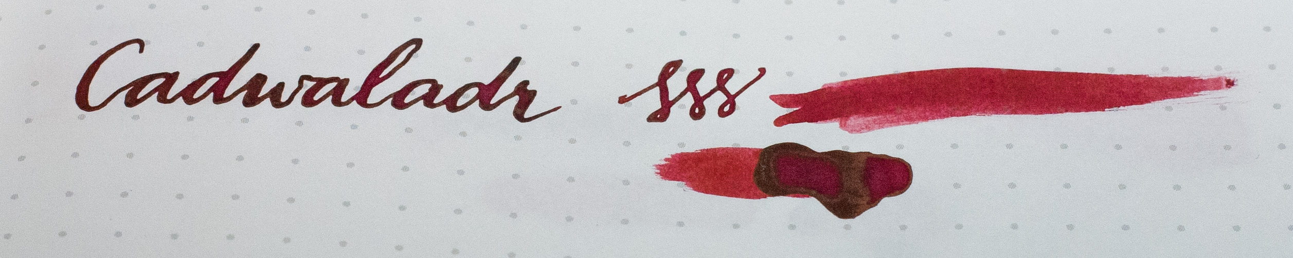
  <li><em>Platinum 3776 Century Soft-Fine</em> with <em>Pure Pens Cadwaladr</em> ink (medium-wet ink, medium-wet pen)</li>
  <li><em>Sheaffer 100 Medium</em> with <em>Sheaffer Slovenian Black Cartridge</em> ink (medium-dry/wet ink, medium-wet pen)</li>
  <li><em>TWSBI Vac 700 with modified Jinhao nib</em> with <em>Pure Pens Windermere</em> ink (medium-wet saturated ink, wet pen)</li>
  <li><em>FPR Himalaya, Ultra-Flex nib</em> with <em>Pure Pens Cwm Idwal</em> ink (medium-wet saturated ink, wet pen)</li>
</ul>

<h3 id="original-120gsm-letterhead">Original 120gsm Letterhead</h3>

<p>The paper feels nice; smooth and slightly glossy – a “modern” style paper.  I would expect this to perform better than standard copier paper.  It’s fairly opaque and the print quality is good.</p>

<figure class="image-wrapper ">


        <img data-srcset="https://images.weserv.nl/?url=gidden.net/images/gidink/moocom/letterhead_original.jpg&amp;w=1000&amp;il, https://images.weserv.nl/?url=gidden.net/images/gidink/moocom/letterhead_original.jpg&amp;w=1000&amp;il&amp;dpr=1.5 1.5x, https://images.weserv.nl/?url=gidden.net/images/gidink/moocom/letterhead_original.jpg&amp;w=1000&amp;il&amp;dpr=2 2x" class="lazyload" loading="lazy" onerror="this.onerror=null;this.srcset='';this.src='/images/gidink/moocom/letterhead_original.jpg'" alt="_Original 120gsm Letterhead_" data-src="https://images.weserv.nl/?url=gidden.net/images/gidink/moocom/letterhead_original.jpg&amp;w=1000&amp;il" />
    
        <figcaption class="image-caption">
            <p><em>Original 120gsm Letterhead</em></p>

        </figcaption>
    
    
</figure>

<p>Fountain pen performance isn’t <em>great</em>… there’s fine feathering on the <em>743 FA</em> and the medium nib, but it’s manageable.  As noted above, being flex, the <em>FA</em> nib tends to be pushed into the paper with a relatively sharp point on the tines, so it effectively injects ink into the paper’s “epidermis”, so it’s a tough test.</p>

<figure class="image-wrapper ">


        <img data-srcset="https://images.weserv.nl/?url=gidden.net/images/gidink/moocom/letterhead_original_closeup1.jpg&amp;w=1000&amp;il, https://images.weserv.nl/?url=gidden.net/images/gidink/moocom/letterhead_original_closeup1.jpg&amp;w=1000&amp;il&amp;dpr=1.5 1.5x, https://images.weserv.nl/?url=gidden.net/images/gidink/moocom/letterhead_original_closeup1.jpg&amp;w=1000&amp;il&amp;dpr=2 2x" class="lazyload" loading="lazy" onerror="this.onerror=null;this.srcset='';this.src='/images/gidink/moocom/letterhead_original_closeup1.jpg'" alt="_Original 120gsm Letterhead (close-up)_" data-src="https://images.weserv.nl/?url=gidden.net/images/gidink/moocom/letterhead_original_closeup1.jpg&amp;w=1000&amp;il" />
    
        <figcaption class="image-caption">
            <p><em>Original 120gsm Letterhead (close-up)</em></p>

        </figcaption>
    
    
</figure>

<p>I don’t have a big fat signing pen, but the <em>Noodler’s Neponset</em> music nib isn’t that far off, and loaded with <em>Pelikan 4001</em>, it’s not atypical.  This combination didn’t feather badly: with this kind of pen for a signature, pressure won’t be hard, and the paper can cope.  Sheening is okay, with some on the <em>Pelikan 4001</em> and the <em>Walden</em>, but not really on the <em>Pure Pens</em> inks, which do tend to sheen a bit on <em>Rhodia</em>, <em>Tomoe River</em> et al.</p>

<p>The best performer was the <em>Pilot Vanishing Point (Fine)</em> with <em>Llanberis Slate</em>, but it’s a fairly dry combination.  Tone with that ink is good on this paper… it’s an interesting ink because its shade is so dependent on the paper: on <em>Tomoe River</em> it’s a very dark grey, whereas on absorbent papers it goes to a light/mid-grey. It’s a good indicator.</p>

<p>Bleed-through on the <em>Original</em> letterhead was slightly visible for all but the <em>Vanishing Point</em>.  The sample I received was printed all-over on the back, so I wouldn’t use the other side anyway, but if left blank it might be more noticeable.</p>

<h3 id="luxe-118gsm-letterhead">Luxe 118gsm Letterhead</h3>

<p>While it’s technically lighter than the <em>Original</em>, being uncoated and rough it feels more substantial.  Unfortunately (and unsurprisingly) it performs about as well as the <em>Luxe</em> cards… very badly.</p>

<figure class="image-wrapper ">


        <img data-srcset="https://images.weserv.nl/?url=gidden.net/images/gidink/moocom/letterhead_luxe.jpg&amp;w=1000&amp;il, https://images.weserv.nl/?url=gidden.net/images/gidink/moocom/letterhead_luxe.jpg&amp;w=1000&amp;il&amp;dpr=1.5 1.5x, https://images.weserv.nl/?url=gidden.net/images/gidink/moocom/letterhead_luxe.jpg&amp;w=1000&amp;il&amp;dpr=2 2x" class="lazyload" loading="lazy" onerror="this.onerror=null;this.srcset='';this.src='/images/gidink/moocom/letterhead_luxe.jpg'" alt="_Luxe 118gsm Letterhead_ (“Mowhawk” [sic])" data-src="https://images.weserv.nl/?url=gidden.net/images/gidink/moocom/letterhead_luxe.jpg&amp;w=1000&amp;il" />
    
        <figcaption class="image-caption">
            <p><em>Luxe 118gsm Letterhead</em> (“Mowhawk” [sic])</p>

        </figcaption>
    
    
</figure>

<p>There was extreme feathering on <em>all</em> the pens except the <em>Pilot Vanishing Point (Fine)</em>.  The ink in the Veep – still <em>Llanberis Slate</em> – went light grey quickly, indicating a lot of absorption, but the line was still crisp enough. Under magnification, it’s clear that it’s just on the edge of feathering.</p>

<figure class="image-wrapper ">


        <img data-srcset="https://images.weserv.nl/?url=gidden.net/images/gidink/moocom/letterhead_luxe_closeup2.jpg&amp;w=1000&amp;il, https://images.weserv.nl/?url=gidden.net/images/gidink/moocom/letterhead_luxe_closeup2.jpg&amp;w=1000&amp;il&amp;dpr=1.5 1.5x, https://images.weserv.nl/?url=gidden.net/images/gidink/moocom/letterhead_luxe_closeup2.jpg&amp;w=1000&amp;il&amp;dpr=2 2x" class="lazyload" loading="lazy" onerror="this.onerror=null;this.srcset='';this.src='/images/gidink/moocom/letterhead_luxe_closeup2.jpg'" alt="_Luxe 118gsm Letterhead (close-up, Pilot Custom 743 FA)_" data-src="https://images.weserv.nl/?url=gidden.net/images/gidink/moocom/letterhead_luxe_closeup2.jpg&amp;w=1000&amp;il" />
    
        <figcaption class="image-caption">
            <p><em>Luxe 118gsm Letterhead (close-up, Pilot Custom 743 FA)</em></p>

        </figcaption>
    
    
</figure>

<p>The <em>Platinum 3776 Soft-Fine</em> with <em>Pure Pens Cadwaladr</em> ink is usually fairly well-behaved, but under flex it will feather on many papers.  On the <em>Luxe</em>, it even feathered on all but the driest, finest lines to some degree.</p>

<figure class="image-wrapper ">


        <img data-srcset="https://images.weserv.nl/?url=gidden.net/images/gidink/moocom/letterhead_luxe_closeup1.jpg&amp;w=1000&amp;il, https://images.weserv.nl/?url=gidden.net/images/gidink/moocom/letterhead_luxe_closeup1.jpg&amp;w=1000&amp;il&amp;dpr=1.5 1.5x, https://images.weserv.nl/?url=gidden.net/images/gidink/moocom/letterhead_luxe_closeup1.jpg&amp;w=1000&amp;il&amp;dpr=2 2x" class="lazyload" loading="lazy" onerror="this.onerror=null;this.srcset='';this.src='/images/gidink/moocom/letterhead_luxe_closeup1.jpg'" alt="_Luxe 118gsm Letterhead (close-up, Platinum 3776 SF)_" data-src="https://images.weserv.nl/?url=gidden.net/images/gidink/moocom/letterhead_luxe_closeup1.jpg&amp;w=1000&amp;il" />
    
        <figcaption class="image-caption">
            <p><em>Luxe 118gsm Letterhead (close-up, Platinum 3776 SF)</em></p>

        </figcaption>
    
    
</figure>

<p>Bleed-through with the <em>Luxe</em> was worse than with the <em>Original</em>.  Once more, the <em>Vanishing Point F</em> didn’t bleed, although this time there was even a slight amount of ghosting visible with that!  The other pens ghosted far more noticeably, and with the feathering bleeding, not just the strokes.</p>

<p>As with the cards, in conclusion, <strong><em>Luxe letterhead</em> is absolutely not appropriate for writing with a fountain pen and ink</strong>.  This is a real shame, because it’s nice-feeling paper.  I wouldn’t want to sign a business letter on it with a broad pen, though… it’ll look horrible.  I bet any fountain pen users at companies that buy <em>Luxe letterhead</em> will quickly keep a spare ballpoint or an ultra-dry pen with an ultra-dry ink… maybe <em>Noodler’s X-Feather</em> or similar.</p>

<p>As an afterthought, I tried the <em>Luxe</em> with a <em>Pilot V-Pen</em>, just to see… it performed well with no feathering or bleeding!  However, signing a big contract with a disposible fountain pen barely better than using a Biro.</p>

<h2 id="conclusion">Conclusion</h2>

<p>On the whole I really like <em>MOO.com</em>’s products, and their notebooks do seem to perform quite well with fountain pen ink.  The business cards, not so much – especially <em>Luxe</em>; and I’d say the two letterheads I tried are certainly <em>not</em> fountain-pen-friendly; especially the <em>Luxe</em>.</p>

<p>It’d be nice if <em>MOO.com</em> looked into sourcing some ink-friendly paper, at least for letterheads.  Considering for some people the only time they use a pen nowadays is for signing letters, contracts and things – well, maybe not the <em>only</em> time, but not far off! – I’d say that making their paper work with modern fountain pens should be a priority.</p>

<p>Charitably, I should note that my selection of pens and inks does veer towards the wet side of things; even my vintages are wet flexers.  I’m not a big fan of dry inks and dry pens with no line variation, so my pens tend to put out a lot of ink as a rule.  I like my <em>Vanishing Point</em> for practicality, but for me it’s not a big step beyond using a rollerball in terms of either experience or results.  I reckon my old boss who took great pleasure in signing letters in purple ink with a big fat broad Montblanc would absolutely <em>hate</em> this paper.</p>]]></content><author><name>Tom Gidden</name></author><category term="pens" /><category term="pens" /><category term="ink" /><category term="paper" /><summary type="html"><![CDATA[Just a quick few tests, here.]]></summary><media:thumbnail xmlns:media="http://search.yahoo.com/mrss/" url="https://gidden.net/images/gidink/moocom/hero.jpg" /><media:content medium="image" url="https://gidden.net/images/gidink/moocom/hero.jpg" xmlns:media="http://search.yahoo.com/mrss/" /></entry><entry><title type="html">Kresto® Kolor ULTRA</title><link href="https://gidden.net/2019/01/28/kresto-kolor-ultra/" rel="alternate" type="text/html" title="Kresto® Kolor ULTRA" /><published>2019-01-28T00:00:00+00:00</published><updated>2019-01-28T00:00:00+00:00</updated><id>https://gidden.net/2019/01/28/kresto-kolor-ultra</id><content type="html" xml:base="https://gidden.net/2019/01/28/kresto-kolor-ultra/"><![CDATA[<p>In my earlier <a href="/2019/01/26/paraphernalia">Paraphernalia</a> post I mentioned <em>“Reduran Spezial hand cleanser”</em>, which I hadn’t tried.  I <a href="https://www.ebay.co.uk/itm/132089187327" target="_blank">found it at a reasonable price on eBay UK</a> and ordered it on Saturday.  It arrived on Monday morning, well-packaged.  Good job, <code class="language-plaintext highlighter-rouge">rapidontheweb</code>, that’s ridiculously quick for eBay.</p>

<blockquote>
  <p>“Removes dye soiling caused by toner, azo dyes, aniline, printing and copying inks, and fruit and vegetable colourants; contains a reducing agent.”</p>
</blockquote>

<p>I must say, it wasn’t entirely easy to find.  Searching for “ReDuRan® SPECIAL”, or “Reduran Spezial”, etc. isn’t entirely helpful.  The tube that arrived is known as <a href="https://www.debgroup.com/uk/products/kresto-kolor-ultra" target="_blank">“Deb stoko Kresto® Kolor ULTRA” “Specialist” hand cleanser</a>, which appears to be its (current) name in the UK.</p>

<p>Anyway, I thought I’d give it a go.  Let’s dive in at the deep end with the notorious <a href="https://www.purepens.co.uk/acatalog/Noodler-s-Baystate-Blue-Ink.html" target="_blank">Noodler’s Baystate Blue</a>.</p>

<figure class="image-wrapper ">


        <img data-srcset="https://images.weserv.nl/?url=gidden.net/images/gidink/kresto/IMG_1404.jpg&amp;w=1000&amp;il, https://images.weserv.nl/?url=gidden.net/images/gidink/kresto/IMG_1404.jpg&amp;w=1000&amp;il&amp;dpr=1.5 1.5x, https://images.weserv.nl/?url=gidden.net/images/gidink/kresto/IMG_1404.jpg&amp;w=1000&amp;il&amp;dpr=2 2x" class="lazyload" loading="lazy" onerror="this.onerror=null;this.srcset='';this.src='/images/gidink/kresto/IMG_1404.jpg'" alt="Test 1: Noodler’s _Baystate Blue_.  This should end well." data-src="https://images.weserv.nl/?url=gidden.net/images/gidink/kresto/IMG_1404.jpg&amp;w=1000&amp;il" />
    
        <figcaption class="image-caption">
            <p>Test 1: Noodler’s <em>Baystate Blue</em>.  This should end well.</p>

        </figcaption>
    
    
</figure>

<p>Right… a dollop of the <em>Kresto</em> and some scrubbing.  It’s beige and gritty. No bad smell.</p>

<blockquote>
  <p>“Converts reducible dyes into their uncoloured form, enabling them to be readily washed off the skin.”</p>
</blockquote>

<p>Apparently the reducing agent counters many dyes, which are often acidic… thinking back to my chemistry, acids are oxidising agents. If I remember correctly, most common fountain pen inks use azo dyes and anilines.  Not sure about diamines, which I think are derivatives of anilines. I do know that many food colourings are acidic, as well as a lot of textile dyes.  I’m not sure about <em>Procion MX</em> and other fibre-reactive dyes that might be used in “Bulletproof” inks.</p>

<p>So, I’m guessing this stuff is slightly alkaline, buffered or something like that.  However, as far as I know Noodler’s inks are sometimes alkaline, so maybe <em>Baystate Blue</em> isn’t a fair test.</p>

<p>(<strong>UPDATE</strong>: yeah, slightly alkaline, pH = 9.  See <a href="#so-whats-in-it">the end of this post</a> for more information)</p>

<figure class="image-wrapper ">


        <img data-srcset="https://images.weserv.nl/?url=gidden.net/images/gidink/kresto/IMG_1405.jpg&amp;w=1000&amp;il, https://images.weserv.nl/?url=gidden.net/images/gidink/kresto/IMG_1405.jpg&amp;w=1000&amp;il&amp;dpr=1.5 1.5x, https://images.weserv.nl/?url=gidden.net/images/gidink/kresto/IMG_1405.jpg&amp;w=1000&amp;il&amp;dpr=2 2x" class="lazyload" loading="lazy" onerror="this.onerror=null;this.srcset='';this.src='/images/gidink/kresto/IMG_1405.jpg'" alt="Result 1: pretty good, but unconclusive..." data-src="https://images.weserv.nl/?url=gidden.net/images/gidink/kresto/IMG_1405.jpg&amp;w=1000&amp;il" />
    
        <figcaption class="image-caption">
            <p>Result 1: pretty good, but unconclusive…</p>

        </figcaption>
    
    
</figure>

<p>Not bad!  However, I’m fairly sure this was more about exfoliation than chemical reduction.  I must admit that as a manly man I don’t exfoliate religiously, so my hands aren’t baby-soft.</p>

<blockquote>
  <p>“Contains Astopon® natural scrubbing agent […] produced from refined walnut shell powder, a natural and renewable source.”</p>
</blockquote>

<p>Let’s try again.</p>

<figure class="image-wrapper ">


        <img data-srcset="https://images.weserv.nl/?url=gidden.net/images/gidink/kresto/IMG_1407.jpg&amp;w=1000&amp;il, https://images.weserv.nl/?url=gidden.net/images/gidink/kresto/IMG_1407.jpg&amp;w=1000&amp;il&amp;dpr=1.5 1.5x, https://images.weserv.nl/?url=gidden.net/images/gidink/kresto/IMG_1407.jpg&amp;w=1000&amp;il&amp;dpr=2 2x" class="lazyload" loading="lazy" onerror="this.onerror=null;this.srcset='';this.src='/images/gidink/kresto/IMG_1407.jpg'" alt="Test 2: More Noodler’s _Baystate Blue_, _Parker Quink_ (permanent) Black, Organics Studio _Walden_, and some Cult Pens _Robert_." data-src="https://images.weserv.nl/?url=gidden.net/images/gidink/kresto/IMG_1407.jpg&amp;w=1000&amp;il" />
    
        <figcaption class="image-caption">
            <p>Test 2: More Noodler’s <em>Baystate Blue</em>, <em>Parker Quink</em> (permanent) Black, Organics Studio <em>Walden</em>, and some Cult Pens <em>Robert</em>.</p>

        </figcaption>
    
    
</figure>

<p>In the process of taking this photo, time stopped for me and I almost had a heart attack.  I knocked the vial of <em>Baystate Blue</em> off the side of my desk and onto the carpet. It was like watching a live grenade fall next to you.  Fortunately, the cap (while loose) was tight enough to stop any spillage.  Crisis averted.</p>

<p>Okay… to the sink.</p>

<figure class="image-wrapper ">


        <img data-srcset="https://images.weserv.nl/?url=gidden.net/images/gidink/kresto/IMG_1408.jpg&amp;w=1000&amp;il, https://images.weserv.nl/?url=gidden.net/images/gidink/kresto/IMG_1408.jpg&amp;w=1000&amp;il&amp;dpr=1.5 1.5x, https://images.weserv.nl/?url=gidden.net/images/gidink/kresto/IMG_1408.jpg&amp;w=1000&amp;il&amp;dpr=2 2x" class="lazyload" loading="lazy" onerror="this.onerror=null;this.srcset='';this.src='/images/gidink/kresto/IMG_1408.jpg'" alt="Washing well with warm water.  The excess dye -- especially the sheening of _Walden_ -- goes away, but that's all" data-src="https://images.weserv.nl/?url=gidden.net/images/gidink/kresto/IMG_1408.jpg&amp;w=1000&amp;il" />
    
        <figcaption class="image-caption">
            <p>Washing well with warm water.  The excess dye – especially the sheening of <em>Walden</em> – goes away, but that’s all</p>

        </figcaption>
    
    
</figure>

<p>As expected, not much change.  Wash with liquid soap and warm water.</p>

<figure class="image-wrapper ">


        <img data-srcset="https://images.weserv.nl/?url=gidden.net/images/gidink/kresto/IMG_1409.jpg&amp;w=1000&amp;il, https://images.weserv.nl/?url=gidden.net/images/gidink/kresto/IMG_1409.jpg&amp;w=1000&amp;il&amp;dpr=1.5 1.5x, https://images.weserv.nl/?url=gidden.net/images/gidink/kresto/IMG_1409.jpg&amp;w=1000&amp;il&amp;dpr=2 2x" class="lazyload" loading="lazy" onerror="this.onerror=null;this.srcset='';this.src='/images/gidink/kresto/IMG_1409.jpg'" alt="The liquid soap... it does nothing!" data-src="https://images.weserv.nl/?url=gidden.net/images/gidink/kresto/IMG_1409.jpg&amp;w=1000&amp;il" />
    
        <figcaption class="image-caption">
            <p>The liquid soap… it does nothing!</p>

        </figcaption>
    
    
</figure>

<p>To be fair, the <em>Quink</em>’s on its way out, but from experience I know it’ll take some time (and moulting) before it really goes away.</p>

<p>Here we go with the <em>Kresto</em>.</p>

<figure class="image-wrapper ">


        <img data-srcset="https://images.weserv.nl/?url=gidden.net/images/gidink/kresto/IMG_1410.jpg&amp;w=1000&amp;il, https://images.weserv.nl/?url=gidden.net/images/gidink/kresto/IMG_1410.jpg&amp;w=1000&amp;il&amp;dpr=1.5 1.5x, https://images.weserv.nl/?url=gidden.net/images/gidink/kresto/IMG_1410.jpg&amp;w=1000&amp;il&amp;dpr=2 2x" class="lazyload" loading="lazy" onerror="this.onerror=null;this.srcset='';this.src='/images/gidink/kresto/IMG_1410.jpg'" alt="I have no idea how much to use." data-src="https://images.weserv.nl/?url=gidden.net/images/gidink/kresto/IMG_1410.jpg&amp;w=1000&amp;il" />
    
        <figcaption class="image-caption">
            <p>I have no idea how much to use.</p>

        </figcaption>
    
    
</figure>

<figure class="image-wrapper ">


        <img data-srcset="https://images.weserv.nl/?url=gidden.net/images/gidink/kresto/IMG_1413.jpg&amp;w=1000&amp;il, https://images.weserv.nl/?url=gidden.net/images/gidink/kresto/IMG_1413.jpg&amp;w=1000&amp;il&amp;dpr=1.5 1.5x, https://images.weserv.nl/?url=gidden.net/images/gidink/kresto/IMG_1413.jpg&amp;w=1000&amp;il&amp;dpr=2 2x" class="lazyload" loading="lazy" onerror="this.onerror=null;this.srcset='';this.src='/images/gidink/kresto/IMG_1413.jpg'" alt="Now what? Do I wait?" data-src="https://images.weserv.nl/?url=gidden.net/images/gidink/kresto/IMG_1413.jpg&amp;w=1000&amp;il" />
    
        <figcaption class="image-caption">
            <p>Now what? Do I wait?</p>

        </figcaption>
    
    
</figure>

<p>Normal hand-washing with the gritty <em>Kresto</em>:</p>

<figure class="image-wrapper ">


        <img data-srcset="https://images.weserv.nl/?url=gidden.net/images/gidink/kresto/IMG_1416.jpg&amp;w=1000&amp;il, https://images.weserv.nl/?url=gidden.net/images/gidink/kresto/IMG_1416.jpg&amp;w=1000&amp;il&amp;dpr=1.5 1.5x, https://images.weserv.nl/?url=gidden.net/images/gidink/kresto/IMG_1416.jpg&amp;w=1000&amp;il&amp;dpr=2 2x" class="lazyload" loading="lazy" onerror="this.onerror=null;this.srcset='';this.src='/images/gidink/kresto/IMG_1416.jpg'" alt="All pretty much gone, apart from the _Baystate Blue_... as expected" data-src="https://images.weserv.nl/?url=gidden.net/images/gidink/kresto/IMG_1416.jpg&amp;w=1000&amp;il" />
    
        <figcaption class="image-caption">
            <p>All pretty much gone, apart from the <em>Baystate Blue</em>… as expected</p>

        </figcaption>
    
    
</figure>

<p>Here I’ll pull out the power tools.  What’s basically an oversized electric toothbrush that I got from <em>Lidl</em> for scrubbing the bathroom tiles.</p>

<figure class="image-wrapper ">


        <img data-srcset="https://images.weserv.nl/?url=gidden.net/images/gidink/kresto/IMG_1419.jpg&amp;w=1000&amp;il, https://images.weserv.nl/?url=gidden.net/images/gidink/kresto/IMG_1419.jpg&amp;w=1000&amp;il&amp;dpr=1.5 1.5x, https://images.weserv.nl/?url=gidden.net/images/gidink/kresto/IMG_1419.jpg&amp;w=1000&amp;il&amp;dpr=2 2x" class="lazyload" loading="lazy" onerror="this.onerror=null;this.srcset='';this.src='/images/gidink/kresto/IMG_1419.jpg'" data-src="https://images.weserv.nl/?url=gidden.net/images/gidink/kresto/IMG_1419.jpg&amp;w=1000&amp;il" />
    
    
</figure>

<figure class="image-wrapper ">


        <img data-srcset="https://images.weserv.nl/?url=gidden.net/images/gidink/kresto/IMG_1418.jpg&amp;w=1000&amp;il, https://images.weserv.nl/?url=gidden.net/images/gidink/kresto/IMG_1418.jpg&amp;w=1000&amp;il&amp;dpr=1.5 1.5x, https://images.weserv.nl/?url=gidden.net/images/gidink/kresto/IMG_1418.jpg&amp;w=1000&amp;il&amp;dpr=2 2x" class="lazyload" loading="lazy" onerror="this.onerror=null;this.srcset='';this.src='/images/gidink/kresto/IMG_1418.jpg'" alt="Not much worse than a nailbrush, really." data-src="https://images.weserv.nl/?url=gidden.net/images/gidink/kresto/IMG_1418.jpg&amp;w=1000&amp;il" />
    
        <figcaption class="image-caption">
            <p>Not much worse than a nailbrush, really.</p>

        </figcaption>
    
    
</figure>

<figure class="image-wrapper ">


        <img data-srcset="https://images.weserv.nl/?url=gidden.net/images/gidink/kresto/IMG_1420.jpg&amp;w=1000&amp;il, https://images.weserv.nl/?url=gidden.net/images/gidink/kresto/IMG_1420.jpg&amp;w=1000&amp;il&amp;dpr=1.5 1.5x, https://images.weserv.nl/?url=gidden.net/images/gidink/kresto/IMG_1420.jpg&amp;w=1000&amp;il&amp;dpr=2 2x" class="lazyload" loading="lazy" onerror="this.onerror=null;this.srcset='';this.src='/images/gidink/kresto/IMG_1420.jpg'" alt="Final result: Not bad." data-src="https://images.weserv.nl/?url=gidden.net/images/gidink/kresto/IMG_1420.jpg&amp;w=1000&amp;il" />
    
        <figcaption class="image-caption">
            <p>Final result: Not bad.</p>

        </figcaption>
    
    
</figure>

<p>So yeah, it looks like this cleaner works well on the inks I tried.  However it is not as <em>chemically</em> effective on <em>Baystate Blue</em>, but is useful <em>mechanically</em> as long as you maintain a good shield of dead skin as a defence.</p>

<h1 id="final-boss-level-gentian-violet">Final boss level: Gentian Violet</h1>

<figure class="image-wrapper ">


        <img data-srcset="https://images.weserv.nl/?url=gidden.net/images/gidink/kresto/IMG_1422.jpg&amp;w=1000&amp;il, https://images.weserv.nl/?url=gidden.net/images/gidink/kresto/IMG_1422.jpg&amp;w=1000&amp;il&amp;dpr=1.5 1.5x, https://images.weserv.nl/?url=gidden.net/images/gidink/kresto/IMG_1422.jpg&amp;w=1000&amp;il&amp;dpr=2 2x" class="lazyload" loading="lazy" onerror="this.onerror=null;this.srcset='';this.src='/images/gidink/kresto/IMG_1422.jpg'" alt="Gentian Violet: this tiny crystal is enough to wreck every carpet in your house." data-src="https://images.weserv.nl/?url=gidden.net/images/gidink/kresto/IMG_1422.jpg&amp;w=1000&amp;il" />
    
        <figcaption class="image-caption">
            <p>Gentian Violet: this tiny crystal is enough to wreck every carpet in your house.</p>

        </figcaption>
    
    
</figure>

<p><em>Gentian Violet</em> is a moss-green crystalline dye that makes for a vivid violet purple ink.  There are many green-sheening violet inks out there that I believe are probably based in part on <em>Gentian Violet</em>.  In fact, I think <em>Cult Pens’ Robert</em> (as tested above) uses <em>Gentian Violet</em>, and I suspect some of the <em>Krishna</em> inks I have use it.  It’s a component in a lot of blue and black inks for printing, ballpoint devil sticks, and inkjet ink.  It’s also great for <a href="https://duckduckgo.com/?q=crystal+violet+baby&amp;ia=images&amp;iax=images" target="_blank">dyeing babies purple</a>; seriously… click it. Hilarious.</p>

<p>Now I know that this goes colourless in alkaline conditions, but I’ve never tried it as I’m not the world’s biggest fan of chemical burns.  However, after using it on one of my toes to see if the antifungal thing worked, I’ve had a purple cuticle for about six months.  I’ve also made a hell of a mess with this stuff, making me regret buying a half-kilogram of it on <em>eBay</em> late one night.  That could pretty much dye the county purple.</p>

<figure class="image-wrapper ">


        <img data-srcset="https://images.weserv.nl/?url=gidden.net/images/gidink/kresto/IMG_1424.jpg&amp;w=1000&amp;il, https://images.weserv.nl/?url=gidden.net/images/gidink/kresto/IMG_1424.jpg&amp;w=1000&amp;il&amp;dpr=1.5 1.5x, https://images.weserv.nl/?url=gidden.net/images/gidink/kresto/IMG_1424.jpg&amp;w=1000&amp;il&amp;dpr=2 2x" class="lazyload" loading="lazy" onerror="this.onerror=null;this.srcset='';this.src='/images/gidink/kresto/IMG_1424.jpg'" alt="Test 3: here we go." data-src="https://images.weserv.nl/?url=gidden.net/images/gidink/kresto/IMG_1424.jpg&amp;w=1000&amp;il" />
    
        <figcaption class="image-caption">
            <p>Test 3: here we go.</p>

        </figcaption>
    
    
</figure>

<p>From experience I can tell you that soap and water won’t help here.  Let’s try <em>Kresto</em>.</p>

<figure class="image-wrapper ">


        <img data-srcset="https://images.weserv.nl/?url=gidden.net/images/gidink/kresto/IMG_1425.jpg&amp;w=1000&amp;il, https://images.weserv.nl/?url=gidden.net/images/gidink/kresto/IMG_1425.jpg&amp;w=1000&amp;il&amp;dpr=1.5 1.5x, https://images.weserv.nl/?url=gidden.net/images/gidink/kresto/IMG_1425.jpg&amp;w=1000&amp;il&amp;dpr=2 2x" class="lazyload" loading="lazy" onerror="this.onerror=null;this.srcset='';this.src='/images/gidink/kresto/IMG_1425.jpg'" alt="Okay, now I'm impressed." data-src="https://images.weserv.nl/?url=gidden.net/images/gidink/kresto/IMG_1425.jpg&amp;w=1000&amp;il" />
    
        <figcaption class="image-caption">
            <p>Okay, now I’m impressed.</p>

        </figcaption>
    
    
</figure>

<h1 id="conclusion">Conclusion</h1>

<p>After all this, my hand’s a little raw, but not too bad.  I have relatively sensitive skin, but it hasn’t broken out too bad yet.  Being a reducing agent, I think it’s definitely best to make sure it’s washed off well after use, perhaps with a more-traditional skin-safe soap. And I’d recommend getting some <a href="https://www.palmers.com/18-cocoa-butter-formula">Palmer’s Cocoa Butter Formula</a> or <a href="http://www.okeeffescompany.com/working-hands">O’Keeffe’s Working Hands Hand Cream</a> for application afterwards, and my hands are now feeling fine (and smell nicely chocolatey)</p>

<p>This <em>Kresto</em> stuff is worth buying.  I urge <a href="https://www.purepens.co.uk/">Pure Pens</a>, <a href="https://gouletpens.com">Goulet Pens</a> and all other retailers to start stocking it.  However, it’s not a panacea, and Noodler’s is still a problem.</p>

<p>Now I’m going to go sprinkle some vinegar on my hand and see what happens.</p>

<p><strong>UPDATE:</strong> Yeah, a spray of limescale-removing bathroom cleaner – contains phosphoric acid – got rid of the remaining <em>Baystate Blue</em>, and probably what’s left of my epidermis.</p>

<h1 id="so-whats-in-it">So what’s in it?</h1>

<p>I checked the <a href="http://my-sds.co.uk/auto.aspx?accountid=guest&amp;languagecode=44&amp;marketcode=44&amp;companyid=Deb2&amp;sdsno=20725" target="_blank">Safety Data Sheet</a>, and it includes:</p>

<ul>
  <li><a href="https://en.wikipedia.org/wiki/Polyethylene_glycol" target="_blank">PEG-8</a> (probably for several reasons, eg. viscosity, humectant)</li>
  <li>LAURETH-10 (emulsifier, surfactant; ie. soap)</li>
  <li><a href="https://en.wikipedia.org/wiki/Sodium_dithionite" target="_blank">SODIUM HYDROSULFITE</a> (ie. reducing agent)</li>
  <li><a href="https://en.wikipedia.org/wiki/Juglans_regia" target="_blank">JUGLANS REGIA</a> SHELL POWDER (ASTOPON®)</li>
  <li>PEG-2 RAPESEEDAMINE (more <a href="https://en.wikipedia.org/wiki/Polyethylene_glycol" target="_blank">polyethylene glycol</a>, this time from rapeseed oil.)</li>
  <li>SILICA (as an abrasive, possibly)</li>
  <li><a href="https://en.wikipedia.org/wiki/Propylene_glycol" target="_blank">PROPYLENE GLYCOL</a> (not the same as the <em>polyethylene glycol</em> above. A humectant, solvent, preservative, although I don’t know its purpose here. It’s sweet, edible, and can be used to make fountain pen ink “wetter”.  Ironically, the <em>American Contact Dermatitis Society’s <a href="https://www.ncbi.nlm.nih.gov/pubmed/29059092">Allergen of the Year for 2018</a></em>)</li>
  <li><a href="https://en.wikipedia.org/wiki/Ethylenediaminetetraacetic_acid" target="_blank">TETRASODIUM EDTA</a> (stabliser, maybe?)</li>
  <li><a href="https://en.wikipedia.org/wiki/Hydroxyethyl_cellulose" target="_blank">HYDROXYETHYL ETHYLCELLULOSE</a> (gelling agent?)</li>
  <li><a href="https://en.wikipedia.org/wiki/Titanium_dioxide" target="_blank">TITANIUM DIOXIDE</a> (white pigment; used in paint, sunscreen, and toothpaste)</li>
  <li><a href="https://en.wikipedia.org/wiki/Sodium_phosphates" target="_blank">SODIUM PHOSPHATE</a> (thickener? emulsifier?)</li>
  <li>PARFUM (FRAGRANCE) (stink!)</li>
</ul>

<p>So, the reducing agent is <em>sodium hydrosulfite</em> a.k.a. <a href="https://en.wikipedia.org/wiki/Sodium_dithionite" target="_blank"><em>sodium dithionite</em></a>, or “Reductone”; a reducing agent.</p>

<blockquote>
  <p>“This compound is a water-soluble salt, and can be used as a reducing agent in aqueous solutions. It is used as such in some industrial dyeing processes, primarily those involving sulfur dyes and vat dyes, where an otherwise water-insoluble dye can be reduced into a water-soluble alkali metal salt (e.g. indigo dye).[7] The reduction properties of sodium dithionite also eliminate excess dye, residual oxide, and unintended pigments, thereby improving overall colour quality.”</p>
</blockquote>

<p>and with the Laureth-10, the PEG-8, the silica and titanium dioxide, it’s not far from being toothpaste, albeit rather more abrasive than usual.</p>

<p>…and it’s pH is 9 in diluted solution (100 g/l, @ 20 °C), so a bit alkaline as I suspected.</p>]]></content><author><name>Tom Gidden</name></author><category term="pens" /><category term="pens" /><category term="ink" /><category term="tools" /><summary type="html"><![CDATA[In my earlier Paraphernalia post I mentioned “Reduran Spezial hand cleanser”, which I hadn’t tried. I found it at a reasonable price on eBay UK and ordered it on Saturday. It arrived on Monday morning, well-packaged. Good job, rapidontheweb, that’s ridiculously quick for eBay.]]></summary><media:thumbnail xmlns:media="http://search.yahoo.com/mrss/" url="https://gidden.net/images/gidink/kresto/hero.jpg" /><media:content medium="image" url="https://gidden.net/images/gidink/kresto/hero.jpg" xmlns:media="http://search.yahoo.com/mrss/" /></entry><entry><title type="html">Paraphernalia</title><link href="https://gidden.net/2019/01/26/paraphernalia/" rel="alternate" type="text/html" title="Paraphernalia" /><published>2019-01-26T00:00:00+00:00</published><updated>2019-01-26T00:00:00+00:00</updated><id>https://gidden.net/2019/01/26/paraphernalia</id><content type="html" xml:base="https://gidden.net/2019/01/26/paraphernalia/"><![CDATA[<p>Here’s a summary of some tools and supplies I’ve found useful for cleaning and maintaining fountain pens.  It’s clearly not exhaustive, but I think it covers what most casual enthusiasts might want.</p>

<p>However, I don’t intend to cover <em>how</em> to use (and how/when <em>not</em> to use these items), and some of them can damage your pens.  This is really just to list what’s available, what kind of thing to search for, and roughly how much to expect to pay on <em>eBay</em> for it.</p>

<p>Still, a lot of useful accessories like syringes and vials are sold for inflated prices by perfectly-respectable fountain pen vendors; they’re not in the business of bulk selling repurposed medical supplies, so don’t blame them for overpricing.  Instead, look for cheap bulk deals on <em>eBay</em> and <em>Amazon</em> for the ancillary stuff that doesn’t matter, and buy the pens from good pen retailers for the value they add to the service.</p>

<p>However, if you just need a couple of vials or syringes and you’re already putting in an order with a good retailer and you need to jack up the order above the minimum for free shipping, they’re not a bad thing to add to the basket!</p>

<h2 id="ink-syringes-and-blunt-needles">Ink syringes and blunt needles</h2>
<figure class="image-wrapper ">


        <img data-srcset="https://images.weserv.nl/?url=gidden.net/images/gidink/paraphernalia/syringe.jpg&amp;w=1000&amp;il, https://images.weserv.nl/?url=gidden.net/images/gidink/paraphernalia/syringe.jpg&amp;w=1000&amp;il&amp;dpr=1.5 1.5x, https://images.weserv.nl/?url=gidden.net/images/gidink/paraphernalia/syringe.jpg&amp;w=1000&amp;il&amp;dpr=2 2x" class="lazyload" loading="lazy" onerror="this.onerror=null;this.srcset='';this.src='/images/gidink/paraphernalia/syringe.jpg'" alt="Ink syringes and blunt needles" data-src="https://images.weserv.nl/?url=gidden.net/images/gidink/paraphernalia/syringe.jpg&amp;w=1000&amp;il" />
    
    
</figure>

<ul>
  <li><a href="https://www.ebay.co.uk/sch/?_nkw=5ml+syringes&amp;LH_PrefLoc=1">Search <em>eBay</em> for <code class="language-plaintext highlighter-rouge">5ml syringes</code></a>; Guide price: £12 per 100</li>
  <li><a href="https://www.ebay.co.uk/sch/?_nkw=5ml+syringes+and+blunt+needles&amp;LH_PrefLoc=1">Search <em>eBay</em> for <code class="language-plaintext highlighter-rouge">5ml syringes and blunt needles</code></a>; Guide price: £16 per 100</li>
  <li><a href="https://www.vintagepensacsandparts.com/product.php/431/3/eye_dropper___ink_cartridge_filling_kit">3 syringes with needles @ The Pendragons (UK)</a></li>
  <li><a href="https://www.gouletpens.com/collections/pen-filling-supplies/products/goulet-5ml-ink-syringes">2 syringes with needles @ Goulet Pens (USA)</a></li>
</ul>

<p>Sometimes needles won’t fit particular syringes, so it may be better to choose the combined packs… if you look around, it can be cheaper anyway.  I use 20-gauge “pink” blunt needles, and 5ml syringes.  As you’re not using them medically, they don’t have to be sterile or individually packed, but they usually are anyway.</p>

<p>A really neat idea for pen filling is to skip the syringe and just put <a href="https://www.purepens.co.uk/acatalog/Pure-Pens-Converter-Blunt-Needle.html">a “pink” needle</a> on an International Standard converter!  It won’t have the benefit of priming the pen’s feed with ink, so you won’t get as much of a fill, but it does mean you won’t have to wipe the nib and grip.</p>

<h2 id="disposable-pipettes">Disposable pipettes</h2>
<figure class="image-wrapper ">


        <img data-srcset="https://images.weserv.nl/?url=gidden.net/images/gidink/paraphernalia/pipette.jpg&amp;w=1000&amp;il, https://images.weserv.nl/?url=gidden.net/images/gidink/paraphernalia/pipette.jpg&amp;w=1000&amp;il&amp;dpr=1.5 1.5x, https://images.weserv.nl/?url=gidden.net/images/gidink/paraphernalia/pipette.jpg&amp;w=1000&amp;il&amp;dpr=2 2x" class="lazyload" loading="lazy" onerror="this.onerror=null;this.srcset='';this.src='/images/gidink/paraphernalia/pipette.jpg'" alt="Disposable pipettes" data-src="https://images.weserv.nl/?url=gidden.net/images/gidink/paraphernalia/pipette.jpg&amp;w=1000&amp;il" />
    
        <figcaption class="image-caption">
            <p>Don’t worry: the ones you get from eBay aren’t usually as blurry.</p>

        </figcaption>
    
    
</figure>

<ul>
  <li><a href="https://www.ebay.co.uk/sch/?_nkw=3ml+Disposable+Pipettes&amp;LH_PrefLoc=1">Search <em>eBay</em> for <code class="language-plaintext highlighter-rouge">3ml Disposable Pipettes</code></a>; Guide price: £3 per 100</li>
  <li><a href="https://www.gouletpens.com/collections/pen-filling-supplies/products/goulet-disposable-transfer-pipettes">10 transfer pipettes @ Goulet Pens (USA)</a></li>
</ul>

<p>A bit wasteful, but with far less risk of cross-contaminating inks than by using reusable syringes and needles.</p>

<h2 id="ink-sample--mixing-tubes">Ink sample / mixing tubes</h2>
<figure class="image-wrapper ">


        <img data-srcset="https://images.weserv.nl/?url=gidden.net/images/gidink/paraphernalia/vials.jpg&amp;w=1000&amp;il, https://images.weserv.nl/?url=gidden.net/images/gidink/paraphernalia/vials.jpg&amp;w=1000&amp;il&amp;dpr=1.5 1.5x, https://images.weserv.nl/?url=gidden.net/images/gidink/paraphernalia/vials.jpg&amp;w=1000&amp;il&amp;dpr=2 2x" class="lazyload" loading="lazy" onerror="this.onerror=null;this.srcset='';this.src='/images/gidink/paraphernalia/vials.jpg'" alt="Ink sample / mixing tubes" data-src="https://images.weserv.nl/?url=gidden.net/images/gidink/paraphernalia/vials.jpg&amp;w=1000&amp;il" />
    
    
</figure>

<ul>
  <li><a href="https://www.ebay.co.uk/sch/?_nkw=5ml+Plastic+Test+Tubes+Vial+Screw+seal&amp;LH_PrefLoc=1">Search <em>eBay</em> for <code class="language-plaintext highlighter-rouge">5ml Plastic Test Tubes Vial Screw seal</code></a>; Guide price: £9 per 100</li>
  <li><a href="https://www.purepens.co.uk/acatalog/Ink-Sample-Vials-5ml-pack-of-10.html">10 ink sample vials @ Pure Pens (UK)</a></li>
  <li><a href="https://www.gouletpens.com/products/goulet-empty-ink-sample-vials">10 ink sample vials @ Goulet Pens (USA)</a></li>
</ul>

<p>The ubiquitous ink sample vial.  15mm diameter, flat bottom, but with a conical internal base, which makes it easier to get the last few drops out.  The cheap ones I see from China usually have blue caps.</p>

<h2 id="ink-sample-tube-rack">Ink sample tube rack</h2>
<figure class="image-wrapper ">


        <img data-srcset="https://images.weserv.nl/?url=gidden.net/images/gidink/paraphernalia/rack.jpg&amp;w=1000&amp;il, https://images.weserv.nl/?url=gidden.net/images/gidink/paraphernalia/rack.jpg&amp;w=1000&amp;il&amp;dpr=1.5 1.5x, https://images.weserv.nl/?url=gidden.net/images/gidink/paraphernalia/rack.jpg&amp;w=1000&amp;il&amp;dpr=2 2x" class="lazyload" loading="lazy" onerror="this.onerror=null;this.srcset='';this.src='/images/gidink/paraphernalia/rack.jpg'" alt="Ink sample tube rack" data-src="https://images.weserv.nl/?url=gidden.net/images/gidink/paraphernalia/rack.jpg&amp;w=1000&amp;il" />
    
        <figcaption class="image-caption">
            <p>The artistic crop has nothing to do with the fact that I couldn’t fit the rack into my tiny light-box</p>

        </figcaption>
    
    
</figure>

<ul>
  <li><a href="https://www.ebay.co.uk/sch/?_nkw=Plastic+Test+Tube+Stand++13-18mm+Test+Tubes&amp;LH_PrefLoc=1">Search <em>eBay</em> for <code class="language-plaintext highlighter-rouge">Plastic Test Tube Stand  13-18mm Test Tubes</code></a>; Guide price: £6</li>
  <li><a href="https://www.gouletpens.com/collections/everything-else/products/goulet-ink-sample-vial-holder">Sample vial holder @ Goulet Pens (USA)</a></li>
</ul>

<p>As typical ink sample tubes are 15mm plus a label, the 13-18mm sizing is appropriate.</p>

<h2 id="kresto-kolor-ultra--reduran-spezial-hand-cleanser">Kresto Kolor Ultra / Reduran Spezial hand cleanser</h2>
<figure class="image-wrapper ">


        <img data-srcset="https://images.weserv.nl/?url=gidden.net/images/gidink/paraphernalia/reduran.jpg&amp;w=1000&amp;il, https://images.weserv.nl/?url=gidden.net/images/gidink/paraphernalia/reduran.jpg&amp;w=1000&amp;il&amp;dpr=1.5 1.5x, https://images.weserv.nl/?url=gidden.net/images/gidink/paraphernalia/reduran.jpg&amp;w=1000&amp;il&amp;dpr=2 2x" class="lazyload" loading="lazy" onerror="this.onerror=null;this.srcset='';this.src='/images/gidink/paraphernalia/reduran.jpg'" alt="Reduran Spezial hand cleanser" data-src="https://images.weserv.nl/?url=gidden.net/images/gidink/paraphernalia/reduran.jpg&amp;w=1000&amp;il" />
    
        <figcaption class="image-caption">
            <p>(Artist’s impression)</p>

        </figcaption>
    
    
</figure>

<ul>
  <li><a href="https://www.ebay.co.uk/sch/?_nkw=Reduran+Spezial&amp;LH_PrefLoc=1">Search <em>eBay</em> for <code class="language-plaintext highlighter-rouge">Reduran Spezial</code></a>; Guide price: £10-£15</li>
  <li><a href="https://www.vintagepensacsandparts.com/product.php/192/3/reduran_spezial_hand_cleaner_for_removing_ink_stains_250_ml_tube">Reduran Spezial, 250ml @ The Pendragons (UK)</a></li>
</ul>

<p><del>I haven’t used this yet, but apparently this is particularly designed for inks and dyes.  I’ll report back with a review when it arrives!</del></p>

<p>I ordered some on eBay on Saturday and it arrived this Monday morning!  <a href="/2019/01/28/kresto-kolor-ultra">I’ve written up a review</a>.  Suffice to say, it does seem to work.  Get some moisturiser too, though.</p>

<h2 id="bulb-ear-syringe">Bulb (Ear) Syringe</h2>
<figure class="image-wrapper ">


        <img data-srcset="https://images.weserv.nl/?url=gidden.net/images/gidink/paraphernalia/bulbsyringe.jpg&amp;w=1000&amp;il, https://images.weserv.nl/?url=gidden.net/images/gidink/paraphernalia/bulbsyringe.jpg&amp;w=1000&amp;il&amp;dpr=1.5 1.5x, https://images.weserv.nl/?url=gidden.net/images/gidink/paraphernalia/bulbsyringe.jpg&amp;w=1000&amp;il&amp;dpr=2 2x" class="lazyload" loading="lazy" onerror="this.onerror=null;this.srcset='';this.src='/images/gidink/paraphernalia/bulbsyringe.jpg'" alt="Bulb (Ear) Syringe" data-src="https://images.weserv.nl/?url=gidden.net/images/gidink/paraphernalia/bulbsyringe.jpg&amp;w=1000&amp;il" />
    
    
</figure>

<ul>
  <li><a href="https://www.ebay.co.uk/sch/?_nkw=bulb+syringe&amp;LH_PrefLoc=1">Search <em>eBay</em> for <code class="language-plaintext highlighter-rouge">bulb syringe</code></a>; Guide price: £2-£4 depending on size</li>
  <li><a href="https://www.purepens.co.uk/acatalog/Bulb-Syringe---60ml.html">60ml Bulb Syringe @ Pure Pens (UK)</a></li>
  <li><a href="https://www.gouletpens.com/collections/pen-cleaning-supplies/products/goulet-bulb-syringe">2oz Bulb Syringe @ Goulet Pens (USA)</a></li>
</ul>

<p>These are the easiest way to flush a pen that uses a removable reservoir (eg. cartridge or converter).  Take off the cartridge, suck up a full bulb of water or pen flush (ie. water with a drop of liquid detergent and a little household ammonia), press it into the back of the section and blast.  It’ll do about 50 fill/flush cycles of the nib and feed in a second.</p>

<p>Brian Goulet explains how to use it here:</p>

<iframe width="1000" height="560" src="https://www.youtube.com/embed/CTglUipLgLA?t=1137?origin=https://gidden.net/2019/01/26/paraphernalia/" frameborder="0" allow="autoplay; encrypted-media; picture-in-picture" allowfullscreen=""></iframe>

<p>On a recent episode of <em>Write Now</em>, Rachel Goulet said that she got them “free” from the hospital after giving birth. Brian choked a bit, pointing out that the hospital probably charged about $400 each on the final bill.</p>

<h2 id="loose-tea-infuser">Loose tea infuser(!)</h2>
<figure class="image-wrapper ">


        <img data-srcset="https://images.weserv.nl/?url=gidden.net/images/gidink/paraphernalia/teainfuser.jpg&amp;w=1000&amp;il, https://images.weserv.nl/?url=gidden.net/images/gidink/paraphernalia/teainfuser.jpg&amp;w=1000&amp;il&amp;dpr=1.5 1.5x, https://images.weserv.nl/?url=gidden.net/images/gidink/paraphernalia/teainfuser.jpg&amp;w=1000&amp;il&amp;dpr=2 2x" class="lazyload" loading="lazy" onerror="this.onerror=null;this.srcset='';this.src='/images/gidink/paraphernalia/teainfuser.jpg'" alt="Loose tea infuser(!)" data-src="https://images.weserv.nl/?url=gidden.net/images/gidink/paraphernalia/teainfuser.jpg&amp;w=1000&amp;il" />
    
    
</figure>

<ul>
  <li><a href="https://www.ebay.co.uk/sch/?_nkw=stainless+steel+tea+infuser&amp;LH_PrefLoc=1">Search <em>eBay</em> for <code class="language-plaintext highlighter-rouge">stainless steel tea infuser</code></a>; Guide price: £2</li>
  <li><a href="https://www.vintagepensacsandparts.com/product.php/378/3/nib__feed_and_small_parts_cleaning_holder">Small parts cleaning holder @ The Pendragons (UK)</a></li>
</ul>

<p>This is a really clever idea I saw on <em>The Pendragons</em> site; it’s an old-style holder for loose tea leaves, but it’s good for cleaning small parts.  I’ve lost a few pen parts – most notably Noodler’s Ahab feeder tubes – down the sink when I’m not careful.  Now, the one shown here is quite small, but good enough for a nib or a feed or something like that. I’ve ordered a larger “mug sized” tea infuser basket so I can wash a bunch of converters, feeds, etc. at once.</p>

<h2 id="pipe-brushes">Pipe brushes</h2>
<figure class="image-wrapper ">


        <img data-srcset="https://images.weserv.nl/?url=gidden.net/images/gidink/paraphernalia/pipebrushes.jpg&amp;w=1000&amp;il, https://images.weserv.nl/?url=gidden.net/images/gidink/paraphernalia/pipebrushes.jpg&amp;w=1000&amp;il&amp;dpr=1.5 1.5x, https://images.weserv.nl/?url=gidden.net/images/gidink/paraphernalia/pipebrushes.jpg&amp;w=1000&amp;il&amp;dpr=2 2x" class="lazyload" loading="lazy" onerror="this.onerror=null;this.srcset='';this.src='/images/gidink/paraphernalia/pipebrushes.jpg'" alt="Pipe brushes" data-src="https://images.weserv.nl/?url=gidden.net/images/gidink/paraphernalia/pipebrushes.jpg&amp;w=1000&amp;il" />
    
    
</figure>

<ul>
  <li><a href="https://www.ebay.co.uk/sch/?_nkw=pipe+brushes&amp;LH_PrefLoc=1">Search <em>eBay</em> for <code class="language-plaintext highlighter-rouge">pipe brushes</code></a>; Guide price: £3</li>
</ul>

<p>These can be really handy for cleaning out pen caps, sections, converters and so forth, especially when the parts can be easily disassembled like <em>TWSBI</em>, <em>Noodlers</em> and so on.  However, don’t get too hung up on your pens being immaculate.  That’s a big problem with Demonstrator pens; I think many beginners (me included) gravitate towards Demonstrator pens because they can understand better, and there’s possibly a fear of not knowing when the ink’s going to run out, or what ink is loaded, but they’re a double-edged sword.  (Well, more powerful than a sword, of course, but that’s by-the-by)  Thing is, it’s difficult to get and keep a Demonstrator pen perfectly clean and unstained.</p>

<h2 id="chamois-leather--microfibre">Chamois leather / Microfibre</h2>
<figure class="image-wrapper ">


        <img data-srcset="https://images.weserv.nl/?url=gidden.net/images/gidink/paraphernalia/chamois.jpg&amp;w=1000&amp;il, https://images.weserv.nl/?url=gidden.net/images/gidink/paraphernalia/chamois.jpg&amp;w=1000&amp;il&amp;dpr=1.5 1.5x, https://images.weserv.nl/?url=gidden.net/images/gidink/paraphernalia/chamois.jpg&amp;w=1000&amp;il&amp;dpr=2 2x" class="lazyload" loading="lazy" onerror="this.onerror=null;this.srcset='';this.src='/images/gidink/paraphernalia/chamois.jpg'" alt="Chamois leather" data-src="https://images.weserv.nl/?url=gidden.net/images/gidink/paraphernalia/chamois.jpg&amp;w=1000&amp;il" />
    
    
</figure>

<ul>
  <li><a href="https://www.ebay.co.uk/sch/?_nkw=genuine+chamois&amp;LH_PrefLoc=1">Search <em>eBay</em> for <code class="language-plaintext highlighter-rouge">genuine chamois</code></a>; Guide price: £7</li>
  <li><a href="https://www.ebay.co.uk/sch/?_nkw=microfibre+cloths&amp;LH_PrefLoc=1">Search <em>eBay</em> for <code class="language-plaintext highlighter-rouge">microfibre cloths</code></a>; Guide price: £5 for 10</li>
</ul>

<p>Now, I can understand many people don’t like using leather and other animal products nowadays, and I can respect that.  Chamois leather is, however, pretty much unmatched for soaking up ink and cleaning nibs and stuff.  I do all my pen maintenance on a chamois leather whenever I remember to do so, and it’s saved plenty of clothes from staining.  <em>P.W. Akkerman</em> makes <a href="https://www.vulpennen.nl/en/akkerman/p-1a/AkkInktlap--nostalgische-inktlap-bij-p-w--akkerman-den-haag.html">a great little chamois pen wipe</a> for cleaning nib and section after bottle filling.  I hear they can also be made from felt and other materials, but the chamois is perfect for it.</p>

<p>If you do object to the use of animal products, then the next best is a good stack of <em>lint-free</em> microfibre cloths. I don’t wash mine, as they develop some beautiful patterns over time, and it’s really easy to “break” a microfibre cloth by using detergents that permanently impair the microfibre’s absorbency.  Saying that, washed microfibre cloths work fine as dusters.</p>

<h1 id="highway-to-the-danger-zone">Highway to the Danger Zone</h1>

<p>You should be pretty safe with everything above here, unless you manage to stab yourself in the eye with a blunt syringe needle or something like that.  Okay, maybe you could use the bulb syringe too hard, blast the nib clean off the pen and end up shooting the cat, but in general you should be fine.</p>

<p>Everything below here, though, is bringing you into the realm of actually breaking your pen(s).  I’m not going to try to explain how to use these tools; there are plenty of resources online for that.  I recommend <a href="https://www.youtube.com/user/TheInkNouveau">Brian Goulet</a> and <a href="https://www.youtube.com/user/sbrebrown">SBREBrown</a>’s videos on YouTube in particular.  And one of the most respected authorities (and best teachers) on fountain pen maintenance, restoration and nib-wizardry is <a href="http://www.richardspens.com/">Richard Binder</a>, his excellent site, as well as his books.</p>

<blockquote>
  <p>“Trying to repair a pen always carries the risk of further damage”</p>

  <p>– Richard Binder (via Stephen Brown)</p>
</blockquote>

<p>I’d go one step further, and say that unless you really know what you’re doing and you’re also aware of the connotations of the <em>Dunning-Kruger effect</em> (and also understand that Dunning-Kruger is not definitive either!) then you’re <em>probably</em> going to wreck your favourite pen. Use these tools to make cheap crappy pens more bearable, and only on pens you are comfortable destroying.</p>

<p>So, it goes without saying, but I’ll say it anyway: <strong>this is entirely your problem, and I will not be held responsible for any damage you do.</strong>  I’d strongly recommend getting a load of <em>Jinhao</em> pens and spare nibs cheap and practicing on them, and leave gold modification to the experts.</p>

<h2 id="loupe">Loupe</h2>
<figure class="image-wrapper ">


        <img data-srcset="https://images.weserv.nl/?url=gidden.net/images/gidink/paraphernalia/loupes.jpg&amp;w=1000&amp;il, https://images.weserv.nl/?url=gidden.net/images/gidink/paraphernalia/loupes.jpg&amp;w=1000&amp;il&amp;dpr=1.5 1.5x, https://images.weserv.nl/?url=gidden.net/images/gidink/paraphernalia/loupes.jpg&amp;w=1000&amp;il&amp;dpr=2 2x" class="lazyload" loading="lazy" onerror="this.onerror=null;this.srcset='';this.src='/images/gidink/paraphernalia/loupes.jpg'" alt="Loupe" data-src="https://images.weserv.nl/?url=gidden.net/images/gidink/paraphernalia/loupes.jpg&amp;w=1000&amp;il" />
    
    
</figure>

<ul>
  <li><a href="https://www.ebay.co.uk/sch/?_nkw=!loupe&amp;LH_PrefLoc=1">Search <em>eBay</em> for <code class="language-plaintext highlighter-rouge">loupe</code></a>; Guide price: £2-£5</li>
  <li><a href="https://www.vintagepensacsandparts.com/product.php/261/3/fountain_pen_illuminated_magnifying_glass_loop__40x__25mm">40X 25mm loupe @ The Pendragons (UK)</a></li>
  <li><a href="https://www.gouletpens.com/products/carton-10x-loupe">10X loupe @ Goulet Pens (USA)</a></li>
</ul>

<p>You should have a loupe. Simple as that. Even if it’s a cheap one.  10X is a bit weak, if you ask me, and over 40X they start distorting, unless you pay for a really good one.  They’re also harder to use at high magnification.  I also have headband magnifiers, which are weaker but more convenient for two-handed work.  It’s useful but not vital to get one with an LED light.</p>

<p>Strictly speaking, a loupe isn’t in the Danger Zone, but I just <em>know</em> that once you start looking at your nib through a loupe, the whole “look but don’t touch” thing will go out the window and you’ll start fiddling with it and breaking it.  I certainly did.</p>

<p>Anyway, the reason you should have one of these is due to the most common cause of a scratchy or bad writing fountain pen: tine misalignment or spacing.  If your pen is scratchy in one direction and smooth in the other, it usually means one of the tines is sitting lower than the other, and its inside edge is scraping on the paper.  You can figure out which tine it is just by thinking about it, but with a loupe you can check.</p>

<p>Adjusting the tines is the first step… if you skip it and go straight for the abrasives below – Micro-mesh, whetstone, lapping film, etc. – you can just make the problem worse and end up with tines that are different <em>thicknesses</em>!  The aim is to make sure the tines are on the same level above <em>and</em> below, which they should be by default.</p>

<p>Following on from the earlier video about the bulb syringe, Brian talks a bit about tine alignment here…</p>

<iframe width="1000" height="560" src="https://www.youtube.com/embed/CTglUipLgLA?t=1179?origin=https://gidden.net/2019/01/26/paraphernalia/" frameborder="0" allow="autoplay; encrypted-media; picture-in-picture" allowfullscreen=""></iframe>

<blockquote>
  <p>“Make sure the tines are aligned before you do any type of smoothing – that’s a good general rule.”</p>

  <p>– Brian Goulet</p>
</blockquote>

<p>Primarily, look through the loupe down the business end of the nib, as if you’re where the writing paper should be… after all, that’s where the configuration of the nib matters!  If you look from the top, bottom or side of the nib, you’re not getting the most information.</p>

<p>Stephen Brown has a good video covering basic nib smoothing that’s well worth a watch:</p>

<iframe width="1000" height="560" src="https://www.youtube.com/embed/i5NImdKrE1k?origin=https://gidden.net/2019/01/26/paraphernalia/" frameborder="0" allow="autoplay; encrypted-media; picture-in-picture" allowfullscreen=""></iframe>

<p>If the tines are misaligned, I tend to just use my fingers to adjust as I get better feedback than using a tool.  You can use a thicker brass shim (below) to “twist” the tines and put some preload into them, but it’s a skill that needs to be learned, and well beyond the scope of this article.  I do my best to avoid using needlenosed pliers or tweezers, as they’re a bit too brutal and can easily damage the nib.  However, if you <em>must</em>, then make sure the jaws are coated with plastic or tape, rather than bare metal, so as not to scratch the nib and wreck the ink flow: I’ve applied heat-shrink tubing to mine.</p>

<h2 id="a-quick-aside">A quick aside…</h2>

<p>Incidentally, the material of the nib – stainless steel, titanium, gold, platinum, etc. – has <em>negligible</em> effect on the <em>smoothness</em> of a nib.  It certainly affects the <em>softness</em> of the nib – although I’d say nowadays that nib geometry and modern metallurgy blurs this factor a lot, and softer metals such as gold may “break in” better and compensate for badly-adjusted tines (although I’m not 100% convinced that’s really a thing… I think most of the time it’s the pen owner getting used to the pen rather than the pen actually adjusting to the user. That and a bunch of placebo effect)</p>

<p>The thing is, the actual writing tip of a typical fountain pen nib isn’t gold or stainless-steel; it’s going to be what’s likely to be referred to as “iridium” but is almost certainly an alloy of various very-hard and corrosion-resistant metals, often platinum-group, including osmium, ruthenium, rhodium, rhenium, and tungsten. <a href="https://www.nibs.com/blog/nibster-writes/how-can-we-talk-about-iridium">It might include iridium, but unless it’s vintage, probably not</a>.  The idea is to have a very hard metal that won’t corrode or wear out. A nib with a tip made of 14K gold would last no time at all and would act more like a bad felt-tip than a fountain pen.  And conversely, a nib made entirely of tipping material (a.k.a “iridium”) would be incredibly hard, unyielding, uncomfortable, probably quite brittle, and unbelievably expensive.</p>

<p>There are stories of ultra-cheap or just plain bad fountain pens that claim to be “iridium tipped” but are actually just the same stainless-steel as the rest of the nib, folded back and melted into a blob… possibly tempered to a different hardness.  I’m not sure how common this is, but I’ve certainly had a distinctly-different hard tip of a very cheap <em>Jinhao</em> nib crack away from the rest of the nib, so I believe that one wasn’t plain stainless-steel.  However, I’m no metallurgist.</p>

<p>Anyway, there are three confusingly-similar, linked, but distinctly different aspects of a nib: <em>smoothness</em>, <em>softness</em> and <em>flex</em>.  It’s far beyond the scope of this post to try to explain the difference, but suffice to say the purpose of the abrasives here are to adjust the <em>smoothness</em>;  the <em>softness</em> (primarily just a user experience thing, with no effect on the resulting line) and the <em>flex</em> (tine deflection leading to line variation) have nothing to do with smoothing of the tip.</p>

<h2 id="micro-mesh-regular-pads">Micro-mesh (regular) pads</h2>
<figure class="image-wrapper ">


        <img data-srcset="https://images.weserv.nl/?url=gidden.net/images/gidink/paraphernalia/micromesh.jpg&amp;w=1000&amp;il, https://images.weserv.nl/?url=gidden.net/images/gidink/paraphernalia/micromesh.jpg&amp;w=1000&amp;il&amp;dpr=1.5 1.5x, https://images.weserv.nl/?url=gidden.net/images/gidink/paraphernalia/micromesh.jpg&amp;w=1000&amp;il&amp;dpr=2 2x" class="lazyload" loading="lazy" onerror="this.onerror=null;this.srcset='';this.src='/images/gidink/paraphernalia/micromesh.jpg'" alt="Micro-mesh (regular) pads" data-src="https://images.weserv.nl/?url=gidden.net/images/gidink/paraphernalia/micromesh.jpg&amp;w=1000&amp;il" />
    
    
</figure>

<ul>
  <li><a href="https://www.ebay.co.uk/sch/?_nkw=!micro-mesh&amp;LH_PrefLoc=1">Search <em>eBay</em> for <code class="language-plaintext highlighter-rouge">micro-mesh</code></a>; Guide price: £12 for 9 grades.</li>
  <li><a href="https://www.vintagepensacsandparts.com/product.php/255/30/micro_mesh_assorted_grit_soft_pads_2_x_2_inch_assorted_9_pack">2” pads @ The Pendragons (UK)</a>. The Pendragons has a great range of Micro-mesh options, including swabs, belts, sheets, liquids, pads.</li>
  <li><a href="https://www.gouletpens.com/collections/pen-tuning-supplies/products/goulet-micro-mesh?variant=11884649545771">6” x 3” sheet @ Goulet Pens (USA)</a></li>
</ul>

<p><strong>Do not use without first making sure the tines are spaced and aligned properly.</strong>  If you don’t know how to do this, you’re not ready for Micro-mesh!</p>

<p>Note, there are variants of Micro-mesh: “Regular” (recommended here), “AO” (aluminium oxide, like lapping film), “MX” for harder metal, “MXD” diamond for very hard metals, ceramics, etc.  They all have different grades, and the particle size is a somewhat-misleading way to compare different abrasives. The most common is “Regular”, and that’s what I’d recommend here.</p>

<table>
  <thead>
    <tr>
      <th>Colour</th>
      <th>“grit” (approx.)</th>
    </tr>
  </thead>
  <tbody>
    <tr>
      <td><em class="bg-mm bg-mm-1500">Brown</em></td>
      <td>1500</td>
    </tr>
    <tr>
      <td><em class="bg-mm bg-mm-1800">Green</em></td>
      <td>1800</td>
    </tr>
    <tr>
      <td><em class="bg-mm bg-mm-2400">Neutral grey</em></td>
      <td>2400</td>
    </tr>
    <tr>
      <td><em class="bg-mm bg-mm-3200">Khaki</em></td>
      <td>3200</td>
    </tr>
    <tr>
      <td><em class="bg-mm bg-mm-3600">Warmer grey</em></td>
      <td>3600</td>
    </tr>
    <tr>
      <td><em class="bg-mm bg-mm-4000">Teal grey</em></td>
      <td>4000</td>
    </tr>
    <tr>
      <td><em class="bg-mm bg-mm-6000">Purple grey</em></td>
      <td>6000</td>
    </tr>
    <tr>
      <td><em class="bg-mm bg-mm-8000">Turquoise blue</em></td>
      <td>8000</td>
    </tr>
    <tr>
      <td><em class="bg-mm bg-mm-12000">Pink</em></td>
      <td>12000</td>
    </tr>
  </tbody>
</table>

<style type="text/css">
.bg-mm { color: white }
.bg-mm-1500 { background-color: #6b4233 }
.bg-mm-1800 { background-color: #537456 }
.bg-mm-2400 { background-color: #646866 }
.bg-mm-3200 { background-color: #aab19b }
.bg-mm-3600 { background-color: #5f605c }
.bg-mm-4000 { background-color: #516d76 }
.bg-mm-6000 { background-color: #73889a }
.bg-mm-8000 { background-color: #44799a }
.bg-mm-12000 { background-color: #ac9cb1 }
</style>

<p>These are cushioned abrasive pads for progressively smoothing and even shaping nib tips.  Should only be used wet, so fill the pen with water, or ink if you don’t mind staining and possibly using up the pads quicker.  It’s really easy to over-do it, so <em>less is more</em>.  You can ruin a nib <em>really</em> easily with these, and I wouldn’t even consider using them on anything but cheap (ie. stainless-steel) nibs.</p>
<p>They come in various forms: I use the 2” x 2” pads, but you can get sticks, swabs, larger pads, and so on.  In fact, you can also use cushioned manicure sticks to improve nibs, although I doubt they’re standardised in any way!</p>

<p>As these pads are cushioned, it’s a bad idea to apply pressure while using them because it’ll increase the chance of overpolishing the inside edges of the tine tips, leading to “baby’s bottom” or other fatal effects.  If used correctly, patiently and moderately, it can eliminate this same problem, though.</p>

<p>The 12,000 grade pink pad is very good at an adequate polish, but if you want to go really buttery, the next step is to use <em>lapping film</em>…</p>

<h2 id="lapping-film">Lapping film</h2>
<figure class="image-wrapper ">


        <img data-srcset="https://images.weserv.nl/?url=gidden.net/images/gidink/paraphernalia/lappingfilm.jpg&amp;w=1000&amp;il, https://images.weserv.nl/?url=gidden.net/images/gidink/paraphernalia/lappingfilm.jpg&amp;w=1000&amp;il&amp;dpr=1.5 1.5x, https://images.weserv.nl/?url=gidden.net/images/gidink/paraphernalia/lappingfilm.jpg&amp;w=1000&amp;il&amp;dpr=2 2x" class="lazyload" loading="lazy" onerror="this.onerror=null;this.srcset='';this.src='/images/gidink/paraphernalia/lappingfilm.jpg'" alt="Lapping film" data-src="https://images.weserv.nl/?url=gidden.net/images/gidink/paraphernalia/lappingfilm.jpg&amp;w=1000&amp;il" />
    
    
</figure>

<ul>
  <li><a href="https://www.ebay.co.uk/sch/?_nkw=lapping+film&amp;LH_PrefLoc=1">Search <em>eBay</em> for <code class="language-plaintext highlighter-rouge">lapping film</code></a>, or <code class="language-plaintext highlighter-rouge">3M lapping film</code>; Guide price: £8 for 6 grades.</li>
  <li><a href="https://www.gouletpens.com/products/goulet-mylar-paper">Sold as “Mylar Paper” @ Goulet Pens (USA)</a></li>
  <li>1 micron, 0.3 micron are probably the most useful.</li>
</ul>

<p><strong>Do not use without first making sure the tines are spaced and aligned properly.</strong>  If you don’t know how to do this, you’re not ready for lapping film!</p>

<p>Aluminium oxide abrasive on Mylar/BoPET plastic sheet.  Used for (among other things) nib smoothing.  This can be used to make a fairly smooth nib into a very smooth nib.  It should only be used wet, but a good tip is to fill the pen with water (or ink, but that’ll degrade the film quicker) and draw a few “figure eight” squiggles on it.</p>
<p>Here’s a far younger Brian Goulet (before he acquired <a href="https://www.nytimes.com/2018/12/26/style/fountain-pens.html">his thick “mink-like hair”</a> and his improved waistline) explaining how to use it:</p>

<iframe width="1000" height="560" src="https://www.youtube.com/embed/05qCiZNXu7M?origin=https://gidden.net/2019/01/26/paraphernalia/" frameborder="0" allow="autoplay; encrypted-media; picture-in-picture" allowfullscreen=""></iframe>

<p>It’s a different type of abrasive, so it’s a bit misleading to compare “grit” values with Micro-mesh or Wet-and-dry emery paper.  I’ve seen several different equivalent grit values for these.</p>

<table>
  <thead>
    <tr>
      <th>Colour</th>
      <th>micron / µm</th>
      <th>“grit” (approx.)</th>
    </tr>
  </thead>
  <tbody>
    <tr>
      <td><em class="bg-my bg-my-1800">Blue</em></td>
      <td>9</td>
      <td>1800</td>
    </tr>
    <tr>
      <td><em class="bg-my bg-my-4000">Brown</em></td>
      <td>5</td>
      <td>4000</td>
    </tr>
    <tr>
      <td><em class="bg-my bg-my-8000">Pink</em></td>
      <td>3</td>
      <td>8000</td>
    </tr>
    <tr>
      <td><em class="bg-my bg-my-14000">Yellowish</em></td>
      <td>1</td>
      <td>14000</td>
    </tr>
    <tr>
      <td><em class="bg-my bg-my-50000">White</em></td>
      <td>0.3</td>
      <td>50000</td>
    </tr>
    <tr>
      <td><em class="bg-my bg-my-500000">Cream</em></td>
      <td>0.05</td>
      <td>500000</td>
    </tr>
  </tbody>
</table>

<style type="text/css">
.bg-my { color: black }
.bg-my-1800 { background-color: #6d759d }
.bg-my-4000 { background-color: #646866 }
.bg-my-8000 { background-color: #9c6f9d }
.bg-my-14000 { background-color: #ad9e65 }
.bg-my-50000 { background-color: #bdbfc1 }
.bg-my-500000 { background-color: #d5d1c3 }
</style>

<h2 id="whetstone">Whetstone</h2>
<figure class="image-wrapper ">


        <img data-srcset="https://images.weserv.nl/?url=gidden.net/images/gidink/paraphernalia/whetstone.jpg&amp;w=1000&amp;il, https://images.weserv.nl/?url=gidden.net/images/gidink/paraphernalia/whetstone.jpg&amp;w=1000&amp;il&amp;dpr=1.5 1.5x, https://images.weserv.nl/?url=gidden.net/images/gidink/paraphernalia/whetstone.jpg&amp;w=1000&amp;il&amp;dpr=2 2x" class="lazyload" loading="lazy" onerror="this.onerror=null;this.srcset='';this.src='/images/gidink/paraphernalia/whetstone.jpg'" alt="Whetstone" data-src="https://images.weserv.nl/?url=gidden.net/images/gidink/paraphernalia/whetstone.jpg&amp;w=1000&amp;il" />
    
    
</figure>

<ul>
  <li><a href="https://www.ebay.co.uk/sch/?_nkw=3000+10000+sharpening+stone&amp;LH_PrefLoc=1">Search <em>eBay</em> for <code class="language-plaintext highlighter-rouge">3000/10000 sharpening stone</code></a>; Guide price: £5</li>
</ul>

<p><strong>As with the other abrasives, don’t use this unless you’ve aligned the tines first, and done all other corrective steps.</strong></p>

<p>Whetstones / sharpening stones have a few drawbacks, including oil residue that can foul the nib – clean it off before using!  The £5 ones you see on <em>eBay</em> are smaller than you’d expect; about the size of a 5-stick pack of chewing gum.  Still, they’re good enough.</p>

<p>I find the 3000/10000 grit stones are very useful for a quick polish. Being hard as a rock (duh) it can be used with pressure to really force a change to the nib; or by just gliding the nib over the fine side, it’ll just hone off edge roughness.  I’ve seen YouTube videos of wizened Japanese pen craftsmen using such stones with figure-eight/infinity strokes to tune a handmade pen.</p>

<h2 id="brass-shim-stock">Brass shim stock</h2>
<figure class="image-wrapper ">


        <img data-srcset="https://images.weserv.nl/?url=gidden.net/images/gidink/paraphernalia/brass.jpg&amp;w=1000&amp;il, https://images.weserv.nl/?url=gidden.net/images/gidink/paraphernalia/brass.jpg&amp;w=1000&amp;il&amp;dpr=1.5 1.5x, https://images.weserv.nl/?url=gidden.net/images/gidink/paraphernalia/brass.jpg&amp;w=1000&amp;il&amp;dpr=2 2x" class="lazyload" loading="lazy" onerror="this.onerror=null;this.srcset='';this.src='/images/gidink/paraphernalia/brass.jpg'" alt="Brass shim stock" data-src="https://images.weserv.nl/?url=gidden.net/images/gidink/paraphernalia/brass.jpg&amp;w=1000&amp;il" />
    
    
</figure>

<ul>
  <li><a href="https://www.ebay.co.uk/sch/?_nkw=Brass+Shim+001+002+003+005&amp;LH_PrefLoc=1">Search <em>eBay</em> for <code class="language-plaintext highlighter-rouge">Brass Shim .001”,.002”,.003”,.005”</code></a>; Guide price: £8 for a “sample pack”</li>
  <li><a href="https://www.vintagepensacsandparts.com/product.php/199/0/brass_shim_sheets___001__002__003__005">Brass shim pack @ The Pendragons (UK)</a></li>
  <li><a href="https://www.gouletpens.com/products/goulet-brass-sheets">0.002” brass sheets @ Goulet Pens (USA)</a></li>
</ul>

<p>Typically, the 0.001” brass works well to “floss” grot out of the nib slit, and the 0.002” and 0.005” can be used for adjusting tine alignment and spacing – a bit more tricky.</p>

<p>However, I’m not personally convinced brass shims are the best for nib flossing. While brass is very soft, and 14K gold is not as soft as pure gold, I suspect the hardnesses can be comparable, and a brass shim may be capable of scratching gold plating.  This could seriously affect ink flow, as gold plating wets better than stainless steel, plus any physical scratch could affect capillary flow.</p>

<p>If you’re careful, yes, it should be fine, but a better material like uncoated non-abrasive BoPET plastic (a.k.a. Mylar, but NOT the “Mylar Paper”, ie. Lapping Film, sold for nib smoothing, which is abrasive!) would <em>definitely</em> be softer than the metal nib and would floss a nib without any risk.</p>

<p>Indeed, Stephen Brown mentioned that Richard Binder recommends burnishing the brass shim to blunt the edges to prevent damage.  If you ask me, it’s safer to just choose something far lower on the Mohs scale.  It should still be homogenous rather than fibrous or powdery, or it’ll add more fibres or grot exactly when you’re trying to <em>remove</em> fibres and grot.  Paper can be surprisingly abrasive, and you don’t want anything waxy like actual <em>dental floss</em> or coated paper.  I really do think transparent Mylar/BoPET film would be ideal.</p>

<p>Bad-Hair Brian strikes again:</p>

<iframe width="1000" height="560" src="https://www.youtube.com/embed/3RLcC0XHscM?origin=https://gidden.net/2019/01/26/paraphernalia/" frameborder="0" allow="autoplay; encrypted-media; picture-in-picture" allowfullscreen=""></iframe>

<p>Anyway, if I ever figure out which grade of transparent Mylar film to buy for good flossing, I’ll update this page.  It’s worth noting that some “TV dinner” packaged meals designed for microwaving – particularly the type that tell you to pierce the film several times before nuking – use transparent BoPET film that’s effectively Mylar, as unlike other plastics used for packaging, it won’t soften and gunk all over the food once it gets hot.  So, you could just buy a microwave lasagne and see if that’ll do the trick.</p>

<h1 id="what-not-to-buy">What not to buy…</h1>

<p>Well, to be honest, if you have a pen, some ink and some paper, <em>all</em> of this is superfluous.  On the other hand, some of it can be pretty useful if you don’t mind doing things yourself.</p>

<p>I’d say you <em>don’t</em> need an ultrasonic cleaner unless you’re really serious, and there are some caveats for those anyway: for some particular types of pen, they can actually damage parts beyond repair.  The cheap plastic-cased ultrasonic cleaners on <em>eBay</em> are useless anyway.  And, many pens – both modern and vintage – aren’t designed to be submerged in water anyway.  I can’t remember who said it, but fountain pens are designed to hold liquid, not be immersed in liquid.</p>

<h1 id="what-did-i-miss">What did I miss?</h1>

<p>Probably a whole bunch of things.  If you have any other useful accessories, please email me and I’ll see about adding them here.</p>

<style type="text/css">

table {
  margin: 1em auto;
  border: none;
}

table thead {
  border-bottom: 1px solid lightgrey;
}

table td, table th {
  padding: 0.2em 0.5em;
  text-align: center;
  vertical-align: middle;
}

</style>

<script type="text/javascript" defer="">
window.onload = function () {
    $('td [class^=bg-]').each(function (i, el) {
        el = $(el);
        el.parent().attr('class', el.attr('class'));
        console.log(el.parent());
    });
};
</script>]]></content><author><name>Tom Gidden</name></author><category term="pens" /><category term="pens" /><category term="ink" /><category term="tools" /><summary type="html"><![CDATA[Here’s a summary of some tools and supplies I’ve found useful for cleaning and maintaining fountain pens. It’s clearly not exhaustive, but I think it covers what most casual enthusiasts might want.]]></summary><media:thumbnail xmlns:media="http://search.yahoo.com/mrss/" url="https://gidden.net/images/gidink/paraphernalia/hero.jpg" /><media:content medium="image" url="https://gidden.net/images/gidink/paraphernalia/hero.jpg" xmlns:media="http://search.yahoo.com/mrss/" /></entry><entry><title type="html">Pure Pens Celtic and English Inks</title><link href="https://gidden.net/2019/01/13/pure-pens-inks/" rel="alternate" type="text/html" title="Pure Pens Celtic and English Inks" /><published>2019-01-13T00:00:00+00:00</published><updated>2019-01-13T00:00:00+00:00</updated><id>https://gidden.net/2019/01/13/pure-pens-inks</id><content type="html" xml:base="https://gidden.net/2019/01/13/pure-pens-inks/"><![CDATA[<p>I can’t say they were the first fountain pen inks I bought, but the <em>Pure Pens Celtic collection</em> were the first ones I actually made a considered choice to buy.</p>

<p>Over the decades, I’d bought a bottle or two of Parker Quink Black or some cartridges, but as I only had the one grotty fountain pen that I rarely used, I never gave the ink much thought. The pen was almost always dried up and not worth using.</p>

<p>When I started actually getting fountain pens as an actual hobby, I bought a cheap no-name pen from <em>Amazon</em> and a <em>Lamy Safari</em>: a matte black with some free black cartridges and what now turn out to be relatively rare orange Lamy cartridges.  Soon after, I found <a href="https://www.purepens.co.uk/">Pure Pens</a>, a small retailer that happens to be about 12 miles away, albeit about 30 miles’ journey thanks to the Severn Estuary.  I bought a <em>Noodler’s Ahab Demonstrator</em> and a bottle of their own-brand cheap <a href="https://www.purepens.co.uk/acatalog/Pure-Pens-Ink-Celtic-Sea.html"><em>“Celtic Sea”</em></a> ink.</p>

<p>It turned out to be an <em>excellent</em> ink, and remains probably my second favourite ink overall ever since.</p>

<p>Launched in early 2018 and supplemented since, the <a href="https://www.purepens.co.uk/acatalog/Pure-Pens-Ink.html"><em>Pure Pens Ink</em></a> range aims to be affordable, good-quality ink that tend to “sit between other ink producers’ main colours”.  I think they’ve done a good job in hitting that target.  They’re not too showy, but not boring either.  They don’t sheen wildly like <em>Organics Studio Nitrogen</em> or <em>Walden</em>, but many do sheen enough to make things a bit more interesting. They’re restrained without being dull.</p>

<p>The bottles aren’t particularly showy or special, but they’re <em>functional</em>; more to the point, they’re fairly generic, which means money hasn’t been wasted on the bottles.  And, they’re 60ml bottles, so somewhere between <em>Diamine</em>’s 30ml small plastic bottles, their 80ml big glass bottles, and the typical 50ml from Parker Quink and Waterman. It’s a useful size and good value.</p>

<p>Now, taking any one of their inks in isolation, and I’m sure you can find a very similar ink in <em>Diamine</em>’s massive catalogue, or one of the other manufacturers.  That might be the case – and not entirely surprising, if you get my meaning – but the thing I really like is the collection as a whole.</p>

<blockquote>
  <p>Fundamentally, it’s a very well <em>curated</em> collection… probably the best I’ve come across.</p>
</blockquote>

<p>The colours complement each other well, and they don’t overlap much. From what I’ve heard, Pure Pens considered a number of different samples, and only chose the ones they felt were interesting enough, rather than releasing everything. I respect that choice.</p>

<p>Later in 2018, they released a new “English” range.  Now, I’m still not sure what distinguishes this from their “Celtic” inks.  As a Welsh company, I thought it was a jab at their neighbours – a range of more conventional, boring inks.  Indeed, <a href="https://www.purepens.co.uk/acatalog/Pure-Pens-Ink-St-Georges-Cross.html"><em>“St. George’s Cross”</em></a> is a fairly conventional (but still good) red ink, and <a href="https://www.purepens.co.uk/acatalog/Pure-Pens-Ink-Buckingham-Blue.html"><em>“Buckingham Blue”</em></a> a fairly conventional blue, but then <a href="https://www.purepens.co.uk/acatalog/WindermereSwatch.jpg"><em>“Windermere”</em></a> is an excellent and interesting blue-black with some sheen, and <a href="https://www.purepens.co.uk/acatalog/Pure-Pens-Ink-Cotswolds.html"><em>“Cotswolds”</em></a> is a complex, heavily-shading ochre / yellow / orange / brown / baby poo.</p>

<p>Anyway, back to the Celtics, I mentioned that my first bottle, <a href="https://www.purepens.co.uk/acatalog/Pure-Pens-Ink-Celtic-Sea.html"><em>“Celtic Sea”</em></a> was probably my second-favourite ink.  It might be joint-first, come to think of it… it’s pipped by <a href="https://www.purepens.co.uk/acatalog/Pure-Pens-Ink-Cwm-Idwal.html"><em>“Cwm Idwal”</em></a>.</p>

<p>This is by no means the first review of <em>Pure Pens’ inks</em>; the <a href="http://unitedinkdom.uk/pure-pens-celtic-collection-fountain-pen-inks/">United Inkdom</a> team have done some great reviews, including <a href="https://nickstewart.ink/2018/04/04/pure-pens-ink-swatch-tests/">beautiful swatches by Nick Stewart</a> and <a href="http://www.clumsypenman.com/pure-pens-inks-the-celtic-heritage/">the absolutely <em>stunning</em> photos by Mateusz</a>, who Pure Pens should be contracting to do all their photography!  While I have absolutely nothing against free samples for review, I bought all these inks myself, and they remain at the forefront of my collection.</p>

<p><strong>Note:</strong> The photos I’ve taken here aren’t 100% consistent and accurate with each other. I’ve intentionally tweaked various hue, saturation and exposure settings for each to make them appear as close as I can make them to the way I perceive them normally.  Some of these inks are difficult to photograph, so the images straight out of the camera just didn’t look correct.  And my camera sucks – it’s a ~15-year-old original <em>Canon EOS 300D</em> (<em>Digital Rebel</em>).</p>

<hr />

<figure class="image-wrapper ">

    <a href="/images/gidink/purepens/purepens_celticsea.jpg" title="" target="_blank">


        <img data-srcset="https://images.weserv.nl/?url=gidden.net/images/gidink/purepens/purepens_celticsea.jpg&amp;w=1000&amp;il, https://images.weserv.nl/?url=gidden.net/images/gidink/purepens/purepens_celticsea.jpg&amp;w=1000&amp;il&amp;dpr=1.5 1.5x, https://images.weserv.nl/?url=gidden.net/images/gidink/purepens/purepens_celticsea.jpg&amp;w=1000&amp;il&amp;dpr=2 2x" class="lazyload" loading="lazy" onerror="this.onerror=null;this.srcset='';this.src='/images/gidink/purepens/purepens_celticsea.jpg'" alt="Pure Pens' _Celtic Sea_ on _Tomoe River_ paper, _Noodlers Ahab_" data-src="https://images.weserv.nl/?url=gidden.net/images/gidink/purepens/purepens_celticsea.jpg&amp;w=1000&amp;il" />
    
        <figcaption class="image-caption">
            <p>Pure Pens’ <em>Celtic Sea</em> on <em>Tomoe River</em> paper, <em>Noodlers Ahab</em></p>

        </figcaption>
    
    
    </a>
    
</figure>

<h6 id="celtic-sea"><a href="https://www.purepens.co.uk/acatalog/Pure-Pens-Ink-Celtic-Sea.html"><em>Celtic Sea</em></a></h6>
<p>is a cerulean blue with good shading and a bit of red sheen. I’m not really a fan of typical “school” blue ink, but this stuff is <em>gorgeous</em>. Being a flex fan, my pens tend to write pretty wet, so it’s a dark blue turquoise blue for me, like a dark azure.</p>

<hr />

<figure class="image-wrapper ">

    <a href="/images/gidink/purepens/purepens_cwmidwal.jpg" title="" target="_blank">


        <img data-srcset="https://images.weserv.nl/?url=gidden.net/images/gidink/purepens/purepens_cwmidwal.jpg&amp;w=1000&amp;il, https://images.weserv.nl/?url=gidden.net/images/gidink/purepens/purepens_cwmidwal.jpg&amp;w=1000&amp;il&amp;dpr=1.5 1.5x, https://images.weserv.nl/?url=gidden.net/images/gidink/purepens/purepens_cwmidwal.jpg&amp;w=1000&amp;il&amp;dpr=2 2x" class="lazyload" loading="lazy" onerror="this.onerror=null;this.srcset='';this.src='/images/gidink/purepens/purepens_cwmidwal.jpg'" alt="Pure Pens' _Cwm Idwal_ on _Tomoe River_ paper, _Noodlers Ahab_" data-src="https://images.weserv.nl/?url=gidden.net/images/gidink/purepens/purepens_cwmidwal.jpg&amp;w=1000&amp;il" />
    
        <figcaption class="image-caption">
            <p>Pure Pens’ <em>Cwm Idwal</em> on <em>Tomoe River</em> paper, <em>Noodlers Ahab</em></p>

        </figcaption>
    
    
    </a>
    
</figure>

<h6 id="cwm-idwal"><a href="https://www.purepens.co.uk/acatalog/Pure-Pens-Ink-Cwm-Idwal.html"><em>Cwm Idwal</em></a></h6>
<p>is a dark murky green, with a dark red sheen. It’s clearly similar in formulation to <em>Organics Studio Henry David Thoreau Walden Pond</em>, but nowhere near as sheeny, so you get to see the underlying colour rather than having your retinas blasted out with maroon reflections.  It has real depth, especially on good paper.  It’s dark enough that it doesn’t scream “Hey! I’m trying to be different!” so I’d be happy using it for everyday notes.</p>

<p>And, it has a interesting property when cleaning your pen: it appears blue in the bottle, and drops into water blue, and but with stirring it (eventually) turns pine green.</p>

<figure class="image-wrapper ">

    <a href="https://youtu.be/6uNad4eF_Uo" title="" target="_blank">


        <img data-srcset="https://images.weserv.nl/?url=gidden.net/images/gidink/purepens/purepens_cwmidwal_anim.gif&amp;w=1000&amp;il, https://images.weserv.nl/?url=gidden.net/images/gidink/purepens/purepens_cwmidwal_anim.gif&amp;w=1000&amp;il&amp;dpr=1.5 1.5x, https://images.weserv.nl/?url=gidden.net/images/gidink/purepens/purepens_cwmidwal_anim.gif&amp;w=1000&amp;il&amp;dpr=2 2x" class="lazyload" loading="lazy" onerror="this.onerror=null;this.srcset='';this.src='/images/gidink/purepens/purepens_cwmidwal_anim.gif'" alt="_Cwm Idwal_ in water. (Click for better video)" data-src="https://images.weserv.nl/?url=gidden.net/images/gidink/purepens/purepens_cwmidwal_anim.gif&amp;w=1000&amp;il" />
    
        <figcaption class="image-caption">
            <p><em>Cwm Idwal</em> in water. (Click for better video)</p>

        </figcaption>
    
    
    </a>
    
</figure>

<p>(I really messed up the exposure and colour-balance on the video, but I’ve tried to correct it in post. Heck, it should be clear what’s going on though.  It does actually go full-on green after a few minutes, but my battery was dying!)</p>

<p>I have <em>at least</em> one pen inked up with <em>Cwm Idwal</em> all the time, if not more.</p>

<hr />

<figure class="image-wrapper ">

    <a href="/images/gidink/purepens/purepens_cadwaladr.jpg" title="" target="_blank">


        <img data-srcset="https://images.weserv.nl/?url=gidden.net/images/gidink/purepens/purepens_cadwaladr.jpg&amp;w=1000&amp;il, https://images.weserv.nl/?url=gidden.net/images/gidink/purepens/purepens_cadwaladr.jpg&amp;w=1000&amp;il&amp;dpr=1.5 1.5x, https://images.weserv.nl/?url=gidden.net/images/gidink/purepens/purepens_cadwaladr.jpg&amp;w=1000&amp;il&amp;dpr=2 2x" class="lazyload" loading="lazy" onerror="this.onerror=null;this.srcset='';this.src='/images/gidink/purepens/purepens_cadwaladr.jpg'" alt="Pure Pens' _Cadwaladr_ on _Tomoe River_ paper, _Noodlers Ahab_" data-src="https://images.weserv.nl/?url=gidden.net/images/gidink/purepens/purepens_cadwaladr.jpg&amp;w=1000&amp;il" />
    
        <figcaption class="image-caption">
            <p>Pure Pens’ <em>Cadwaladr</em> on <em>Tomoe River</em> paper, <em>Noodlers Ahab</em></p>

        </figcaption>
    
    
    </a>
    
</figure>

<h6 id="cadwaladr"><a href="https://www.purepens.co.uk/acatalog/Pure-Pens-Ink-Cadwaladr.html"><em>Cadwaladr</em></a></h6>
<p>is a deep red that shades quite well. It’s a blood red – but not <em>Diamine Oxblood</em> – and it has a hint of gold sheen… just a hint, though. It’s really rich, and presents as a proper red ink, without being a <em>boring</em> red ink.  It won’t underwhelm.  It’s definitely a favourite of mine, and <em>Cadwaladr</em> is permanently inked up in my <em>Platinum 3776 Bourgogne</em>.</p>

<hr />

<figure class="image-wrapper ">

    <a href="/images/gidink/purepens/purepens_flowerofscotland.jpg" title="" target="_blank">


        <img data-srcset="https://images.weserv.nl/?url=gidden.net/images/gidink/purepens/purepens_flowerofscotland.jpg&amp;w=1000&amp;il, https://images.weserv.nl/?url=gidden.net/images/gidink/purepens/purepens_flowerofscotland.jpg&amp;w=1000&amp;il&amp;dpr=1.5 1.5x, https://images.weserv.nl/?url=gidden.net/images/gidink/purepens/purepens_flowerofscotland.jpg&amp;w=1000&amp;il&amp;dpr=2 2x" class="lazyload" loading="lazy" onerror="this.onerror=null;this.srcset='';this.src='/images/gidink/purepens/purepens_flowerofscotland.jpg'" alt="Pure Pens' _Flower of Scotland_ on _Tomoe River_ paper, _Noodlers Ahab_" data-src="https://images.weserv.nl/?url=gidden.net/images/gidink/purepens/purepens_flowerofscotland.jpg&amp;w=1000&amp;il" />
    
        <figcaption class="image-caption">
            <p>Pure Pens’ <em>Flower of Scotland</em> on <em>Tomoe River</em> paper, <em>Noodlers Ahab</em></p>

        </figcaption>
    
    
    </a>
    
</figure>

<h6 id="flower-of-scotland"><a href="https://www.purepens.co.uk/acatalog/Pure-Pens-Ink-Flower-of-Scotland.html"><em>Flower of Scotland</em></a></h6>
<p>is a reliable middle-of-the-road purple; relatively dark, and with a little gold sheen.  Oddly, with purple being one of my favourite colours, I wasn’t that impressed with <em>Flower of Scotland</em>.  There’s certainly nothing wrong with it, but as with <em>Diamine Imperial Purple</em>, it just doesn’t wow me.  Saying that, I’ve heard others rave about <em>Flower of Scotland</em> so by no means would I call it a dud.  It did show an odd foaming in the bottle that worried me a little, but I was assured by Pure Pens that it’s normal and just something about the purple dye used.</p>

<hr />

<figure class="image-wrapper ">

    <a href="/images/gidink/purepens/purepens_saltire.jpg" title="" target="_blank">


        <img data-srcset="https://images.weserv.nl/?url=gidden.net/images/gidink/purepens/purepens_saltire.jpg&amp;w=1000&amp;il, https://images.weserv.nl/?url=gidden.net/images/gidink/purepens/purepens_saltire.jpg&amp;w=1000&amp;il&amp;dpr=1.5 1.5x, https://images.weserv.nl/?url=gidden.net/images/gidink/purepens/purepens_saltire.jpg&amp;w=1000&amp;il&amp;dpr=2 2x" class="lazyload" loading="lazy" onerror="this.onerror=null;this.srcset='';this.src='/images/gidink/purepens/purepens_saltire.jpg'" alt="Pure Pens' _Saltire_ on _Tomoe River_ paper, _Noodlers Ahab_" data-src="https://images.weserv.nl/?url=gidden.net/images/gidink/purepens/purepens_saltire.jpg&amp;w=1000&amp;il" />
    
        <figcaption class="image-caption">
            <p>Pure Pens’ <em>Saltire</em> on <em>Tomoe River</em> paper, <em>Noodlers Ahab</em></p>

        </figcaption>
    
    
    </a>
    
</figure>

<h6 id="saltire"><a href="https://www.purepens.co.uk/acatalog/Pure-Pens-Ink-Saltire-Blue.html"><em>Saltire</em></a></h6>
<p>is a “nice” dark blue ink.  I say “nice” because I’m not really a fan of plain blue ink. I’m not sure if this is a holdover from school or not, but I do remember that at school my handwriting was worse in blue ink, so I tended to use black instead. Well, for that matter I was usually using a Biro anyway.</p>

<p>Still, one of my resolutions for 2019 is to try to learn to love plain blue ink. In fact, I’m planning to explore a range of washable/erasable blue inks shortly, much as I hate to admit it. After all, blue is a favourite colour of mine, although as with purple, I don’t seem to take well to blue <em>ink</em>.</p>

<p>Anyway, many people clearly like blue ink. For a blue ink it is good. It is one of the notorious RSBs: the red-sheening blues that infected 2018 like a plague that seems to have reached epidemic levels in <a href="https://www.robertoster.com.au/">Mt. Gambier, Australia.</a> ;-)</p>

<p>It’s darker and more saturated than <em>Waterman Mysterious Blue</em> (probably by virtue of being wetter), <em>Lamy Blue</em>, and certainly all the washable Royal Blues like <em>Pelikan 4001</em>, <em>Sheaffer Skrip Blue</em>,  <em>Diamine Royal Blue</em>, and so forth.  It’s definitely Blue rather than Blue-Black, though.</p>

<p>Out of the Pure Pens collection, I’d say it’s the sheeniest.</p>

<p>And, gritting my teeth, if I had to get a blue ink, I do think <em>Saltire</em> would be a favourite.</p>

<hr />

<figure class="image-wrapper ">

    <a href="/images/gidink/purepens/purepens_pendinesands.jpg" title="" target="_blank">


        <img data-srcset="https://images.weserv.nl/?url=gidden.net/images/gidink/purepens/purepens_pendinesands.jpg&amp;w=1000&amp;il, https://images.weserv.nl/?url=gidden.net/images/gidink/purepens/purepens_pendinesands.jpg&amp;w=1000&amp;il&amp;dpr=1.5 1.5x, https://images.weserv.nl/?url=gidden.net/images/gidink/purepens/purepens_pendinesands.jpg&amp;w=1000&amp;il&amp;dpr=2 2x" class="lazyload" loading="lazy" onerror="this.onerror=null;this.srcset='';this.src='/images/gidink/purepens/purepens_pendinesands.jpg'" alt="Pure Pens' _Pendine Sands_ on _Tomoe River_ paper, _Noodlers Ahab_" data-src="https://images.weserv.nl/?url=gidden.net/images/gidink/purepens/purepens_pendinesands.jpg&amp;w=1000&amp;il" />
    
        <figcaption class="image-caption">
            <p>Pure Pens’ <em>Pendine Sands</em> on <em>Tomoe River</em> paper, <em>Noodlers Ahab</em></p>

        </figcaption>
    
    
    </a>
    
</figure>

<h6 id="pendine-sands"><a href="https://www.purepens.co.uk/acatalog/Pure-Pens-Ink-Pendine-Sands.html"><em>Pendine Sands</em></a></h6>
<p>is an orange, tending towards a darker, slightly dirtier tone rather than comedy orange. It’s not a million miles from the venerable Noodler’s Apache Sunset; so I suppose the sky is a little less showy in Cornwall than Arizona. It shades richly and can provide a very deep reddy-orange if laid on thick. Once settled (at normal volumes) it is more subtle than it might seem when wet, which is not necessarily a bad thing… as with the others, these are relatively “sensible” inks.  Being generally lighter than the others, I contaminated my tests once or twice, much as yellows and oranges are prone to do.</p>

<hr />

<figure class="image-wrapper ">

    <a href="/images/gidink/purepens/purepens_porthcurnocove.jpg" title="" target="_blank">


        <img data-srcset="https://images.weserv.nl/?url=gidden.net/images/gidink/purepens/purepens_porthcurnocove.jpg&amp;w=1000&amp;il, https://images.weserv.nl/?url=gidden.net/images/gidink/purepens/purepens_porthcurnocove.jpg&amp;w=1000&amp;il&amp;dpr=1.5 1.5x, https://images.weserv.nl/?url=gidden.net/images/gidink/purepens/purepens_porthcurnocove.jpg&amp;w=1000&amp;il&amp;dpr=2 2x" class="lazyload" loading="lazy" onerror="this.onerror=null;this.srcset='';this.src='/images/gidink/purepens/purepens_porthcurnocove.jpg'" alt="Pure Pens' _Porthcurno Cove_ on _Tomoe River_ paper, _Noodlers Ahab_" data-src="https://images.weserv.nl/?url=gidden.net/images/gidink/purepens/purepens_porthcurnocove.jpg&amp;w=1000&amp;il" />
    
        <figcaption class="image-caption">
            <p>Pure Pens’ <em>Porthcurno Cove</em> on <em>Tomoe River</em> paper, <em>Noodlers Ahab</em></p>

        </figcaption>
    
    
    </a>
    
</figure>

<h6 id="porthcurno-cove"><a href="https://www.purepens.co.uk/acatalog/Pure-Pens-Ink-Porthcurno-Cove.html"><em>Porthcurno Cove</em></a></h6>
<p>is a vibrant turquoise.  I haven’t been to the eponymic beach in Cornwall, but this really does remind me of the waters of the Tobago Cays in the Caribbean, which I have been happy to snorkel around.  It’s somewhat close to being a lighter <em>Celtic Sea</em>, but definitely a greener tinge. It shades well, giving it texture.  As other reviewers have noticed, it’s hard to portray it in photographs – the colour doesn’t fit well into the sRGB gamut – so just consider it a little bit greener than it might appear here.</p>

<hr />

<figure class="image-wrapper ">

    <a href="/images/gidink/purepens/purepens_llanberisslate.jpg" title="" target="_blank">


        <img data-srcset="https://images.weserv.nl/?url=gidden.net/images/gidink/purepens/purepens_llanberisslate.jpg&amp;w=1000&amp;il, https://images.weserv.nl/?url=gidden.net/images/gidink/purepens/purepens_llanberisslate.jpg&amp;w=1000&amp;il&amp;dpr=1.5 1.5x, https://images.weserv.nl/?url=gidden.net/images/gidink/purepens/purepens_llanberisslate.jpg&amp;w=1000&amp;il&amp;dpr=2 2x" class="lazyload" loading="lazy" onerror="this.onerror=null;this.srcset='';this.src='/images/gidink/purepens/purepens_llanberisslate.jpg'" alt="Pure Pens' _Llanberis Slate_ on _Tomoe River_ paper, _Noodlers Ahab_" data-src="https://images.weserv.nl/?url=gidden.net/images/gidink/purepens/purepens_llanberisslate.jpg&amp;w=1000&amp;il" />
    
        <figcaption class="image-caption">
            <p>Pure Pens’ <em>Llanberis Slate</em> on <em>Tomoe River</em> paper, <em>Noodlers Ahab</em></p>

        </figcaption>
    
    
    </a>
    
</figure>

<h6 id="llanberis-slate"><a href="https://www.purepens.co.uk/acatalog/Pure-Pens-Ink-Llanberis-Slate.html"><em>Llanberis Slate</em></a>.</h6>
<p>I bloody <strong>love</strong> <em>Llanberis Slate</em>.  I didn’t think I’d like a grey ink that much, but it’s just compelling.  It’s a cold grey (much like its namesake, and much like the rest of Wales, to be honest) but it really does conjure up the slate of Snowdonia. It goes on pretty dark (at least with the wet-nibbed <em>Noodlers Ahab</em> I’m using), but slowly fades to a more subtle mid-grey.  This is <em>very</em> dependent on paper, mind you.  On <em>Tomoe River</em> it stays quite dark, but on some papers, it goes as light as HB pencil. It works particularly well on light cream paper, giving a nice contrast.</p>

<figure class="image-wrapper ">

    <a href="/images/gidink/purepens/purepens_llanberis_prisen.jpg" title="" target="_blank">


        <img data-srcset="https://images.weserv.nl/?url=gidden.net/images/gidink/purepens/purepens_llanberis_prisen.jpg&amp;w=1000&amp;il, https://images.weserv.nl/?url=gidden.net/images/gidink/purepens/purepens_llanberis_prisen.jpg&amp;w=1000&amp;il&amp;dpr=1.5 1.5x, https://images.weserv.nl/?url=gidden.net/images/gidink/purepens/purepens_llanberis_prisen.jpg&amp;w=1000&amp;il&amp;dpr=2 2x" class="lazyload" loading="lazy" onerror="this.onerror=null;this.srcset='';this.src='/images/gidink/purepens/purepens_llanberis_prisen.jpg'" alt="Pure Pens' _Llanberis Slate_ on _Lemome_ cream paper, _Mabie-Todd Swan_" data-src="https://images.weserv.nl/?url=gidden.net/images/gidink/purepens/purepens_llanberis_prisen.jpg&amp;w=1000&amp;il" />
    
        <figcaption class="image-caption">
            <p>Pure Pens’ <em>Llanberis Slate</em> on <em>Lemome</em> cream paper, <em>Mabie-Todd Swan</em></p>

        </figcaption>
    
    
    </a>
    
</figure>

<p>It shades well, and if you squint hard and tap your heels together, you’ll see a tinge of purple in there too.  It’s just beautiful.</p>

<hr />

<figure class="image-wrapper ">

    <a href="/images/gidink/purepens/purepens_glensofantrim.jpg" title="" target="_blank">


        <img data-srcset="https://images.weserv.nl/?url=gidden.net/images/gidink/purepens/purepens_glensofantrim.jpg&amp;w=1000&amp;il, https://images.weserv.nl/?url=gidden.net/images/gidink/purepens/purepens_glensofantrim.jpg&amp;w=1000&amp;il&amp;dpr=1.5 1.5x, https://images.weserv.nl/?url=gidden.net/images/gidink/purepens/purepens_glensofantrim.jpg&amp;w=1000&amp;il&amp;dpr=2 2x" class="lazyload" loading="lazy" onerror="this.onerror=null;this.srcset='';this.src='/images/gidink/purepens/purepens_glensofantrim.jpg'" alt="Pure Pens' _Glens of Antrim_ on _Tomoe River_ paper, _Noodlers Ahab_" data-src="https://images.weserv.nl/?url=gidden.net/images/gidink/purepens/purepens_glensofantrim.jpg&amp;w=1000&amp;il" />
    
        <figcaption class="image-caption">
            <p>Pure Pens’ <em>Glens of Antrim</em> on <em>Tomoe River</em> paper, <em>Noodlers Ahab</em></p>

        </figcaption>
    
    
    </a>
    
</figure>

<h6 id="glens-of-antrim"><a href="https://www.purepens.co.uk/acatalog/Pure-Pens-Ink-Glens-Of-Antrim.html"><em>Glens of Antrim</em></a></h6>
<p>is a proper green. It’s leafy, it’s rich, it’s lush. Unlike the dark <em>Cwm Idwal</em>, it won’t be mistaken for anything but a green ink, and it doesn’t veer at all towards turquoise.  Slap bang in the middle of the purest green, it’s a little yellower than what I’ve seen with some other inks just called “Green”.  It shades well, but it doesn’t sheen.</p>

<hr />

<figure class="image-wrapper ">

    <a href="/images/gidink/purepens/purepens_cotswolds.jpg" title="" target="_blank">


        <img data-srcset="https://images.weserv.nl/?url=gidden.net/images/gidink/purepens/purepens_cotswolds.jpg&amp;w=1000&amp;il, https://images.weserv.nl/?url=gidden.net/images/gidink/purepens/purepens_cotswolds.jpg&amp;w=1000&amp;il&amp;dpr=1.5 1.5x, https://images.weserv.nl/?url=gidden.net/images/gidink/purepens/purepens_cotswolds.jpg&amp;w=1000&amp;il&amp;dpr=2 2x" class="lazyload" loading="lazy" onerror="this.onerror=null;this.srcset='';this.src='/images/gidink/purepens/purepens_cotswolds.jpg'" alt="Pure Pens' _Cotswolds_ on _Tomoe River_ paper, _Noodlers Ahab_" data-src="https://images.weserv.nl/?url=gidden.net/images/gidink/purepens/purepens_cotswolds.jpg&amp;w=1000&amp;il" />
    
        <figcaption class="image-caption">
            <p>Pure Pens’ <em>Cotswolds</em> on <em>Tomoe River</em> paper, <em>Noodlers Ahab</em></p>

        </figcaption>
    
    
    </a>
    
</figure>

<h6 id="cotswolds"><a href="https://www.purepens.co.uk/acatalog/Pure-Pens-Ink-Cotswolds.html"><em>Cotswolds</em></a></h6>
<p>is a dirty mustard yellow, with the capability to tend towards brown, depending on the paper and the pen.  With a dry pen or absorbent paper, it’s a relatively unsaturated, subtle yellow, but when piled on wet or on something like <em>Tomoe River</em>, it shades strongly to brown, grey and black. It’s been described as honey, but if so, it’s more like that yellower opaque honey than the archetypal golden clear honey. There is a risk of it looking like baby-poo, to be honest, but it doesn’t smell like it. It shades, but doesn’t sheen.</p>

<hr />

<figure class="image-wrapper ">

    <a href="/images/gidink/purepens/purepens_windermere.jpg" title="" target="_blank">


        <img data-srcset="https://images.weserv.nl/?url=gidden.net/images/gidink/purepens/purepens_windermere.jpg&amp;w=1000&amp;il, https://images.weserv.nl/?url=gidden.net/images/gidink/purepens/purepens_windermere.jpg&amp;w=1000&amp;il&amp;dpr=1.5 1.5x, https://images.weserv.nl/?url=gidden.net/images/gidink/purepens/purepens_windermere.jpg&amp;w=1000&amp;il&amp;dpr=2 2x" class="lazyload" loading="lazy" onerror="this.onerror=null;this.srcset='';this.src='/images/gidink/purepens/purepens_windermere.jpg'" alt="Pure Pens' _Windermere_ on _Tomoe River_ paper, _Noodlers Ahab_" data-src="https://images.weserv.nl/?url=gidden.net/images/gidink/purepens/purepens_windermere.jpg&amp;w=1000&amp;il" />
    
        <figcaption class="image-caption">
            <p>Pure Pens’ <em>Windermere</em> on <em>Tomoe River</em> paper, <em>Noodlers Ahab</em></p>

        </figcaption>
    
    
    </a>
    
</figure>

<h6 id="windermere"><a href="https://www.purepens.co.uk/acatalog/Pure-Pens-Ink-Windermere.html"><em>Windermere</em></a></h6>
<p>is a blue-black with a slight red sheen, and a surprise for me.  Did I mention I can’t bear blue ink?  Well, <em>Windermere</em> made me like blue-black. Actually, <a href="https://nickstewart.ink/2018/07/19/nick-stewarts-randall-a-blue-black-chameleon/"><em>Randall</em> by <em>Nick Stewart</em></a> really did it, but the not-dissimilar (and cheaper, but less special) <em>Windermere</em> solidified it.  It’s on the bluer side of blue-black (black-blue?) and has some healthy red/maroon sheen, showing its kinship with <em>Saltire</em>.  In terms of <em>chromatic saturation</em> (ie. how colourful it is… not the same as <em>chemical saturation</em>), it’s more colourful than other blue-blacks I’ve seen that tend towards a blue-tinted dark grey; this is more a black-tinted blue! It’s also a tiny bit greener/tealer than a typical blue-black which tend to be a colder blue.  It’s definitely a good everyday carry ink.  It does shade, but with a dark ink like this it’s not that apparent.</p>

<hr />

<figure class="image-wrapper ">

    <a href="/images/gidink/purepens/purepens_stgeorgescross.jpg" title="" target="_blank">


        <img data-srcset="https://images.weserv.nl/?url=gidden.net/images/gidink/purepens/purepens_stgeorgescross.jpg&amp;w=1000&amp;il, https://images.weserv.nl/?url=gidden.net/images/gidink/purepens/purepens_stgeorgescross.jpg&amp;w=1000&amp;il&amp;dpr=1.5 1.5x, https://images.weserv.nl/?url=gidden.net/images/gidink/purepens/purepens_stgeorgescross.jpg&amp;w=1000&amp;il&amp;dpr=2 2x" class="lazyload" loading="lazy" onerror="this.onerror=null;this.srcset='';this.src='/images/gidink/purepens/purepens_stgeorgescross.jpg'" alt="Pure Pens' _St. George's Cross_ on _Tomoe River_ paper, _Noodlers Ahab_" data-src="https://images.weserv.nl/?url=gidden.net/images/gidink/purepens/purepens_stgeorgescross.jpg&amp;w=1000&amp;il" />
    
        <figcaption class="image-caption">
            <p>Pure Pens’ <em>St. George’s Cross</em> on <em>Tomoe River</em> paper, <em>Noodlers Ahab</em></p>

        </figcaption>
    
    
    </a>
    
</figure>

<h6 id="st-georges-cross"><a href="https://www.purepens.co.uk/acatalog/Pure-Pens-Ink-St-Georges-Cross.html"><em>St. George’s Cross</em></a></h6>
<p>is a red ink. To be absolutely honest, I’m not sure I would’ve bought this if it wasn’t for completism. It and <em>Buckingham Blue</em> are what made me think the “English” range was Pure Pens’ dig at the English for being boring.  However, it’s actually <em>not</em> that dull.  It’s definitely a plainer red than <em>Cadwaladr</em>, but it’s got some grit to it;  when laid on with a dry pen, it’s a plain red and not even very saturated (chromatically).  It even looks a bit washed out.  However, with a wetter pen, it’s goes grunge, and shades with a dark edge.  It’s a meaner version of plain red ink.  It’s red ink in a grouchy mood.  St. George <em>is</em> cross, after all.  (badum-tish.)</p>

<hr />

<figure class="image-wrapper ">

    <a href="/images/gidink/purepens/purepens_buckinghamblue.jpg" title="" target="_blank">


        <img data-srcset="https://images.weserv.nl/?url=gidden.net/images/gidink/purepens/purepens_buckinghamblue.jpg&amp;w=1000&amp;il, https://images.weserv.nl/?url=gidden.net/images/gidink/purepens/purepens_buckinghamblue.jpg&amp;w=1000&amp;il&amp;dpr=1.5 1.5x, https://images.weserv.nl/?url=gidden.net/images/gidink/purepens/purepens_buckinghamblue.jpg&amp;w=1000&amp;il&amp;dpr=2 2x" class="lazyload" loading="lazy" onerror="this.onerror=null;this.srcset='';this.src='/images/gidink/purepens/purepens_buckinghamblue.jpg'" alt="Pure Pens' _Buckingham Blue_ on _Tomoe River_ paper, _Noodlers Ahab_" data-src="https://images.weserv.nl/?url=gidden.net/images/gidink/purepens/purepens_buckinghamblue.jpg&amp;w=1000&amp;il" />
    
        <figcaption class="image-caption">
            <p>Pure Pens’ <em>Buckingham Blue</em> on <em>Tomoe River</em> paper, <em>Noodlers Ahab</em></p>

        </figcaption>
    
    
    </a>
    
</figure>

<h6 id="buckingham-blue"><a href="https://www.purepens.co.uk/acatalog/Pure-Pens-Ink-Buckingham-Blue.html"><em>Buckingham Blue</em></a></h6>
<p>is a blue ink.  Much like <em>St. George’s Cross</em>, my initial reaction – especially from Pure Pens’ own photographs – was that this was just an insipid plain blue ink like the ones that come free with every pen. Turns out… well, maybe half right. It’s certainly a plain blue, but it has a little richness to it that makes it more palatable.  I did test it with an ink eradicator pen, and it does show some lightening to an almost <em>Porthcurno</em> light cyan/turquoise, so it certainly shares some of the same dyes as “Washable Bleh”.  It’s close to <em>Diamine Royal Blue</em>, which also eradicates to a light cyan.  With a wetter pen, it does have a bit of dark shading, and some richness to it.</p>

<hr />

<figure class="image-wrapper ">

    <a href="/images/gidink/purepens/purepens_castellcoch.jpg" title="" target="_blank">


        <img data-srcset="https://images.weserv.nl/?url=gidden.net/images/gidink/purepens/purepens_castellcoch.jpg&amp;w=1000&amp;il, https://images.weserv.nl/?url=gidden.net/images/gidink/purepens/purepens_castellcoch.jpg&amp;w=1000&amp;il&amp;dpr=1.5 1.5x, https://images.weserv.nl/?url=gidden.net/images/gidink/purepens/purepens_castellcoch.jpg&amp;w=1000&amp;il&amp;dpr=2 2x" class="lazyload" loading="lazy" onerror="this.onerror=null;this.srcset='';this.src='/images/gidink/purepens/purepens_castellcoch.jpg'" alt="Pure Pens' _Castell Coch_ on _Tomoe River_ paper, _Noodlers Ahab_" data-src="https://images.weserv.nl/?url=gidden.net/images/gidink/purepens/purepens_castellcoch.jpg&amp;w=1000&amp;il" />
    
        <figcaption class="image-caption">
            <p>Pure Pens’ <em>Castell Coch</em> on <em>Tomoe River</em> paper, <em>Noodlers Ahab</em></p>

        </figcaption>
    
    
    </a>
    
</figure>

<h6 id="castell-coch"><a href="https://www.purepens.co.uk/acatalog/Pure-Pens-Ink---Castell-Coch.html"><em>Castell Coch</em></a></h6>
<p>was expected to be a baby pink ink.  When written with a dry pen, it’s certainly a nice subtle pink.  However, when thrown at the page with a wet flex pen or a dunked Q-tip, it’s an orangey Candy Apple Red!   As with a lot of the others, it can shade with a dark edge, although not as much as the others.  As I’ve mentioned above, most of my pens write wet and I use a good paper like <em>Tomoe River</em> or <em>Rhodia</em>, so for me, <em>Castell Coch</em> is more red-orange than pink.  If you write with a drier pen, expect a proper middle-of-the-road warm pink.</p>

<p>And, at the time of writing, 10% of proceeds go to charity – Breast Cancer Care, specifically.</p>

<hr />

<figure class="image-wrapper ">

    <a href="/images/gidink/purepens/purepens_beddgelert.jpg" title="" target="_blank">


        <img data-srcset="https://images.weserv.nl/?url=gidden.net/images/gidink/purepens/purepens_beddgelert.jpg&amp;w=1000&amp;il, https://images.weserv.nl/?url=gidden.net/images/gidink/purepens/purepens_beddgelert.jpg&amp;w=1000&amp;il&amp;dpr=1.5 1.5x, https://images.weserv.nl/?url=gidden.net/images/gidink/purepens/purepens_beddgelert.jpg&amp;w=1000&amp;il&amp;dpr=2 2x" class="lazyload" loading="lazy" onerror="this.onerror=null;this.srcset='';this.src='/images/gidink/purepens/purepens_beddgelert.jpg'" alt="Pure Pens' _Beddgelert_ on _Tomoe River_ paper, _Noodlers Ahab_" data-src="https://images.weserv.nl/?url=gidden.net/images/gidink/purepens/purepens_beddgelert.jpg&amp;w=1000&amp;il" />
    
        <figcaption class="image-caption">
            <p>Pure Pens’ <em>Beddgelert</em> on <em>Tomoe River</em> paper, <em>Noodlers Ahab</em></p>

        </figcaption>
    
    
    </a>
    
</figure>

<h6 id="beddgelert"><a href="https://www.purepens.co.uk/acatalog/Pure-Pens-Ink---Beddgelert.html"><em>Beddgelert</em></a></h6>
<p>… ah, one day I’ll write about my search for the brown of my dreams.  Well, <a href="/2018/12/09/parker-vacumatic-1934">to some extent I already have</a>.  I was looking for a brown that wasn’t too red (eg. <em>Diamine Ancient Copper</em>, <em>Waterman Absolute Brown</em>), or too orange/yellow (<em>Diamine Sepia</em>, <em>Edelstein Smoky Quartz</em>), or too chocolatey (<em>Diamine Chocolate Brown</em>).  I wanted the colour of the stain a wet tea-bag leaves (Yorkshire Tea, and no, <em>Herbin’s Lie de Thé</em> wasn’t right either)  I wanted something like my <a href="/2018/12/09/parker-vacumatic-1934">1934 Parker Vacumatic</a>, which I <em>think</em> was originally burgundy but drifted more towards the golden yellow end over the years.  I felt that Pure Pens’ range was missing a brown… and a black, for that matter.</p>

<p>I’d wished for a bottle of <em>SBREBROWN</em>, but being limited edition, I missed it.  I was forlorn.  It did appear to be slightly too red, but various other reviews showed it might be right. I messaged Dr. Brown himself and asked for more, and even bugged P.W.Akkerman a little on their Facebook page.  In the meantime, I picked up <em>Diamine Ochre</em>, which turned out to be almost exactly right.  It’s darker than I wanted, and the name is <em>utterly</em> misleading – I consider “ochre” to be a far yellower, lighter colour.  When <em>SBREBROWN</em> was re-released by Akkerman, I think I must’ve been first in the queue for it, hammering “Buy Now” for a couple of bottles.  It hasn’t disappointed.</p>

<p>But this isn’t about <em>SBREBROWN</em> or <em>Diamine Ochre</em>.  Pure Pens’ <em>Beddgelert</em> is a less showy brown; it’s more towards chocolate than either of those two, and much like Pure Pens’ other inks, it shades dark, and sits in the middle of the road. It’s a good chocolate with a <em>tiny</em> bit of sheen on <em>Tomoe River</em>.  It’s less chromatically-saturated than either of the two aforementioned browns with practically no “toffee” or “orange” to it.  In that regard, it actually fits my original criteria pretty well: it doesn’t tend towards red, orange or yellow, and is fairly squarely in the “plain brown” camp.  It’s a chocolate, frankly.  It doesn’t match my Vacumatic, but that’s okay because I have ample supplies of <em>Diamine Ochre</em> and <em>SBREBROWN</em> for the time being.</p>

<p>Hmm… That didn’t sound like a glowing review of <em>Beddgelert</em>, but on the contrary, it is a good ink.  It’s just not exactly what I was looking for in my earlier search, and that was my yardstick. It’s a solid brown and does fit with the rest of the range.</p>

<h2 id="what-next">What next?</h2>

<p>I think Pure Pens needs a black, and not a plain black. I’d love to see a black with a hint of green or a hint of… well, anything really, except for blue.</p>

<p>I’d also like to see them offer a limey yellow/green with some dirty shading, much like <em>Cotswolds</em> but green rather than mustard.</p>

<p>There are a number of colours I’d love to see as inks, but the question of whether they’d fit into the <em>well-curated</em> range that Pure Pens has managed to assemble is another question.  I think there are already one or two outliers that I’m not sure I would’ve included in that definition, but I still trust them not to overwhelm us with confusing similar shades or just silly, badly-behaved inks.</p>

<p>I’d also like to see more <em>washable</em> inks out there.  We hear a lot about the desire for <em>permanent</em>, <em>bulletproof</em>, <em>waterproof</em> inks, but with the amount of clothes and carpet I’ve ruined, and the almost perpetual stains on my hands nowadays, I’d actually like some washable/erasable inks that aren’t that insipid “Washable Bleh” that we’re saddled with.</p>

<p>I can understand that the predominance of blue for washable/erasable ink comes from the existence of a safe, simple washable dye that happens to be blue, coupled with the fact that schools and businesses – the main users of fountain pens back in the day – wanted blue ink; and that there’s not been much demand since.  Parker Quink seems to have stopped selling their Washable Black in bottled form, only now selling cartridges.  So, wouldn’t it be nice if someone filled that <em>Niche</em> with some new kid-friendly and school-uniform-friendly inks that weren’t that awful dull bleh?</p>

<p><strong>UPDATE, March 2020:</strong> Blacks from Pure Pens, <a href="/2020/03/02/pure-pens-blacks"><em>Beast of Bodmin</em> and its glitterati sister <em>Welsh Gold</em></a> are available.  I’d still like a black with something a little special… but not as special as the shimmer-laden <em>Welsh Gold</em>!</p>]]></content><author><name>Tom Gidden</name></author><category term="pens" /><category term="pens" /><category term="ink" /><category term="pure-pens" /><summary type="html"><![CDATA[I can’t say they were the first fountain pen inks I bought, but the Pure Pens Celtic collection were the first ones I actually made a considered choice to buy.]]></summary><media:thumbnail xmlns:media="http://search.yahoo.com/mrss/" url="https://gidden.net/images/gidink/purepens/purepens_collection.jpg" /><media:content medium="image" url="https://gidden.net/images/gidink/purepens/purepens_collection.jpg" xmlns:media="http://search.yahoo.com/mrss/" /></entry><entry><title type="html">The Inky Menagerie</title><link href="https://gidden.net/2018/12/28/inky-menagerie/" rel="alternate" type="text/html" title="The Inky Menagerie" /><published>2018-12-28T00:00:00+00:00</published><updated>2018-12-28T00:00:00+00:00</updated><id>https://gidden.net/2018/12/28/inky-menagerie</id><content type="html" xml:base="https://gidden.net/2018/12/28/inky-menagerie/"><![CDATA[<p>I’m a relative newcomer to the hobby of fountain pens, so my first year has been spent feeling out what I like, what I don’t like, and so on.  Many hobbyists concentrate on a single brand or even a single model of pen, sometimes to the point of obsession.  Others look for a wide selection of pens, either beautiful, or technically interesting.  And still others go for performance: how well the pen writes, or feels, or behaves.</p>

<p>These choices define a fountain pen hobbyist’s collection.  You can go bankrupt chasing down every rare Montblanc, Waterman or Parker.  Or you can go for the rarest of all, and spend crazy money that way too.  I think it’s hard and extremely unlikely to use fountain pens as a viable <em>investment</em>: keeping the pens virgin, uninked, unused, unloved, in a vault, in the hope that someone someday will pay more than you paid for them originally.  Sure, it’s possible, but I think there are easier and more reliable ways to invest money.</p>

<p>For me, I want pens that perform well, and that I enjoy using. I’m not a collector in the sense that I do tend to use the pens I value, and consider them to have intrinsic value to me, and no more than that.</p>

<p>Saying that, I have another side. I <em>do</em> casually collect ridiculous kitsch fountain pens, usually Chinese, and often from the venerable Jinhao.  As many of these are animal-themed – often dragons – I call it my <strong>inky menagerie</strong>.</p>

<p>One rule (sometimes broken) is that pens in the menagerie must cost less than £15 delivered; this is partly to ensure the <em>kitsch</em> nature, partly to save my wallet, but mostly to avoid the 20% VAT and £8 fee incurred when overseas purchases come in over £15.</p>

<p>The zoo is kept in a beautiful pen wrap made by my friend Emmy from the finest (well… cheapest) fake silk dragon fabric available on AliExpress.</p>

<figure class="image-wrapper ">

    <a href="/images/gidink/menagerie/wrap_open.jpg" title="" target="_blank">


        <img data-srcset="https://images.weserv.nl/?url=gidden.net/images/gidink/menagerie/wrap_open.jpg&amp;w=1000&amp;il, https://images.weserv.nl/?url=gidden.net/images/gidink/menagerie/wrap_open.jpg&amp;w=1000&amp;il&amp;dpr=1.5 1.5x, https://images.weserv.nl/?url=gidden.net/images/gidink/menagerie/wrap_open.jpg&amp;w=1000&amp;il&amp;dpr=2 2x" class="lazyload" loading="lazy" onerror="this.onerror=null;this.srcset='';this.src='/images/gidink/menagerie/wrap_open.jpg'" alt="Only the finest imitation silk." data-src="https://images.weserv.nl/?url=gidden.net/images/gidink/menagerie/wrap_open.jpg&amp;w=1000&amp;il" />
    
        <figcaption class="image-caption">
            <p>Only the finest imitation silk.</p>

        </figcaption>
    
    
    </a>
    
</figure>

<h1 id="the-cobras">The Cobras</h1>

<figure class="image-wrapper ">

    <a href="/images/gidink/menagerie/cobras.jpg" title="" target="_blank">


        <img data-srcset="https://images.weserv.nl/?url=gidden.net/images/gidink/menagerie/cobras.jpg&amp;w=1000&amp;il, https://images.weserv.nl/?url=gidden.net/images/gidink/menagerie/cobras.jpg&amp;w=1000&amp;il&amp;dpr=1.5 1.5x, https://images.weserv.nl/?url=gidden.net/images/gidink/menagerie/cobras.jpg&amp;w=1000&amp;il&amp;dpr=2 2x" class="lazyload" loading="lazy" onerror="this.onerror=null;this.srcset='';this.src='/images/gidink/menagerie/cobras.jpg'" alt="The Jinhao Cobra, in “Gold” and “Ancient Silver”" data-src="https://images.weserv.nl/?url=gidden.net/images/gidink/menagerie/cobras.jpg&amp;w=1000&amp;il" />
    
        <figcaption class="image-caption">
            <p>The Jinhao Cobra, in “Gold” and “Ancient Silver”</p>

        </figcaption>
    
    
    </a>
    
</figure>

<p>I love these two.  They’re incredibly unwieldy, but they just look so badass.  There’s a silver one available as well, but I don’t think it looks as good.  Gaudy and over-the-top, I was surprised to find out they’re heavily influenced by the <em>Parker Snake Pen</em> #37 and #38 from 1906 and re-released since.  It didn’t have a <em>fricken’ cobra head</em> as the top finial, though.</p>

<figure class="image-wrapper ">

    <a href="/images/gidink/menagerie/parker_snake_new.jpg" title="" target="_blank">


        <img data-srcset="https://images.weserv.nl/?url=gidden.net/images/gidink/menagerie/parker_snake_new.jpg&amp;w=1000&amp;il, https://images.weserv.nl/?url=gidden.net/images/gidink/menagerie/parker_snake_new.jpg&amp;w=1000&amp;il&amp;dpr=1.5 1.5x, https://images.weserv.nl/?url=gidden.net/images/gidink/menagerie/parker_snake_new.jpg&amp;w=1000&amp;il&amp;dpr=2 2x" class="lazyload" loading="lazy" onerror="this.onerror=null;this.srcset='';this.src='/images/gidink/menagerie/parker_snake_new.jpg'" alt="Parker Snake Pen (recreation) - more than $2000!" data-src="https://images.weserv.nl/?url=gidden.net/images/gidink/menagerie/parker_snake_new.jpg&amp;w=1000&amp;il" />
    
        <figcaption class="image-caption">
            <p>Parker Snake Pen (recreation) - more than $2000!</p>

        </figcaption>
    
    
    </a>
    
</figure>

<p>It just shows that there’s a very fine line between kitsch and luxury.  Me, I prefer the kitsch.</p>

<figure class="image-wrapper ">

    <a href="/images/gidink/menagerie/cobra_heads.jpg" title="" target="_blank">


        <img data-srcset="https://images.weserv.nl/?url=gidden.net/images/gidink/menagerie/cobra_heads.jpg&amp;w=1000&amp;il, https://images.weserv.nl/?url=gidden.net/images/gidink/menagerie/cobra_heads.jpg&amp;w=1000&amp;il&amp;dpr=1.5 1.5x, https://images.weserv.nl/?url=gidden.net/images/gidink/menagerie/cobra_heads.jpg&amp;w=1000&amp;il&amp;dpr=2 2x" class="lazyload" loading="lazy" onerror="this.onerror=null;this.srcset='';this.src='/images/gidink/menagerie/cobra_heads.jpg'" alt="The Jinhao Cobras, head to head" data-src="https://images.weserv.nl/?url=gidden.net/images/gidink/menagerie/cobra_heads.jpg&amp;w=1000&amp;il" />
    
        <figcaption class="image-caption">
            <p>The Jinhao Cobras, head to head</p>

        </figcaption>
    
    
    </a>
    
</figure>

<h1 id="the-noblest-dragon-and-phoenix">The Noblest Dragon and Phoenix</h1>

<figure class="image-wrapper ">

    <a href="/images/gidink/menagerie/dragon-phoenixes.jpg" title="" target="_blank">


        <img data-srcset="https://images.weserv.nl/?url=gidden.net/images/gidink/menagerie/dragon-phoenixes.jpg&amp;w=1000&amp;il, https://images.weserv.nl/?url=gidden.net/images/gidink/menagerie/dragon-phoenixes.jpg&amp;w=1000&amp;il&amp;dpr=1.5 1.5x, https://images.weserv.nl/?url=gidden.net/images/gidink/menagerie/dragon-phoenixes.jpg&amp;w=1000&amp;il&amp;dpr=2 2x" class="lazyload" loading="lazy" onerror="this.onerror=null;this.srcset='';this.src='/images/gidink/menagerie/dragon-phoenixes.jpg'" alt="The Jinhao Noblest Dragon-and-Phoenix, in “Silver/Black” and “Ancient Silver/Red”" data-src="https://images.weserv.nl/?url=gidden.net/images/gidink/menagerie/dragon-phoenixes.jpg&amp;w=1000&amp;il" />
    
        <figcaption class="image-caption">
            <p>The Jinhao Noblest Dragon-and-Phoenix, in “Silver/Black” and “Ancient Silver/Red”</p>

        </figcaption>
    
    
    </a>
    
</figure>

<p>These are the heaviest pens in my collection.  <strong>[UPDATE: no longer! See below]</strong> All of these overblown Jinhaos are hefty, but these come in at over 115 grams each, and will post.  That’s something like 4 ounces.</p>

<blockquote>
  <p><em>“It was Colonel Mustard, in the library, with the blunt Jinhao.”</em></p>
</blockquote>

<h1 id="the-dragon-playing-with-a-pearl">The Dragon Playing with a Pearl</h1>

<figure class="image-wrapper ">

    <a href="/images/gidink/menagerie/wands.jpg" title="" target="_blank">


        <img data-srcset="https://images.weserv.nl/?url=gidden.net/images/gidink/menagerie/wands.jpg&amp;w=1000&amp;il, https://images.weserv.nl/?url=gidden.net/images/gidink/menagerie/wands.jpg&amp;w=1000&amp;il&amp;dpr=1.5 1.5x, https://images.weserv.nl/?url=gidden.net/images/gidink/menagerie/wands.jpg&amp;w=1000&amp;il&amp;dpr=2 2x" class="lazyload" loading="lazy" onerror="this.onerror=null;this.srcset='';this.src='/images/gidink/menagerie/wands.jpg'" alt="The Jinhao Dragon Playing with a Pearl" data-src="https://images.weserv.nl/?url=gidden.net/images/gidink/menagerie/wands.jpg&amp;w=1000&amp;il" />
    
        <figcaption class="image-caption">
            <p>The Jinhao Dragon Playing with a Pearl</p>

        </figcaption>
    
    
    </a>
    
</figure>

<p>These almost look more like magic wands than pens. The pearlescent captive ball at the end rattles as used; the cap posts with a screw thread.  While they come in several colour combinations, I found the “antique silver and red” particularly striking with the awfully “aged” (ie. painted) cap with dramatic chinese script.  I have no idea what it says, but bets are it’s something about good wishes or luck, knowing Jinhao.</p>

<h1 id="the-double-dragons">The Double Dragons</h1>

<figure class="image-wrapper ">

    <a href="/images/gidink/menagerie/metal-dragons.jpg" title="" target="_blank">


        <img data-srcset="https://images.weserv.nl/?url=gidden.net/images/gidink/menagerie/metal-dragons.jpg&amp;w=1000&amp;il, https://images.weserv.nl/?url=gidden.net/images/gidink/menagerie/metal-dragons.jpg&amp;w=1000&amp;il&amp;dpr=1.5 1.5x, https://images.weserv.nl/?url=gidden.net/images/gidink/menagerie/metal-dragons.jpg&amp;w=1000&amp;il&amp;dpr=2 2x" class="lazyload" loading="lazy" onerror="this.onerror=null;this.srcset='';this.src='/images/gidink/menagerie/metal-dragons.jpg'" alt="From top: Double Dragon Golden Tower; Bronze Double Dragon; “Antique Silver” Dragon King" data-src="https://images.weserv.nl/?url=gidden.net/images/gidink/menagerie/metal-dragons.jpg&amp;w=1000&amp;il" />
    
        <figcaption class="image-caption">
            <p>From top: Double Dragon Golden Tower; Bronze Double Dragon; “Antique Silver” Dragon King</p>

        </figcaption>
    
    
    </a>
    
</figure>

<p>As with all of these, I’m not sure about the precise names. Jinhao are strange that way; heck, sometimes even the name/brand of the company isn’t clear.</p>

<p>The “Double Dragon, Golden Tower” seems to be two dragons, but is capped with a Chinese-style tiered roof (Pagoda?) on the cap.  Being almost completely “gold”, it’s tough to make it out.  The “silver” version just looks like a rod of scrunched-up aluminium cooking foil.</p>

<p>The “Dragon King” only has the one dragon, with a smooth flared cap.  Again, I’m not sure this is the Dragon King, but I can’t find a different distinct name.</p>

<p>The “Double Dragon” is the one that initially attracted me to the range, when Brian and Rachel Goulet showed them in their “Write Now - Episode 050” video.</p>

<iframe width="1000" height="560" src="https://www.youtube.com/embed/uMRRWq2lRx8?origin=https://gidden.net/2018/12/28/inky-menagerie/" frameborder="0" allow="autoplay; encrypted-media; picture-in-picture" allowfullscreen=""></iframe>

<p>Now, I’m not sure if this is the Jinhao 999, as Goulet Pens lists it. I’ve seen other sources refer to the “Noblest Dragon and Phoenix” (see above) as the Jinhao 999.  Maybe they both are?</p>

<p>Anyway, this video also made me start ordering Jinhao 993 Sharks too, but that’s for later…</p>

<h1 id="the-elephant-and-eagle">The Elephant and Eagle</h1>

<p>These don’t appear to be Jinhao, but rather <em>Fuliwen</em>.</p>

<figure class="image-wrapper ">

    <a href="/images/gidink/menagerie/elephant.jpg" title="" target="_blank">


        <img data-srcset="https://images.weserv.nl/?url=gidden.net/images/gidink/menagerie/elephant.jpg&amp;w=1000&amp;il, https://images.weserv.nl/?url=gidden.net/images/gidink/menagerie/elephant.jpg&amp;w=1000&amp;il&amp;dpr=1.5 1.5x, https://images.weserv.nl/?url=gidden.net/images/gidink/menagerie/elephant.jpg&amp;w=1000&amp;il&amp;dpr=2 2x" class="lazyload" loading="lazy" onerror="this.onerror=null;this.srcset='';this.src='/images/gidink/menagerie/elephant.jpg'" alt="Elephant" data-src="https://images.weserv.nl/?url=gidden.net/images/gidink/menagerie/elephant.jpg&amp;w=1000&amp;il" />
    
        <figcaption class="image-caption">
            <p>Elephant</p>

        </figcaption>
    
    
    </a>
    
</figure>

<p>The eagle looks <em>very</em> annoyed, and not that eagle-ish.  In the sales listings, it was named either “Business Eagle” or more commonly, “Owl”.</p>

<figure class="image-wrapper ">

    <a href="/images/gidink/menagerie/eagle.jpg" title="" target="_blank">


        <img data-srcset="https://images.weserv.nl/?url=gidden.net/images/gidink/menagerie/eagle.jpg&amp;w=1000&amp;il, https://images.weserv.nl/?url=gidden.net/images/gidink/menagerie/eagle.jpg&amp;w=1000&amp;il&amp;dpr=1.5 1.5x, https://images.weserv.nl/?url=gidden.net/images/gidink/menagerie/eagle.jpg&amp;w=1000&amp;il&amp;dpr=2 2x" class="lazyload" loading="lazy" onerror="this.onerror=null;this.srcset='';this.src='/images/gidink/menagerie/eagle.jpg'" alt="Business Eagle, or “Disgruntled Owl”" data-src="https://images.weserv.nl/?url=gidden.net/images/gidink/menagerie/eagle.jpg&amp;w=1000&amp;il" />
    
        <figcaption class="image-caption">
            <p>Business Eagle, or “Disgruntled Owl”</p>

        </figcaption>
    
    
    </a>
    
</figure>

<h1 id="others">Others</h1>

<p>Now we’re going a little less bumpy.</p>

<figure class="image-wrapper ">

    <a href="/images/gidink/menagerie/others1.jpg" title="" target="_blank">


        <img data-srcset="https://images.weserv.nl/?url=gidden.net/images/gidink/menagerie/others1.jpg&amp;w=1000&amp;il, https://images.weserv.nl/?url=gidden.net/images/gidink/menagerie/others1.jpg&amp;w=1000&amp;il&amp;dpr=1.5 1.5x, https://images.weserv.nl/?url=gidden.net/images/gidink/menagerie/others1.jpg&amp;w=1000&amp;il&amp;dpr=2 2x" class="lazyload" loading="lazy" onerror="this.onerror=null;this.srcset='';this.src='/images/gidink/menagerie/others1.jpg'" alt="From top: Jinhao Y2 Dragon; Jinhao 'porcelain peony'; Another Jinhao Dragon; Advanced Jinhao 5000 Dragon" data-src="https://images.weserv.nl/?url=gidden.net/images/gidink/menagerie/others1.jpg&amp;w=1000&amp;il" />
    
        <figcaption class="image-caption">
            <p>From top: Jinhao Y2 Dragon; Jinhao ‘porcelain peony’; Another Jinhao Dragon; Advanced Jinhao 5000 Dragon</p>

        </figcaption>
    
    
    </a>
    
</figure>

<p>The Jinhao Y2 restricts its dragon to a ring below the section, and includes their logo horse-and-cart.  I’m not sure how the horse will take to the dragon.</p>

<p>The “Advanced Jinhao 5000 Dragon” has a nice “gold” filigree; otherwise a pleasant slim cylindrical pen.  I’m not sure how it’s “advanced”. Maybe the dragon can do calculus.</p>

<p>I’m not sure about the third one here. There is such a thing as a Jinhao 888 Dragon, but I’m not sure this is it.  There’s also the Jinhao 891 Claret that has a dragon clip.</p>

<figure class="image-wrapper ">

    <a href="/images/gidink/menagerie/red-wine.jpg" title="" target="_blank">


        <img data-srcset="https://images.weserv.nl/?url=gidden.net/images/gidink/menagerie/red-wine.jpg&amp;w=1000&amp;il, https://images.weserv.nl/?url=gidden.net/images/gidink/menagerie/red-wine.jpg&amp;w=1000&amp;il&amp;dpr=1.5 1.5x, https://images.weserv.nl/?url=gidden.net/images/gidink/menagerie/red-wine.jpg&amp;w=1000&amp;il&amp;dpr=2 2x" class="lazyload" loading="lazy" onerror="this.onerror=null;this.srcset='';this.src='/images/gidink/menagerie/red-wine.jpg'" alt="Jinhao 891 Claret?" data-src="https://images.weserv.nl/?url=gidden.net/images/gidink/menagerie/red-wine.jpg&amp;w=1000&amp;il" />
    
        <figcaption class="image-caption">
            <p>Jinhao 891 Claret?</p>

        </figcaption>
    
    
    </a>
    
</figure>

<p>The “porcelain” pen is animal-free, and possibly porcelain-free. It does have weight and coolness that reminds me of ceramic, and I have other allegedly-porcelain Jinhaos:</p>

<figure class="image-wrapper ">

    <a href="/images/gidink/menagerie/porcelains.jpg" title="" target="_blank">


        <img data-srcset="https://images.weserv.nl/?url=gidden.net/images/gidink/menagerie/porcelains.jpg&amp;w=1000&amp;il, https://images.weserv.nl/?url=gidden.net/images/gidink/menagerie/porcelains.jpg&amp;w=1000&amp;il&amp;dpr=1.5 1.5x, https://images.weserv.nl/?url=gidden.net/images/gidink/menagerie/porcelains.jpg&amp;w=1000&amp;il&amp;dpr=2 2x" class="lazyload" loading="lazy" onerror="this.onerror=null;this.srcset='';this.src='/images/gidink/menagerie/porcelains.jpg'" alt="Allegedly-porcelain Jinhaos." data-src="https://images.weserv.nl/?url=gidden.net/images/gidink/menagerie/porcelains.jpg&amp;w=1000&amp;il" />
    
        <figcaption class="image-caption">
            <p>Allegedly-porcelain Jinhaos.</p>

        </figcaption>
    
    
    </a>
    
</figure>

<h1 id="january-2019-beware-of-the-leopard">January 2019: Beware of the Leopard</h1>

<p>This one seems to be a new model, which I’ve only seen in a couple of listings.  It weighs an incredible 149 grams, although unlike the dragons it won’t post, so it’s really only 75 grams when writing.</p>

<figure class="image-wrapper ">

    <a href="/images/gidink/menagerie/leopard1.jpg" title="" target="_blank">


        <img data-srcset="https://images.weserv.nl/?url=gidden.net/images/gidink/menagerie/leopard1.jpg&amp;w=1000&amp;il, https://images.weserv.nl/?url=gidden.net/images/gidink/menagerie/leopard1.jpg&amp;w=1000&amp;il&amp;dpr=1.5 1.5x, https://images.weserv.nl/?url=gidden.net/images/gidink/menagerie/leopard1.jpg&amp;w=1000&amp;il&amp;dpr=2 2x" class="lazyload" loading="lazy" onerror="this.onerror=null;this.srcset='';this.src='/images/gidink/menagerie/leopard1.jpg'" alt="Jinhao Leopard, 'ancient silver'" data-src="https://images.weserv.nl/?url=gidden.net/images/gidink/menagerie/leopard1.jpg&amp;w=1000&amp;il" />
    
        <figcaption class="image-caption">
            <p>Jinhao Leopard, ‘ancient silver’</p>

        </figcaption>
    
    
    </a>
    
</figure>

<p>Also available in gold, but I went for “ancient silver”.  It’s a pity that the gold version’s spots are gold too; if they’d lacquered them black, it’d’ve been incredible.  In fact… hmmm… yeah, I’m going to order one and a pot of paint.</p>

<figure class="image-wrapper ">

    <a href="/images/gidink/menagerie/leopard2.jpg" title="" target="_blank">


        <img data-srcset="https://images.weserv.nl/?url=gidden.net/images/gidink/menagerie/leopard2.jpg&amp;w=1000&amp;il, https://images.weserv.nl/?url=gidden.net/images/gidink/menagerie/leopard2.jpg&amp;w=1000&amp;il&amp;dpr=1.5 1.5x, https://images.weserv.nl/?url=gidden.net/images/gidink/menagerie/leopard2.jpg&amp;w=1000&amp;il&amp;dpr=2 2x" class="lazyload" loading="lazy" onerror="this.onerror=null;this.srcset='';this.src='/images/gidink/menagerie/leopard2.jpg'" alt="149 grams, 5¼ oz!" data-src="https://images.weserv.nl/?url=gidden.net/images/gidink/menagerie/leopard2.jpg&amp;w=1000&amp;il" />
    
        <figcaption class="image-caption">
            <p>149 grams, 5¼ oz!</p>

        </figcaption>
    
    
    </a>
    
</figure>

<h1 id="november-2020-jinhao-vintage-luxurious-metal-dragon-cloud-heavy-big-pen">November 2020: Jinhao Vintage Luxurious Metal Dragon Cloud Heavy Big Pen</h1>

<p>About the same weight as the Leopard, but it will post.  This is a monster.  When posted, it’s like writing with a preschooler hanging off the end cap.  I have to hold it so far back, it’s like trying to sign something with a baguette.  “Dragon Cloud” is possibly the least appropriate name.  It neither floats or flies.  It’s a lethal melée weapon.</p>

<figure class="image-wrapper ">


        <img data-srcset="https://images.weserv.nl/?url=gidden.net/images/gidink/menagerie/cloud.jpg&amp;w=1000&amp;il, https://images.weserv.nl/?url=gidden.net/images/gidink/menagerie/cloud.jpg&amp;w=1000&amp;il&amp;dpr=1.5 1.5x, https://images.weserv.nl/?url=gidden.net/images/gidink/menagerie/cloud.jpg&amp;w=1000&amp;il&amp;dpr=2 2x" class="lazyload" loading="lazy" onerror="this.onerror=null;this.srcset='';this.src='/images/gidink/menagerie/cloud.jpg'" alt="Jinhao Dragon Cloud" data-src="https://images.weserv.nl/?url=gidden.net/images/gidink/menagerie/cloud.jpg&amp;w=1000&amp;il" />
    
    
</figure>

<p>Also, I picked up one of the purple Cloisonné variants of the Jinhao Dragon-and-Phoenix, last year on a special offer.  Although over the £15 limit, it was fortunately not hit by customs.  It’s beautiful.</p>

<figure class="image-wrapper ">


        <img data-srcset="https://images.weserv.nl/?url=gidden.net/images/gidink/menagerie/cloisonne2.jpg&amp;w=1000&amp;il, https://images.weserv.nl/?url=gidden.net/images/gidink/menagerie/cloisonne2.jpg&amp;w=1000&amp;il&amp;dpr=1.5 1.5x, https://images.weserv.nl/?url=gidden.net/images/gidink/menagerie/cloisonne2.jpg&amp;w=1000&amp;il&amp;dpr=2 2x" class="lazyload" loading="lazy" onerror="this.onerror=null;this.srcset='';this.src='/images/gidink/menagerie/cloisonne2.jpg'" alt="Jinhao Dragon and Phoenix Cloisonné in purple" data-src="https://images.weserv.nl/?url=gidden.net/images/gidink/menagerie/cloisonne2.jpg&amp;w=1000&amp;il" />
    
    
</figure>

<h1 id="whats-missing">What’s missing?</h1>

<p>There are a whole host of different variations on what’s shown above.  I did try to get a variety, but it’d be silly to get them all.</p>

<p>The Jinhao 1200 Advanced Dragon (!?) is available, but it has that bumpy “scaly” texture that I really don’t like, so it’s one I won’t be ordering.</p>

<p>I really regret missing out on the Jinhao Tigers; I’d love one of the red and black tigers if I could find one:</p>

<figure class="image-wrapper ">

    <a href="/images/gidink/menagerie/jinhao-tigers.jpg" title="" target="_blank">


        <img data-srcset="https://images.weserv.nl/?url=gidden.net/images/gidink/menagerie/jinhao-tigers.jpg&amp;w=1000&amp;il, https://images.weserv.nl/?url=gidden.net/images/gidink/menagerie/jinhao-tigers.jpg&amp;w=1000&amp;il&amp;dpr=1.5 1.5x, https://images.weserv.nl/?url=gidden.net/images/gidink/menagerie/jinhao-tigers.jpg&amp;w=1000&amp;il&amp;dpr=2 2x" class="lazyload" loading="lazy" onerror="this.onerror=null;this.srcset='';this.src='/images/gidink/menagerie/jinhao-tigers.jpg'" alt="The elusive tiger.  I'm avoiding the Monty Python joke here." data-src="https://images.weserv.nl/?url=gidden.net/images/gidink/menagerie/jinhao-tigers.jpg&amp;w=1000&amp;il" />
    
        <figcaption class="image-caption">
            <p>The elusive tiger.  I’m avoiding the Monty Python joke here.</p>

        </figcaption>
    
    
    </a>
    
</figure>

<h1 id="and-the-sharks-and-the-swans">and the sharks, and the swans…</h1>

<p>Yes, I have the Jinhao 993 Sharks too. Not only that, I have the rarer demonstrators in clear, smoke, blue and red, along with the grey opaque that <em>doesn’t</em> come with the current multipack.</p>

<p>In addition I have what I think is a full set of Jinhao Swans, which are the same as the Sharks but with different caps so they can include a clip – the swan has a ridiculously long bill.</p>

<figure class="image-wrapper ">

    <a href="/images/gidink/menagerie/sharks-and-swans.jpg" title="" target="_blank">


        <img data-srcset="https://images.weserv.nl/?url=gidden.net/images/gidink/menagerie/sharks-and-swans.jpg&amp;w=1000&amp;il, https://images.weserv.nl/?url=gidden.net/images/gidink/menagerie/sharks-and-swans.jpg&amp;w=1000&amp;il&amp;dpr=1.5 1.5x, https://images.weserv.nl/?url=gidden.net/images/gidink/menagerie/sharks-and-swans.jpg&amp;w=1000&amp;il&amp;dpr=2 2x" class="lazyload" loading="lazy" onerror="this.onerror=null;this.srcset='';this.src='/images/gidink/menagerie/sharks-and-swans.jpg'" alt="The Sharks and the Jets... I mean Swans." data-src="https://images.weserv.nl/?url=gidden.net/images/gidink/menagerie/sharks-and-swans.jpg&amp;w=1000&amp;il" />
    
        <figcaption class="image-caption">
            <p>The Sharks and the Jets… I mean Swans.</p>

        </figcaption>
    
    
    </a>
    
</figure>

<p>For kicks, I also picked up a couple of the Jinhao Shark sets that included the lesser-known Shark gel pens.  While not fountain pens, I thought they were interesting, partly by being <em>slightly</em> longer than the standard shark.</p>

<p>And to round it off, I have some <em>knock-off sharks</em> – yes, Jinhao aren’t immune from being copied themselves. These have tiny little shark tails and <em>three</em> fins (rather than the Jinhao single fin) on the caps.</p>

<p>Separate to all of these, I have other kitsch fountain pens from Japan, China, Korea and so forth, including teddy bears, farmyard animals, “Pokit Bunnies”, vegetables, syringes, and the list goes on.</p>

<figure class="image-wrapper ">

    <a href="/images/gidink/menagerie/other_animals.jpg" title="" target="_blank">


        <img data-srcset="https://images.weserv.nl/?url=gidden.net/images/gidink/menagerie/other_animals.jpg&amp;w=1000&amp;il, https://images.weserv.nl/?url=gidden.net/images/gidink/menagerie/other_animals.jpg&amp;w=1000&amp;il&amp;dpr=1.5 1.5x, https://images.weserv.nl/?url=gidden.net/images/gidink/menagerie/other_animals.jpg&amp;w=1000&amp;il&amp;dpr=2 2x" class="lazyload" loading="lazy" onerror="this.onerror=null;this.srcset='';this.src='/images/gidink/menagerie/other_animals.jpg'" alt="I &lt;3 DUCK" data-src="https://images.weserv.nl/?url=gidden.net/images/gidink/menagerie/other_animals.jpg&amp;w=1000&amp;il" />
    
        <figcaption class="image-caption">
            <p>I &lt;3 DUCK</p>

        </figcaption>
    
    
    </a>
    
</figure>

<h1>£$€!!!</h1>

<p>Where can you buy all these?  Well, eBay is one possible choice, but I bought almost all of them on <a href="https://www.aliexpress.com/w/wholesale-fountain-pen.html">AliExpress</a>.  A few of the more kitschy plastic ones at the end came from Etsy, and I do keep an eye on Rakuten; the sillier cartoon plastic often tends to be Japanese or Korean rather than Chinese, so AliExpress isn’t the obvious place for them, but they do still come up.</p>

<p>Delivery from China, Hong Kong, Singapore (as these are sent via various routes) can take as little as two weeks (!) but as much as two or three months.  Typically I’ve found it to be a month, and I’m pleasantly surprised when it takes less.</p>

<h2 id="uk-import-strategies">UK import strategies</h2>

<p>If you’re buying in the UK, then there’s an initial import limit of £15 <em>including</em> shipping: less than that and it won’t be charged at all. This makes for some <em>very</em> cheap deals: less than £1 <em>delivered</em> in some cases.  However, a penny over £15 and there’s a risk of it getting hit for VAT (20%) and an automatic £8 Royal Mail handling fee.  To add insult to injury, it can also add about two weeks of clearance at Heathrow.  Now, 20% + £8 isn’t a huge amount in absolute terms, but compared to the price of the pens it’s an unpleasant surprise.</p>

<p>On AliExpress, these sellers will often “for your convenience” (ugh) combine purchases into a single shipment, thus pushing a bunch of cheap pens over the £15 limit.  Some sellers have multiple accounts and will <em>still</em> combine orders, so try to be aware of similar listings. They will also sometimes ship <em>after</em> they’ve said they’ll ship, so even if you delay purchases you should give a couple of days of leeway to make sure the first package really <em>has</em> dispatched before buying the next from the same (or similar) seller. My shpping basket has about 100 items on it from where I’ve delayed purchases.</p>

<p>Over £135 and you’ll also incur import duty, although if I remember correctly, this is only about 3.5%. It matters if you’re going to import a grail pen from Japan, but not this cheap stuff from AliExpress.</p>

<h3 id="update-december-2020">UPDATE: December 2020</h3>

<p>Apparently the £15 allowance – the “Low Value Consignment Relief” – <a href="https://www.gov.uk/government/publications/changes-to-vat-treatment-of-overseas-goods-sold-to-customers-from-1-january-2021/changes-to-vat-treatment-of-overseas-goods-sold-to-customers-from-1-january-2021">is to be abolished in January 2021</a>.  So the above section is basically obsolete.  At this time, it’s not clear how enforced the new rules will be, or how the markets will react to the new requirements.  Anyway, caveat emptor.</p>

<h2 id="other-countries">Other countries</h2>

<p>I don’t know about other countries’ import regimes, but I <em>believe</em> the US is fairly lenient and you can import about $800 before it gets hit for customs.  <em>HOWEVER</em>, check this before ordering; I may be wrong, or it might’ve changed since I last looked.</p>

<hr />

<p>Anyway, please do let me know if you find anything new and cool that I should add to the menagerie!</p>

<p>Oh, and if you get a lead on a spare Jinhao Tiger, in red or otherwise, I’d love to get one of those.  Do remember the (oft-ignored) rule though: the idea is that these things are silly but also ridiculously cheap.  I’m not going to buy a Montegrappa Pirates, Bruce Lee Dragon, or that hideous Sylvester Stallone pen just because they look like Jinhao Dragons… if you haven’t seen the Montegrappa Chaos, by Sylvester Stallone, you <em>must</em> watch this…  (Keep “watch”ing ‘til the end.)</p>

<iframe width="1000" height="560" src="https://www.youtube.com/embed/p4XpwLHPlhw?origin=https://gidden.net/2018/12/28/inky-menagerie/" frameborder="0" allow="autoplay; encrypted-media; picture-in-picture" allowfullscreen=""></iframe>]]></content><author><name>Tom Gidden</name></author><category term="pens" /><category term="pens" /><summary type="html"><![CDATA[I’m a relative newcomer to the hobby of fountain pens, so my first year has been spent feeling out what I like, what I don’t like, and so on. Many hobbyists concentrate on a single brand or even a single model of pen, sometimes to the point of obsession. Others look for a wide selection of pens, either beautiful, or technically interesting. And still others go for performance: how well the pen writes, or feels, or behaves.]]></summary><media:thumbnail xmlns:media="http://search.yahoo.com/mrss/" url="https://gidden.net/images/gidink/menagerie/hero.jpg" /><media:content medium="image" url="https://gidden.net/images/gidink/menagerie/hero.jpg" xmlns:media="http://search.yahoo.com/mrss/" /></entry><entry><title type="html">Jinhao Flexperiment</title><link href="https://gidden.net/2018/12/26/jinhao-flexperiment/" rel="alternate" type="text/html" title="Jinhao Flexperiment" /><published>2018-12-26T00:00:00+00:00</published><updated>2018-12-26T00:00:00+00:00</updated><id>https://gidden.net/2018/12/26/jinhao-flexperiment</id><content type="html" xml:base="https://gidden.net/2018/12/26/jinhao-flexperiment/"><![CDATA[<iframe width="1000" height="560" src="https://www.youtube.com/embed/-kBupKPiPd4?origin=https://gidden.net/2018/12/26/jinhao-flexperiment/" frameborder="0" allow="autoplay; encrypted-media; picture-in-picture" allowfullscreen=""></iframe>

<p><a href="/2018/12/12/flex-and-the-art-of-line-variation">As mentioned previously,</a> I’ve modified Noodlers Ahab and FPR Flex nibs with rotary tools to get some extra flex, or at least make it easier.  While this is cheap and fun, the nibs aren’t as common as you might like if you want to do a lot of experiments.</p>

<p>However, I have <em>a lot</em> of Jinhao pens.  These are very cheap, usually fairly good quality, and use fairly standard nib and feed sizes.  The feeds used in the Jinhao X750 and 159, for example, are almost identical to those used in the nib units for Conklin pens.  While their other pens use smaller nibs, some Jinhaos like the X750 and 159 use a reasonably standard-sized #6’ish nib.</p>

<p>Now, #6 isn’t really a standard size, per se.  It usually denotes a nominally 6mm diameter radius, but the thickness of the material and the exact curvature can differ between manufacturers. A TWSBI Vac 700 nib will fit in a Jinhao 159 or a Noodlers Ahab (loosely), while an Ahab nib <em>can</em> be jammed into a TWSBI Vac 700 if you want to risk it.</p>

<p>The overall material of the Ahab nib seems to be thicker than the TWSBI nib – about 0.1mm thicker. However, at the thinnest part of the tines, the Ahab nib is almost half as thick as the TWSBI, one of the causes of the difference in flexibility between the semi-flex Ahab and the rigid TWSBI.</p>

<p>Jinhao nibs are pretty rigid. They’re relatively thin at the root of the nib – about 0.15mm – thickening to about 0.3mm at the breather hole and almost 0.5mm at the thickest part of the tines.  While some might deride Jinhao products as “crap” or even “counterfeit” (a very unfair and arguably racist bias, in my opinion) Jinhao nibs really aren’t very bad at all. Their quality control isn’t perfect, but I really think it’s on a par with other brands in the sub-£100 market.  And I’ve seen a lot worse from other brands in pen costing ten times as much.</p>

<p>As far as flex modding’s concerned, unlike Noodlers Ahab and FPR nibs, the Jinhao slit is fairly short, so the approach used by those two semi-flex nibs won’t work.  Saying that, there are perfectly good flex nibs with short slits.</p>

<p>One advanced technique used by expert nibmeisters is to thin the material on the underside of the nib, making it more flexible.  As an advanced technique, I assume this is only really done on gold nibs:  firstly, with gold being softer than steel it’s easier; and secondly, it’s probably not <em>worth</em> putting in the effort on a steel nib.  Working the underside preserves the look of the top of the nib; however, while I’m far from being an expert, I believe messing with the underside of the nib is directly affecting the ink flow, so it’s not just a question of grinding it down.</p>

<p>So, what about just attacking the top side instead?  Seems straightforward!  Just get out a rotary tool or even just some wet-and-dry sandpaper and get to it!  With Jinhao nibs being as cheap as they are, there’s nothing to be lost.</p>

<figure class="image-wrapper ">


        <img data-srcset="https://images.weserv.nl/?url=gidden.net/images/gidink/jinhaoflex_4nibs_overview.jpg&amp;w=1000&amp;il, https://images.weserv.nl/?url=gidden.net/images/gidink/jinhaoflex_4nibs_overview.jpg&amp;w=1000&amp;il&amp;dpr=1.5 1.5x, https://images.weserv.nl/?url=gidden.net/images/gidink/jinhaoflex_4nibs_overview.jpg&amp;w=1000&amp;il&amp;dpr=2 2x" class="lazyload" loading="lazy" onerror="this.onerror=null;this.srcset='';this.src='/images/gidink/jinhaoflex_4nibs_overview.jpg'" alt="From left: Unmodified Jinhao #6 nib; Attempt #1; Attempt #2; Attempt #3" data-src="https://images.weserv.nl/?url=gidden.net/images/gidink/jinhaoflex_4nibs_overview.jpg&amp;w=1000&amp;il" />
    
        <figcaption class="image-caption">
            <p>From left: Unmodified Jinhao #6 nib; Attempt #1; Attempt #2; Attempt #3</p>

        </figcaption>
    
    
</figure>

<h2 id="attempt-1">Attempt #1</h2>

<p>I sanded off the top layer to the point that the engraving no longer showed.  Sanding flat, I took off the upper-side of the tip as well;  unfortunately, I chipped it on the right tine, but it doesn’t seem to have affected the writing significantly, as the business side of the tip is intact.  I also slimmed down the shoulders a little, and smoothed them off.</p>

<p>Writing, it now performs much like an unmodified Ahab.  It doesn’t feel the same in terms of spring, and I’m not entirely sure whether I prefer it or not.  I left the finish rough, and it actually looks pretty sweet.  The underside of the nib is still gold-plated, which should help the wetting of the ink.</p>

<figure class="image-wrapper ">


        <img data-srcset="https://images.weserv.nl/?url=gidden.net/images/gidink/jinhaoflex_sample2.jpg&amp;w=1000&amp;il, https://images.weserv.nl/?url=gidden.net/images/gidink/jinhaoflex_sample2.jpg&amp;w=1000&amp;il&amp;dpr=1.5 1.5x, https://images.weserv.nl/?url=gidden.net/images/gidink/jinhaoflex_sample2.jpg&amp;w=1000&amp;il&amp;dpr=2 2x" class="lazyload" loading="lazy" onerror="this.onerror=null;this.srcset='';this.src='/images/gidink/jinhaoflex_sample2.jpg'" alt="Attempt #1" data-src="https://images.weserv.nl/?url=gidden.net/images/gidink/jinhaoflex_sample2.jpg&amp;w=1000&amp;il" />
    
        <figcaption class="image-caption">
            <p>Attempt #1</p>

        </figcaption>
    
    
</figure>

<h2 id="attempt-2">Attempt #2</h2>

<p>This time I tried to concentrate more on slimming the tines in top-down shape rather than thickness.  I did still sand down the top layer, and indeed polished it to a shine.  This made for a very soft nib, but not as much “flex” (ie. deflection, ie. line variation)   It also feels weird, as there’s little resistance before it starts to flex.  I haven’t quantified the stress/strain but it does feel a lot more linear than <em>Attempt #1</em> or another semi-flex steel nib.  I don’t really like it.</p>

<figure class="image-wrapper ">


        <img data-srcset="https://images.weserv.nl/?url=gidden.net/images/gidink/jinhaoflex_nibtop3.jpg&amp;w=1000&amp;il, https://images.weserv.nl/?url=gidden.net/images/gidink/jinhaoflex_nibtop3.jpg&amp;w=1000&amp;il&amp;dpr=1.5 1.5x, https://images.weserv.nl/?url=gidden.net/images/gidink/jinhaoflex_nibtop3.jpg&amp;w=1000&amp;il&amp;dpr=2 2x" class="lazyload" loading="lazy" onerror="this.onerror=null;this.srcset='';this.src='/images/gidink/jinhaoflex_nibtop3.jpg'" alt="From left: Unmodified Jinhao #6 nib; Attempt #1; Attempt #2. Notice the tine shape of Attempt #2" data-src="https://images.weserv.nl/?url=gidden.net/images/gidink/jinhaoflex_nibtop3.jpg&amp;w=1000&amp;il" />
    
        <figcaption class="image-caption">
            <p>From left: Unmodified Jinhao #6 nib; Attempt #1; Attempt #2. Notice the tine shape of Attempt #2</p>

        </figcaption>
    
    
</figure>

<h2 id="attempt-3">Attempt #3</h2>

<p>I did this one in more of a rush, limiting myself solely to sanding down the thickness rather than reshaping the top-down aspect.  I did thin it unequally, with the tines getting less attention, while concentrating instead on the shoulders… I got this down to just 0.15mm at the shoulders which <em>should</em> maximise hinging.  The problem is that the tines go out of whack <em>really</em> easily, requiring adjustment.  In short, it’s more fragile.</p>

<p>I expect this may be in part due to work hardening: with the more extreme removal of material, the remaining material will be harder and will deform in the plastic domain than elastic.  Neither my equipment or experience is up to tackling annealing or other management of hardness, so I’m not really going to address that.</p>

<p>Unfortunately, the finish and overall uniformity of Attempt #3 is sub-par compared to Attempts #1 and #2.  I didn’t want to spend too much time fixing this, as I think it was mainly the result of tine misalignment near the start and subsequent attempts to correct.  Instead, I’d just start again with an Attempt #4.</p>

<p>I didn’t get around to cutting scallops, oddly considering it’s the first thing I do with an Ahab nib.  With an Ahab I still have to consider scarcity, so my desire here with an abundant supply of Jinhao nibs is to go for the more advanced thinning options.  As the tine narrowing of Attempt #2 was less successful, I didn’t continue down that course for Attempt #3.  I might try doing it later.  Another approach would be to widen the breather hole, having the effect of reducing curvature at the shoulders while still maintaining the moment that gives deflection (which can be lost if the shoulders are trimmed instead)</p>

<figure class="image-wrapper ">


        <img data-srcset="https://images.weserv.nl/?url=gidden.net/images/gidink/jinhaoflex_4nibs_points.jpg&amp;w=1000&amp;il, https://images.weserv.nl/?url=gidden.net/images/gidink/jinhaoflex_4nibs_points.jpg&amp;w=1000&amp;il&amp;dpr=1.5 1.5x, https://images.weserv.nl/?url=gidden.net/images/gidink/jinhaoflex_4nibs_points.jpg&amp;w=1000&amp;il&amp;dpr=2 2x" class="lazyload" loading="lazy" onerror="this.onerror=null;this.srcset='';this.src='/images/gidink/jinhaoflex_4nibs_points.jpg'" alt="From left: Attempt #3; Attempt #2; Attempt #1; Unmodified Jinhao #6 nib" data-src="https://images.weserv.nl/?url=gidden.net/images/gidink/jinhaoflex_4nibs_points.jpg&amp;w=1000&amp;il" />
    
        <figcaption class="image-caption">
            <p>From left: Attempt #3; Attempt #2; Attempt #1; Unmodified Jinhao #6 nib</p>

        </figcaption>
    
    
</figure>

<p>My conclusion is that with simple tools (sandpaper, a cheap rotary tool a.k.a. “Dremel”) it’s best to make a few conservative changes here and there rather than concentrating on any one method.  Out of the three experiments, #1 performed the best, as I didn’t go to either extreme of reshaping (#2) or thinning (#3).  I think it is possible to improve the softness and acquire some mild semi-flex from a Jinhao nib, but I wouldn’t expect much more than that!</p>

<p>If/when I get around to it, my next attempt will probably be a re-do of Attempt #1 with some <em>mild</em> influences from #2 and #3, and possibly some geometry change with scallops or shoulder adjustments.</p>

<h1 id="update-attempt-4">Update: Attempt #4</h1>

<figure class="image-wrapper ">


        <img data-srcset="https://images.weserv.nl/?url=gidden.net/images/gidink/jinhaoflex_attempt4_sample.jpg&amp;w=1000&amp;il, https://images.weserv.nl/?url=gidden.net/images/gidink/jinhaoflex_attempt4_sample.jpg&amp;w=1000&amp;il&amp;dpr=1.5 1.5x, https://images.weserv.nl/?url=gidden.net/images/gidink/jinhaoflex_attempt4_sample.jpg&amp;w=1000&amp;il&amp;dpr=2 2x" class="lazyload" loading="lazy" onerror="this.onerror=null;this.srcset='';this.src='/images/gidink/jinhaoflex_attempt4_sample.jpg'" alt="Attempt #4" data-src="https://images.weserv.nl/?url=gidden.net/images/gidink/jinhaoflex_attempt4_sample.jpg&amp;w=1000&amp;il" />
    
        <figcaption class="image-caption">
            <p>Attempt #4</p>

        </figcaption>
    
    
</figure>

<p>Well, a day or so later, the failure of Attempt #3 was getting to me, so I had another go.  Attempt #4 started as a redo of Attempt #1: just thinning and flattening the surface.  I wasn’t <em>as</em> successful with a completely flat surface as #1, but the tip and overall integrity was kept intact.  This resulted in a good writing experience with hard semi-flex.</p>

<figure class="image-wrapper ">


        <img data-srcset="https://images.weserv.nl/?url=gidden.net/images/gidink/jinhaoflex_attempt4_inked.jpg&amp;w=1000&amp;il, https://images.weserv.nl/?url=gidden.net/images/gidink/jinhaoflex_attempt4_inked.jpg&amp;w=1000&amp;il&amp;dpr=1.5 1.5x, https://images.weserv.nl/?url=gidden.net/images/gidink/jinhaoflex_attempt4_inked.jpg&amp;w=1000&amp;il&amp;dpr=2 2x" class="lazyload" loading="lazy" onerror="this.onerror=null;this.srcset='';this.src='/images/gidink/jinhaoflex_attempt4_inked.jpg'" alt="Attempt #4" data-src="https://images.weserv.nl/?url=gidden.net/images/gidink/jinhaoflex_attempt4_inked.jpg&amp;w=1000&amp;il" />
    
    
</figure>

<p>I then decided to go a little further and thin up the shoulders and eventually cut some mild scallops.  This is to reduce the minimum distance between the breather hole and the edge, encouraging a hinge effect along a line that encourages deflection.</p>

<figure class="image-wrapper ">


        <img data-srcset="https://images.weserv.nl/?url=gidden.net/images/gidink/jinhaoflex_attempt4_closeup.jpg&amp;w=1000&amp;il, https://images.weserv.nl/?url=gidden.net/images/gidink/jinhaoflex_attempt4_closeup.jpg&amp;w=1000&amp;il&amp;dpr=1.5 1.5x, https://images.weserv.nl/?url=gidden.net/images/gidink/jinhaoflex_attempt4_closeup.jpg&amp;w=1000&amp;il&amp;dpr=2 2x" class="lazyload" loading="lazy" onerror="this.onerror=null;this.srcset='';this.src='/images/gidink/jinhaoflex_attempt4_closeup.jpg'" alt="Attempt #4" data-src="https://images.weserv.nl/?url=gidden.net/images/gidink/jinhaoflex_attempt4_closeup.jpg&amp;w=1000&amp;il" />
    
    
</figure>

<p>It seems to work!  It writes smoothly, well, and is a good semi-flex.  Softer and easier than an Ahab, but not as far as an FPR Ultra-Flex;  I think this is a happy medium and the fact that I can get it out of a £0.20 nib is very encouraging.</p>

<h1 id="conclusion">Conclusion</h1>

<p>Anyway, buying a bunch of Jinhao 159s on eBay and a cheap rotary tool – mine cost just £10 on Amazon on a Lightning Deal! – is a great way to play with nibs and understand how the material changes affect the writing performance.  As ever, I’d strongly recommend reading Fountain Pen Design’s <a href="https://fountainpendesign.wordpress.com/fountain-pen-nib/flex-nibs-experience/flex-nib-modification/">page on flex modification</a>.  You don’t have to be a nibmeister to try these things out; just don’t do it on a pen or nib that’s worth proper money!</p>

<p>And, <strong>for crying out loud, don’t blame me if you wreck an expensive nib and/or pen, rotary tool, favourite clothing, carpet, body parts, etc.</strong> Attempt any of these at your own risk to life, limb, property and pride.  Okay?  Okay. :)</p>

<p><img src="/images/nibmeister.png" alt="(I Am Not A Nibmeister!)" style="max-width:224px" /></p>

<p>(I Am Not A Nibmeister!)</p>]]></content><author><name>Tom Gidden</name></author><category term="pens" /><category term="pens" /><category term="flex" /><category term="nibs" /><category term="modifications" /><summary type="html"><![CDATA[A simple modification to a standard Jinhao (cheap) fountain pen nib to give it a bit of flex.]]></summary><media:thumbnail xmlns:media="http://search.yahoo.com/mrss/" url="https://gidden.net/images/gidink/jinhaoflex_sample.jpg" /><media:content medium="image" url="https://gidden.net/images/gidink/jinhaoflex_sample.jpg" xmlns:media="http://search.yahoo.com/mrss/" /></entry></feed>